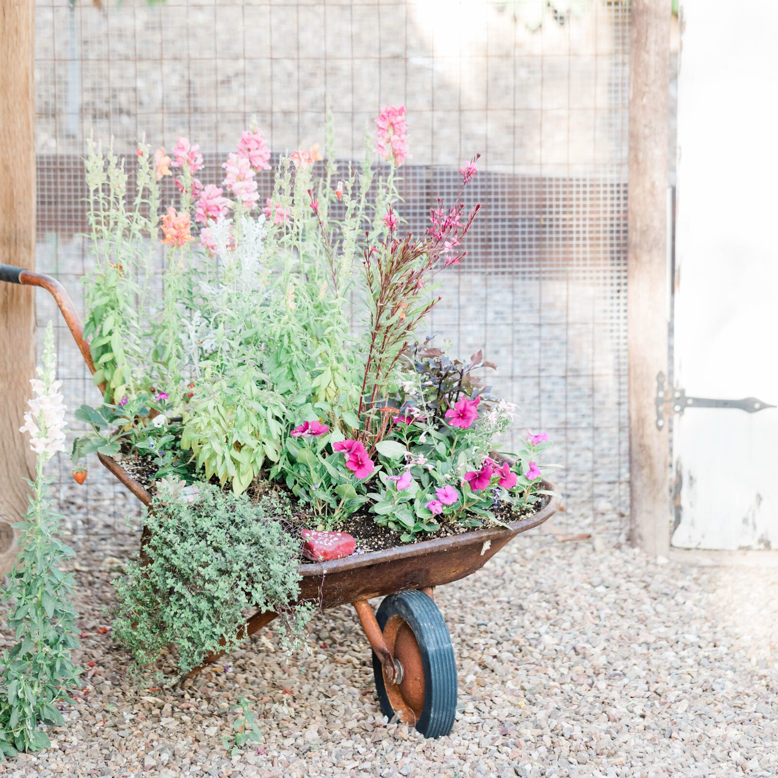


Here at Haute Stock, we absolutely love seeing our stock photos in action! We always get a little giddy when we come across a website featuring our images because it really brings home our “why” — helping women business owners create beautiful online brands so they can build successful businesses.
So we thought it would be fun to introduce a Member Spotlight Series, where we could feature the interesting and creative ways our members are using their Haute Stock images.
For this Member Spotlight, we’re sharing how Anna & Flori from Business School for Mums have used our images to add instant polish and professionalism to their website.
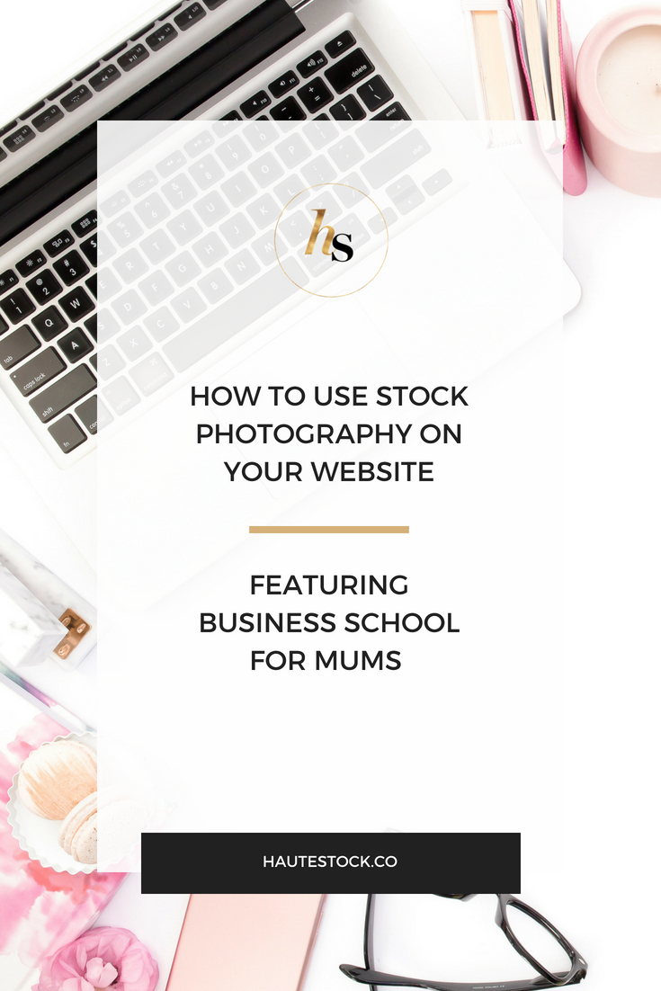
1 / ON THEir HOMEPAGE
Anna & Flori used this image from our Pink & Navy collection as a background on their homepage. It’s not only used to visually break up all of the info on the main page, but also to bring attention to what BSFM is and what they offer.
To make this stock photo work as a background for text, they added a semi-transparent white overlay to the image so that both the text and the on-brand colored props can stand out.
Tip: Want to break up all that text on your homepage with something that’s visually appealing and functional? Consider using a stock photo as background for your text. You can choose one that already has enough white (negative) space to easily add in your text or add a semi-transparent overlay to a busy (prop-filled) stock photo to ensure the text will stand out.
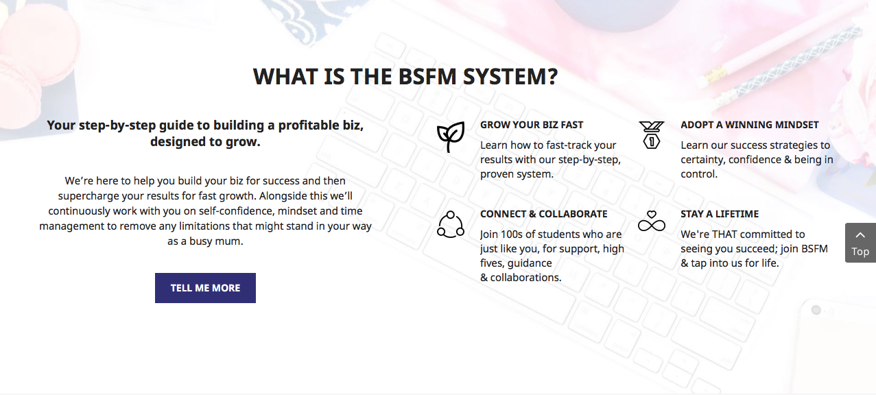
2 / FOR their SERVICE OFFERINGS
Look closely and you’ll spot Haute Stock photos being used in the background of these course offerings.
Anna & Flori created these graphics to help people quickly decide which of their programs are the right fit for them and they get right to the gist without any lengthy amounts of text.
Neither one of these stock photos have enough negative space for all of the text and graphics, so Anna & Flori added a semi-transparent white overlay to the images to ensure the text and icons stand out.
While the white overlay is opaque enough to easily read the text, you can still make out the colors and props in the images which adds flair to the overall buttons — making them more visually interesting than just a plain white background.
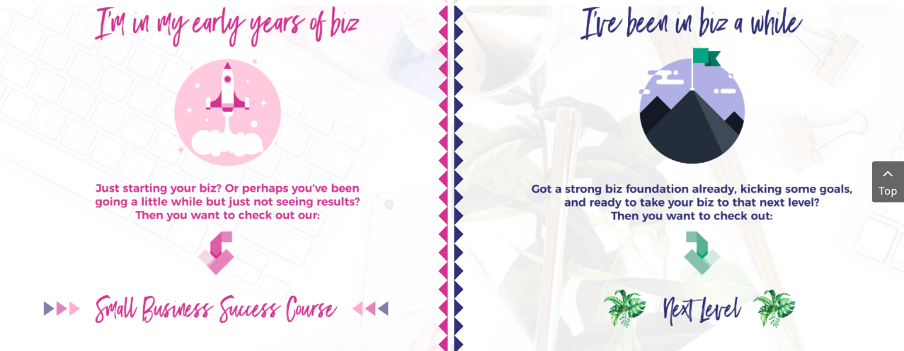
Tip: Tired of the same ol’ look on your sales page? Website buttons need a refresh? Consider using a stock photo as your base and work your way up with on-brand overlays, fonts, icons, and colors as needed. Remember not to add in too many design details — keep your graphics looking professional by keeping them clean and legible.
3 / For their MENU BUTTONS
Anna & Flori share blog content with their audience in multiple ways, so they created these interesting website menu buttons to point readers in the right direction, depending on their preferred learning style.
The two images that they chose from our library feature not only their brand colors, but also the appropriate props for the action — the word ‘Listen’ is imposed on a stock photo that contains gold headphones and ‘Read’ features reading glasses. They also made sure to add on-brand colored fonts to keep these graphics consistent with the rest of their website.

Tip: Using stock photos as menu buttons is a simple way to add visual interest to your website. Go ahead and make a list of buttons or CTA’s on your website that can be updated with on-brand stock photography as a background. You don’t need to use images for every single button, but think about which ones would benefit from the added visual interest and can be used to strategically solidify your brand feel and presence.
4 / for EYE-CATCHING CALLS TO ACTION
You want your website visitors to easily find their way around your digi home, right? You definitely want them to be able to quickly find what they’re looking for, and to draw attention to the actions you want them to take on your site.
An easy way to do this is to create interesting visuals that clearly show a call-to-action, so that your visitors are enticed to click where you want them to.
Anna & Flori used these bold, colorful images from our library to create these eye-catching CTA buttons and on-brand color blocks to make sure the text stands out and is easy to read.
In addition, Anna & Flori chose a great image to pair with the ‘Connect with Us on Instagram’ text. This particular image of tea and macarons evokes the feeling of two friends sitting together for tea time, ready to share and enjoy each other’s company. This graphic gives off a warm, friendly, and welcoming vibe —exactly how you want your followers on social media to feel when interacting with your brand.


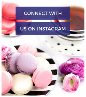
Tip: Tie in your text with stock photos that either directly relate to the topic or evoke a particular feeling. Pairing the text with the right type of imagery can emphasize the messaging, creating a strong, impactful brand presence.
5 / FOR their COURSE BUTTONS
As we know, your website has lots of buttons directing your readers to important areas of your website. And even in the members-only area, Anna & Flori dressed up their course buttons (and banner) with stock photos from our library.
By doing so, they’ve created a polished, professional look throughout their website — from the homepage to the paid-for pages.
Though the images in the example below all have different color palettes and styles, Anna & Flori made sure they’re cohesive by adding a semi-transparent white overlay and their brand fonts. It ups the level of professionalism and creates a beautiful, visually appealing website design that’s clean and easy to navigate.
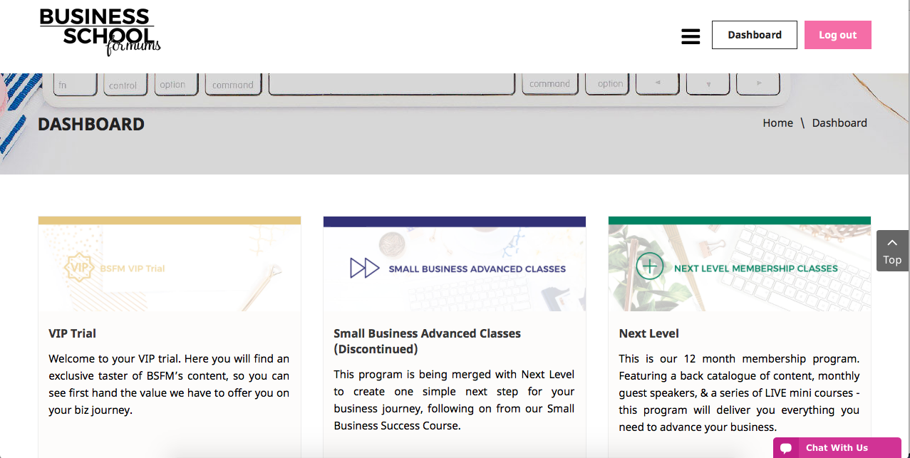
Tip: Don’t just focus on using stock photography for creating great graphics on your website — dress up your paid-for content and materials, too! Customers will appreciate those beautifully designed, info rich workbooks, checklists, presentations, or members-only areas. It’s another great opportunity to create collateral that’s on-brand, which will further act to solidify your biz look and feel.
Well, that’s a wrap! Anna & Flori have used these images and others so well on their website, I hope it inspired you to also find interesting and fun ways to use your stock photots to really make your brand personality pop!
What are some interesting ways you’ve used stock photos for your website, online course or social media accounts? Let us know in the comments below!