Last week our Canva 101 Tutorial showed you how to use color overlays, filters and gradients to create six different styles of graphics using the same stock image.
To take that a step further, this week we will discuss typography and how, by selecting the right typeface for your project, you can further customize your branded graphics.
Over the years, I have designed book covers for a wide variety of topics, all requiring a different look to match their specific brand style. For example, when I worked on a cover for a French book on Style, the look was completely different than what I designed for the cover of cookbook that featured Paleo Recipes.
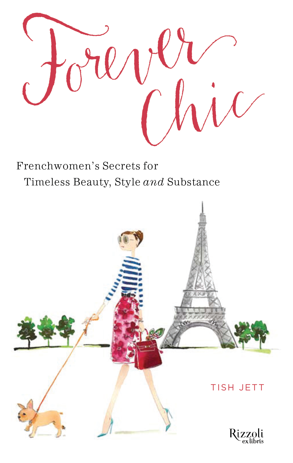
Forever Chic, Book Cover Designed by LeAnna Weller Smith
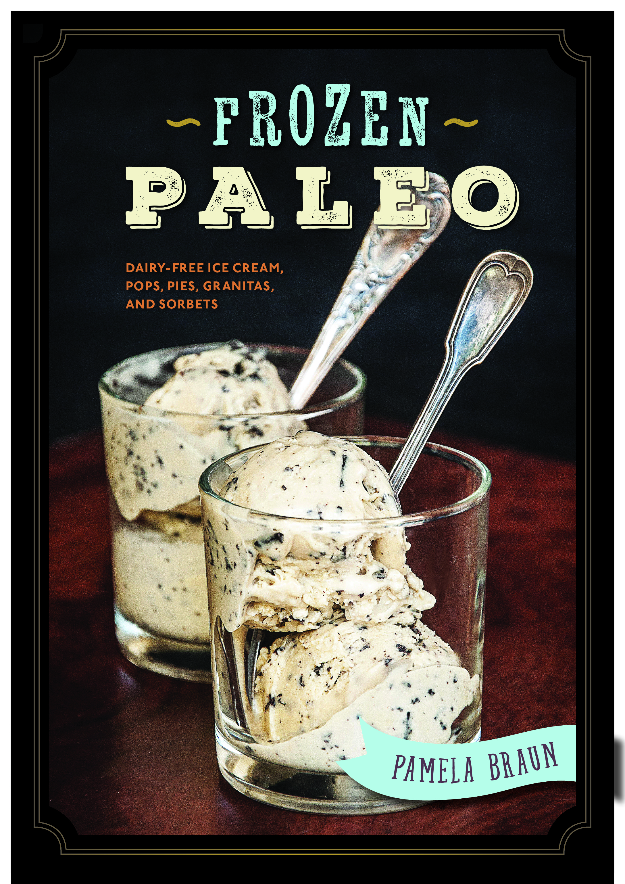
Frozen Paleo, Book Cover Designed by LeAnna Weller Smith
Had I chosen to use the same type treatments for both, they would definitely not have resonated with the customers they were intended to attract. The same goes for designing graphics that represent your brand. You wouldn’t want to use fonts that don’t fit your style or that don’t resonate with your target market.
How do you go about selecting the right typeface for your brand when there are soooo many to choose from?
Coming from someone that has worked with tons of different typefaces and fonts, while I often know what will work best, occasionally even an expert like myself needs to spend time mixing and matching to obtain the desired effect.
So, to make things easier for you, I thought it would be fun to put together a few sample styles along with tips for choosing typefaces for your next set of branded graphics.
Be sure to check out the short video tutorial below that shows some of these tips in action and as a BONUS, we have a FREE typography style guide for you to use as a reference!
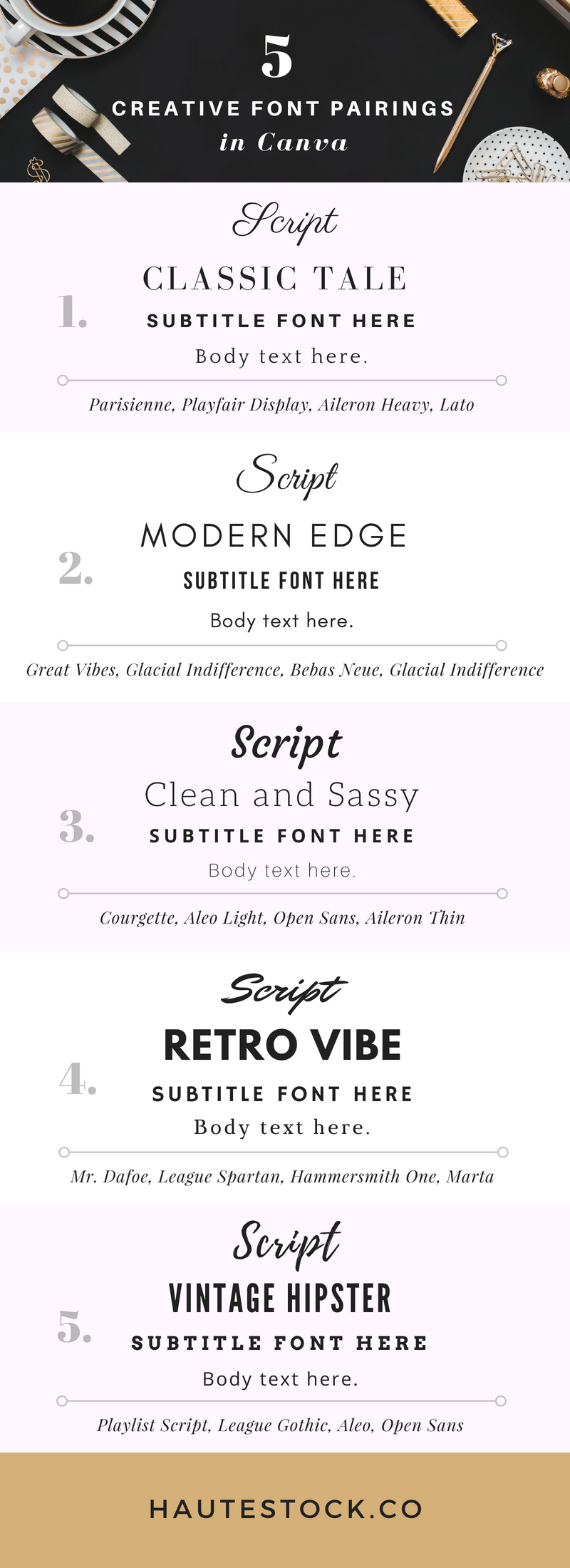
Here are some important tips to keep in mind when choosing fonts:
1. Take a look on the web to find inspiration for type treatments (ie. a combination of types that look good together) that you like. From those, you can try to emulate that style using typefaces that are available to you from within Canva, Google Fonts or you can download fonts from sites like Creative Market, Dafont.com and Font Squirrel. Bonus: If you have Canva for Work, you can upload your brand fonts to use on your graphics.
2. Generally I like to have a font suite of 3 different typefaces which often includes:
-
Serif – those classic typefaces that have what we call “feet”, like Bodoni, Times and Playfair.
-
Sans Serif – you guessed it — fonts with no “feet”, like Helvetica, Montserrat and Aileron.
-
Finally, some sort of script face (the key here is to make sure it is a readable script, could be flowy or handwritten), like Allura or Mr Dafoe.
*All the fonts mentioned are available in Canva for reference.*
Now you’re ready to start designing…So let’s get to it!
Don’t forget to grab your free typography style guide BELOW!

This post and video tutorial were created by LeAnna Weller Smith: Executive Creative Director, Weller Smith Design & Design Expert, Haute Stock.


This is extremely helpful. I have been trying to figure out which typeface go together best and this video came at the perfect time.
Glad to hear that it help, Linda! Good luck 🙂
This is so great! I love that you care about your customers and this kind of content keeps me coming back. Don’t stop being of service.
We’re happy to help! Thank you so much, Krisha 🙂
Loving these tutorials, they are so helpful! This is excellent content. Thank you.
You’re welcome Dee, glad to hear you’re finding it helpful!
Thank you so much for this. I need to pick consistent fonts and am not that great at design! I appreciate all you do!
Very helpful, thank you for sharing this, it has clarified things for me and helped me to get started with my brand choices.
I’m glad to hear that Jane, so happy that you found this helpful! Good luck 🙂
Thank you for this awesome post! I’m a writer, not a designer, and it’s always been impossible for me to create the type of graphics I want. Not anymore!
So glad that you found this post useful, Meagan! Best of luck with your graphics!