Your bookkeeping business can look editorial, warm, feminine and established without looking like every cheesy stock-photo version of an accounting firm.

And maybe it should.
Because somewhere along the way, “I handle money” became visually synonymous with navy blue, glass office buildings and a woman in a blazer enthusiastically pointing at a pie chart.
Which makes sense, in theory.
Bookkeeping is serious. Your clients are trusting you with something important. You want to look credible, experienced and like you absolutely know what a reconciliation is without Googling it.
But credible and corporate are not the same thing.
Especially if the people you actually want to work with are designers, coaches, consultants, photographers, wellness founders, creatives or other women building modern businesses.
They don’t necessarily want their bookkeeper to look like a regional bank.
They want someone who understands their business, makes the numbers feel less intimidating and generally gives them the reassuring feeling that okay, an adult is looking at this.
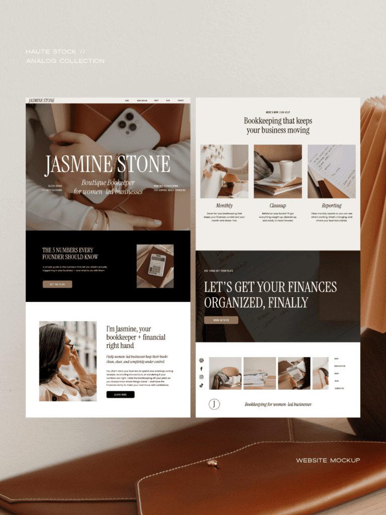
That’s the brand we wanted to create with Jasmine Stone, a fictional bookkeeping business we built using imagery from our Analog Collection.
A genuinely different way of thinking about what a financial brand can look and feel like.
Professional doesn’t have to mean corporate
There’s an interesting dilemma in financial services branding. You’re dealing with something important, so naturally you want your brand to feel dependable.
But wanting your clients to feel like you’re the safe choice shouldn’t come at the cost of playing it safe with your branding.
A memorable brand might actually be part of what makes you feel like the safer choice.
People remember you. They understand who you’re for. Your business feels thought-out. There are signals that someone is paying attention here.
And when two businesses offer roughly the same service at roughly the same price, those signals matter.
Start with how you want working with you to feel
This is where we’d start before choosing a color palette, pinning logo inspiration or searching for “bookkeeping stock photos.”
Ask a better question:
What should someone feel when they land here?
For our fictional brand, Jasmine Stone, the answer was something like:
I’ll help you understand what’s happening in your business so your finances feel calmer, clearer and more under control.
Already, that gives us much more to work with than “she is a bookkeeper.”
Because if the feeling is calm, capable and organized, the visual identity can communicate that.
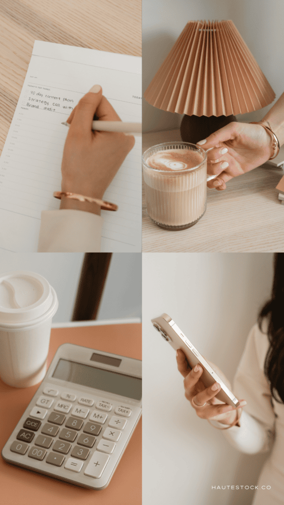
Warm leather tones. Tactile paper. A notebook open on the desk. Coffee beside a stack of work. Beautifully organized folders. A founder who looks like an actual person rather than someone currently starring in a banking commercial.
The imagery still belongs in the world of business, it just feels more authentic and human.
And this is one of our favorite ways to approach brand imagery in general:
Don’t only show what you do. Show what it feels like to work with you.
A therapist doesn’t need 27 photos of a therapy session.
A copywriter doesn’t need an entire website of hands typing.
And your bookkeeping business does not need a calculator in every available square inch.
Your service is the literal thing you sell.
Your brand gets to tell the bigger story.
Look beyond obvious bookkeeping imagery
Now, to defend the calculator for a second: there are calculators on this website. We’re not monsters.
There’s nothing wrong with using imagery that makes your industry immediately recognizable. In fact, you probably should.
The problem is when every image is trying to explain your job description.
Instead, think about building a visual world around the business.
For a bookkeeping brand, that might include:
- notebooks, planners and organized paperwork
- thoughtful workspace details
- phones and laptops being used naturally
- coffee shops and work-from-anywhere moments
- hands writing, planning or sorting
- founder portraits
- client-meeting imagery
- folders, documents and office supplies
- subtle financial details
- lifestyle imagery that reflects the people you want to work with
Notice that not everything on that list says BOOKKEEPING.
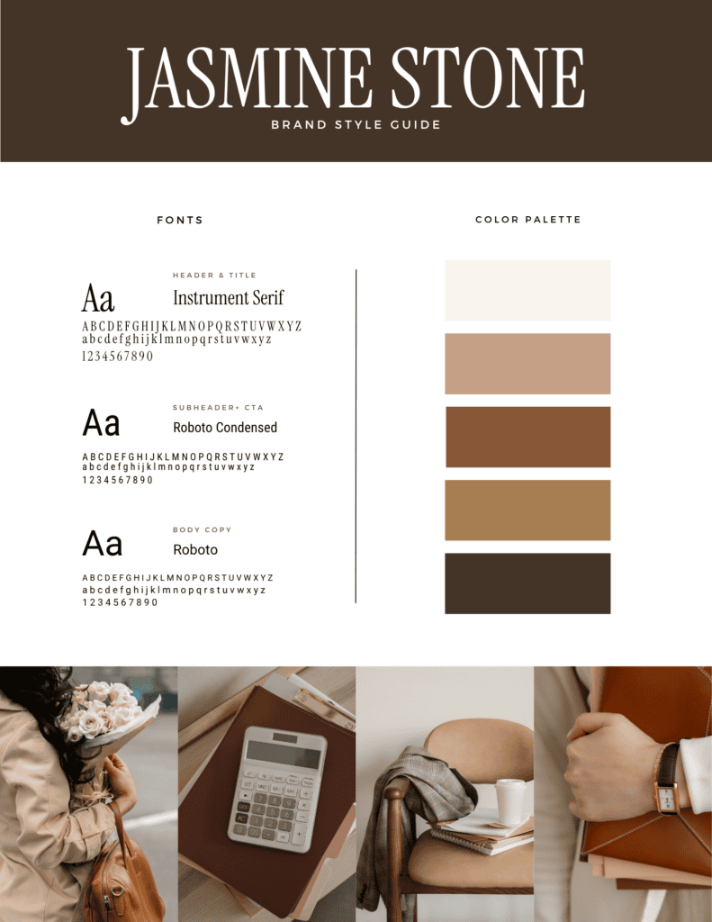
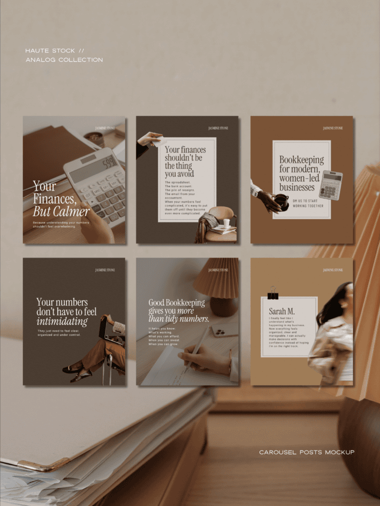
In the Jasmine Stone concept, the visual thread isn’t “there is money in every photograph.” It’s the creamy neutrals, camel leather, warm browns, black accents, tactile materials and slightly editorial feeling of the images.
Some photographs are clearly business-related. Others simply belong in the same world. And that distinction gives you so much more to work with.
Because eventually you need an image for an email about taking Friday off. Or a post about business boundaries. And if your entire visual identity hinges on finding yet another aesthetically acceptable spreadsheet, things get limiting pretty quickly.
Let your brand attract the kind of client you actually want
Branding is so often treated as a way of telling people who you are.
Your personality. Your values. Your colors. Your vibe. And don’t get us wrong, these are all important.
But arguably more important is what your brand tells the person looking at it:
This business is for someone like you.
Imagine two bookkeeping businesses offering essentially the same monthly service.
One has the traditional blue-and-grey financial-services website. The other feels polished but warm, modern and intentionally designed for women running creative or service-based businesses.
Neither is objectively better.
But they may attract very different clients.
And that’s kind of the point.
If you specialize in working with coaches, designers, photographers, consultants, wellness founders or other women-led businesses, your visual identity can reflect the world your clients are already in—or the world they want their own business to belong to.
There’s a little moment of recognition that happens before they’ve read your package inclusions or figured out exactly what “monthly close” means.
Oh. She gets businesses like mine.
That is branding doing its job.
Not making you look prettier.
Making the right person feel more certain that she’s in the right place.
Your website should feel like one visual thought
One of the reasons we’ve started putting more of our stock photography into full brand and website mockups is because it forces a much more useful question.
Does this photo belong to this brand?
Most of us are perfectly capable of collecting 38 beautiful images that have absolutely no business being in the same room together.
The goal isn’t to find the prettiest photograph every time. It’s to create enough consistency that everything begins to feel intentional.
On the Jasmine Stone website, we kept returning to the same visual cues: warm neutrals, tactile details, editorial crops, rich brown tones, natural light.
And that’s what makes a website start to feel custom even when you’re using a website template and stock photography. It’s also what allows your brand to expand naturally beyond your website. Your Instagram feed doesn’t need to look like twelve tiny versions of your homepage.
But there should be a thread. A sense that the same person made all of these decisions.
That’s the difference between having a collection of nice brand assets and having an actual visual identity.
Create your own brand with Haute Stock
The imagery in our Jasmine Stone concept comes from the Analog collection inside the Haute Stock Membership.
And you don’t only have to use these images for a bookkeeping brand, you can use them for:
✓ business, productivity + planning content
✓ finance, accounting, legal, and real estate brands
✓ designers, consultants, educators, and course creators
✓ founder stories, entrepreneur content
And there are several other collections inside the library that you can mix and match with it in the same aesthetic.

The membership is full of warm, editorial business imagery that can move between your website, social content, emails, launches and all the other places your brand needs to show up without feeling like you’re using the same three “business woman at laptop” photos forever.
And yes, you can still keep the calculator.