

How to Use Editorial Stock Photos to Create a More Elevated Visual Identity
A brand doesn’t usually feel premium because of one thing, it feels premium because of the details.
For fashion stylists, interior designers, home and lifestyle brands, brand designers, and creative directors, those details matter even more. Your audience is not only hiring you for a service. They’re hiring you for your creative eye, your taste, and your ability to curate.
That’s why your visual identity needs to communicate taste, refinement, and intention before anyone reads a single line of copy.
In this post, we’re breaking down the visual details that make a brand feel more premium and how to use editorial stock photos like Haute Stock’s collections across your website, Instagram, Pinterest, email marketing, and client-facing materials.

Why Small Visual Details Make a Brand Feel More Premium
Premium branding is rarely about adding more.Most of the time, premium branding is about restraint. It’s about knowing what to leave out, what to repeat, and what to make feel intentional.
The details that often make a brand feel more elevated include:
- soft, tactile textures
- natural light and shadow
- negative space
- warm neutral tones
- editorial cropping
- refined styling
- consistent image direction
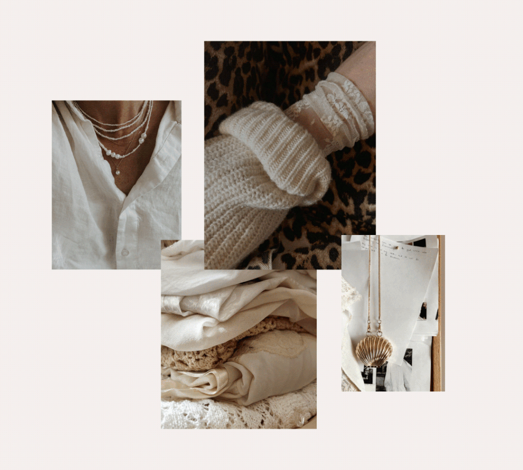
- materials that feel sensory, like linen, marble, wood, pearls, paper, or ceramics
These visual cues tell your audience something before your words do. And for businesses built around taste, creativity, styling, design, or transformation, that kind of first impression is everything.
Premium visuals are not always glossy or extravagant. But they are cohesive, intentional, and emotionally specific.

The Details That Make a Brand Look More Elevated
A brand feels premium when every visual choice supports the same feeling.
That doesn’t mean everything has to match perfectly. It means your photos, graphics, colors, typography, and layout should all feel like they belong to the same world.
Here are five details that instantly make a brand feel more elevated.
Texture
Texture adds depth to your visual identity. Think linen, knits, marble, handwritten paper, pearls, wood, ceramics, soft upholstery, and natural fibers. These elements make your brand feel more tactile and dimensional, especially in digital spaces where your audience can’t physically touch what you offer.
Texture is especially powerful for stylists, designers, and lifestyle brands because it creates a sensory feeling around your work.
Negative Space
Negative space gives your visuals room to breathe. Premium brands often use space intentionally. Instead of filling every corner of a graphic or website section, they allow the image, message, or product to stand on its own.
For social graphics, website banners, Pinterest pins, and email headers, images with negative space are especially useful because they make it easier to layer text without making the design feel crowded.
Natural Light and Shadow
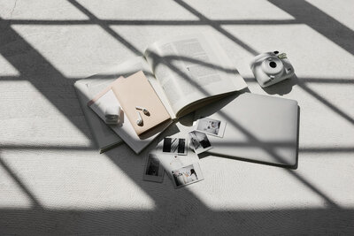
Light can completely change the mood of a brand. Soft sunlight, warm shadows, and gentle contrast make imagery feel editorial and atmospheric. These details create a sense of intimacy and realism that overly bright or generic stock photos often miss.
Editorial Cropping
Not every image needs to show the full scene. A close-up of pearls layered over linen. A corner of a marble countertop. A soft fold in fabric. A partial view of a styled shelf.
Editorial cropping makes your visuals feel more artful and less obvious. It invites the viewer in, which is exactly what refined brand imagery should do.
Repeated Visual Motifs
The most recognizable brands repeat certain visual cues.
That might be a specific color palette, a type of texture, a lighting style, a material, or a recurring object. Over time, these motifs help your audience recognize your brand before they even see your logo.
For example, a fashion stylist might repeat wardrobe textures, accessories, and soft neutrals. An interior designer might repeat marble, ceramics, warm wood, and natural light. A brand designer might use abstract detail shots to communicate mood and creative direction.
These small repetitions create a brand world.
How Fashion Stylists and Wardrobe Consultants Can Use Editorial Detail Photos
For fashion stylists and wardrobe consultants, your visuals need to say more than “I help people get dressed.” They need to communicate taste, curation, confidence, and personal transformation.
That’s where detail-driven imagery becomes incredibly useful.
Instead of relying only on outfit photos, you can use close-ups of jewelry, linen, accessories, soft wardrobe moments, and styled details to create a more editorial brand presence.
For example, a wardrobe consultant could use a pearl necklace image as the opening slide of a carousel titled “5 Details That Make an Outfit Feel More Expensive.”
Then, throughout the carousel, they could pair styling advice with linen textures, accessory close-ups, and wardrobe imagery to create a cohesive editorial flow.
The result feels more elevated than a standard tip post and more aligned with the kind of transformation a premium stylist is selling.
How Interior Designers and Home/Lifestyle Brands Can Use Detail-Driven Imagery
Interior designers and home/lifestyle brands sell more than beautiful rooms. They sell atmosphere. They sell the feeling of walking into a space that feels calm, collected, and deeply personal.
Detail imagery helps communicate that feeling before a potential client ever books a consultation.
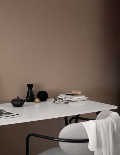
Think marble surfaces, open shelving, soft textiles, warm kitchen moments, ceramics, coffee rituals, handwritten notes, and natural light. These are the details that make a home feel lived-in, layered, and intentional.
For example, an interior designer could use a marble-and-coffee image for a blog post titled “How to Make Your Home Feel More Collected”
A home organizer could use soft shelving or kitchen detail imagery for a service page that explains the emotional value of a more intentional home.
A boutique home decor brand could use textile and tabletop images to create Pinterest graphics that feel warm, premium, and aspirational.
Interior and lifestyle brands can use detail photos to sell the feeling of the finished experience, not just the finished space.
And if you’re an interior designer creating websites, presentations, moodboards or marketing materials for your own design clients, our Agency Plan includes commercial licensing for client work.

How Brand Designers and Creative Directors Can Use Detail Photos in Client Work
For brand designers and creative directors, detail photos are one of the most versatile types of imagery. They can communicate a mood without becoming too literal.
A linen texture, shell accessory, handwritten note, pearl detail, or softly styled kitchen scene can express words like:
- refined
- feminine
- tactile
- editorial
- intimate
- thoughtful
- luxury
- artisan
- elevated
- intentional
That makes editorial detail imagery especially useful in the early stages of visual direction.
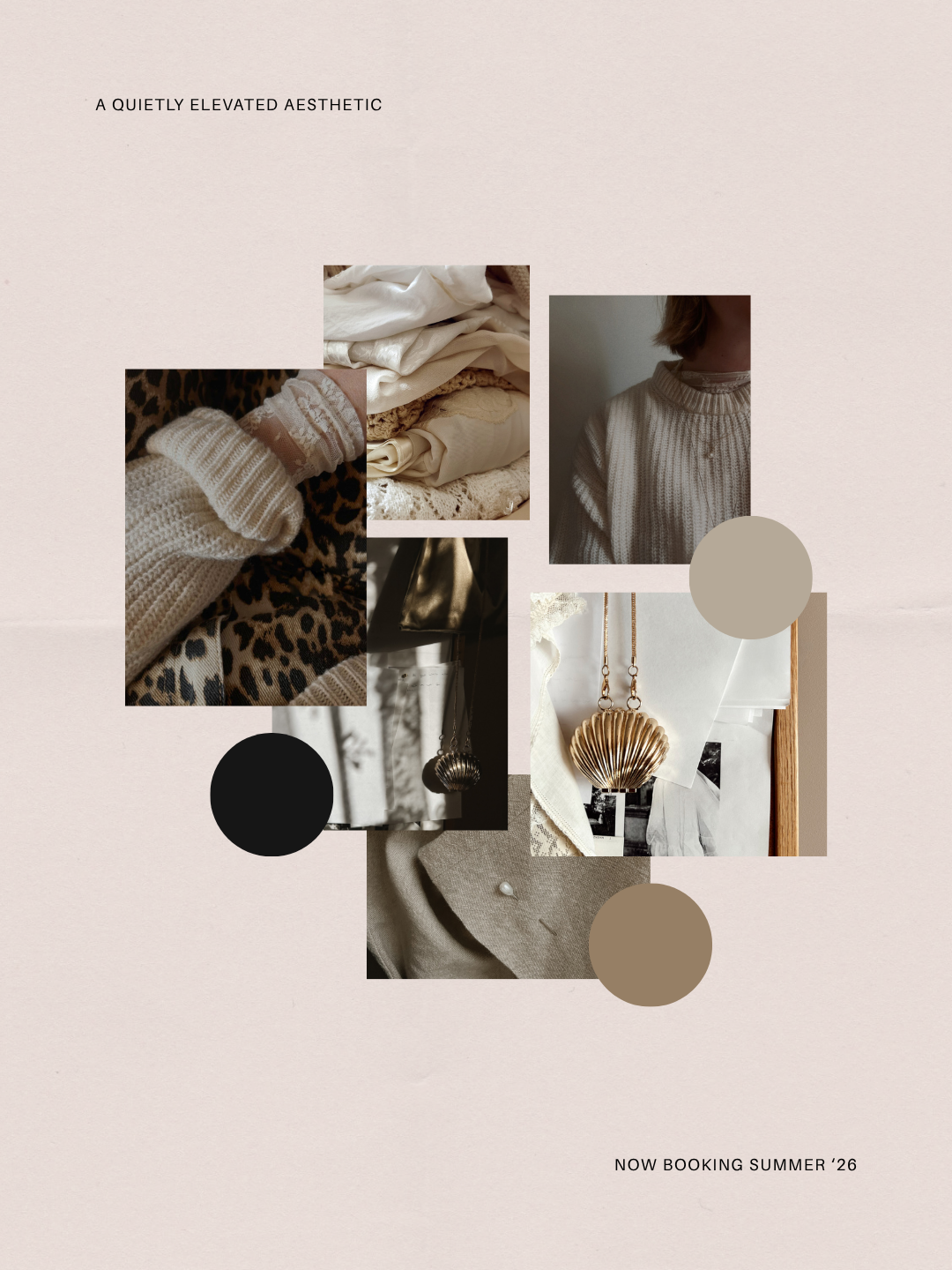
For example, a brand designer could use the Details Darling collection to create a visual direction board for a client whose brand keywords are elevated, intimate, tactile, and editorial.
The images help create context around the brand before the logo, color palette, or typography are finalized. They also work beautifully as supporting visuals in client presentations, where you need the overall concept to feel polished and easy to understand.
For designers, detail photos help translate abstract brand words into a visual language clients can feel.
If you’re using Haute Stock imagery as part of custom client work, our Agency Plan gives you commercial licensing for client websites, brand designs, social content, presentations and other custom deliverables. If you create templates or digital products that you sell to multiple customers, you’ll want the Designer Plan.
How to Use Editorial Stock Photo Collections Across Your Brand
One of the biggest mistakes business owners make with stock photos is treating them like one-off images.
They download a photo for one post, another for a sales page, another for Pinterest, and another for an email header, but nothing feels connected. A curated editorial stock photo collection solves that problem because the images are designed to work together.
With one cohesive collection, you can create a visual system across multiple brand touchpoints.
Use one collection for:
- website home page images
- about page accents
- service page visuals
- Instagram carousel backgrounds
- Pinterest pins
- email newsletter headers
- blog post graphics
- lead magnet covers
- client guides
- brand mood boards
- launch graphics
- Canva templates
- sales page sections
This is where stock photos become more than “pretty images.” They become brand infrastructure. When your website, social posts, Pinterest graphics, emails, and client materials all share the same visual mood, your brand starts to feel more recognizable and more trustworthy.
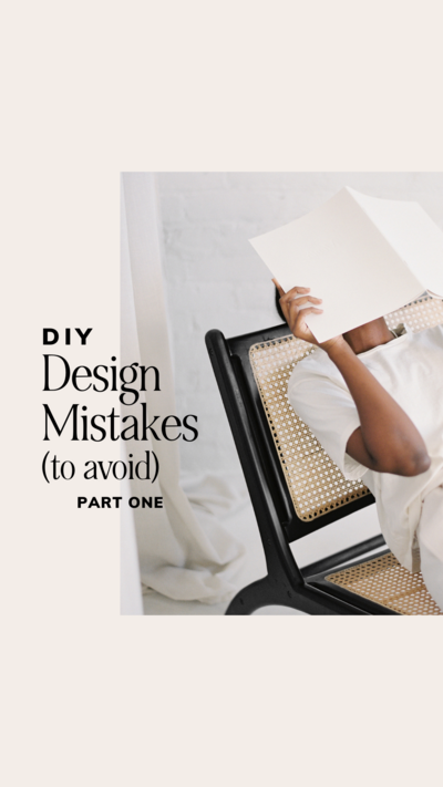
That consistency matters, especially for business owners who sell a premium experience. To make creating cohesive graphics easier, you’ll find many exclusive templates inside the Haute Stock membership that are expertly designed to work with our stock images. Templates like this Designer Details collection that are available now inside the Haute Stock library.

Featured Collection: Details Darling
The Details Darling collection was created for brands that understand the power of nuance.
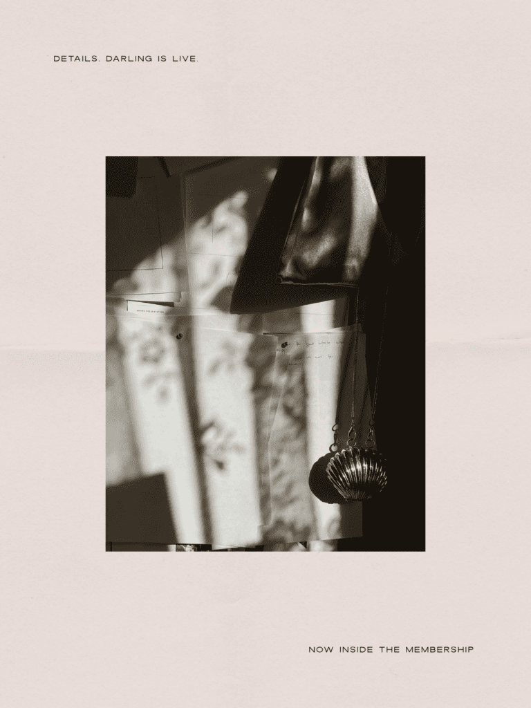
With soft linens, pearl accents, wardrobe moments, marble surfaces, kitchen styling, handwritten notes, warm neutrals, and editorial still-life compositions, this collection gives you the kind of refined visual details that make a brand feel thoughtful, tactile, and premium.
It’s especially well suited for:
- fashion stylists
- wardrobe consultants
- interior designers
- home and lifestyle brands
- brand designers
- creative directors
- boutique service providers
- premium personal brands
Use it when you want your audience to feel the quality of your work before you ever explain it.Inside the Haute Stock membership, members can access the full Details Darling collection, along with thousands of premium stock photos, stock videos, Canva templates, marketing guides, and brand-building resources designed to help your business show up beautifully and consistently
FAQ: Premium Brand Visuals and Editorial Stock Photos
What makes a brand feel premium?
A brand feels premium when its visuals, messaging, and customer experience feel cohesive, intentional, and refined. Details like color, texture, spacing, photography style, and consistency all shape how elevated a brand feels.
How can I make my brand visuals look more editorial?
Use images with natural light, texture, negative space, thoughtful composition, and restrained styling. Editorial brand visuals often feel less staged and more atmospheric.
Who should use detail-focused stock photos?
Detail-focused stock photos work especially well for fashion stylists, interior designers, brand designers, creative directors, wellness brands, lifestyle businesses, and service providers who want to communicate taste and trust.
Can stock photos make my brand look premium?
Yes, using stock photos can make your brand look premium when they are cohesive, high-quality (like the curated imagery from Haute Stock), and aligned with your brand aesthetic. The key is choosing images that support your visual identity instead of mixing random styles from different sources.
How do I use stock photos without making my brand look generic?
Choose a curated image collection with a consistent color palette, mood, lighting style, and subject matter. Then use those images across your website, social media, Pinterest, email marketing, and client materials so they become part of a cohesive visual system.
Can I use Haute Stock images in client work or templates I sell?
Yes, with the appropriate commercial plan. The Agency Plan is designed for creatives using Haute Stock assets in custom client work, including websites, social graphics, marketing materials and brand designs. The Designer Plan includes those rights plus expanded licensing for templates, digital products and select products you sell.
Ready to Make Your Brand Feel More Considered?
Your brand doesn’t need more random images sitting in a downloads folder. It needs a visual library that helps every touchpoint feel aligned, polished, and intentional.
Explore the Haute Stock membership to access thousands of editorial stock photos, stock videos, Canva templates, marketing guides, and brand-building resources designed to help your business look elevated everywhere you show up.