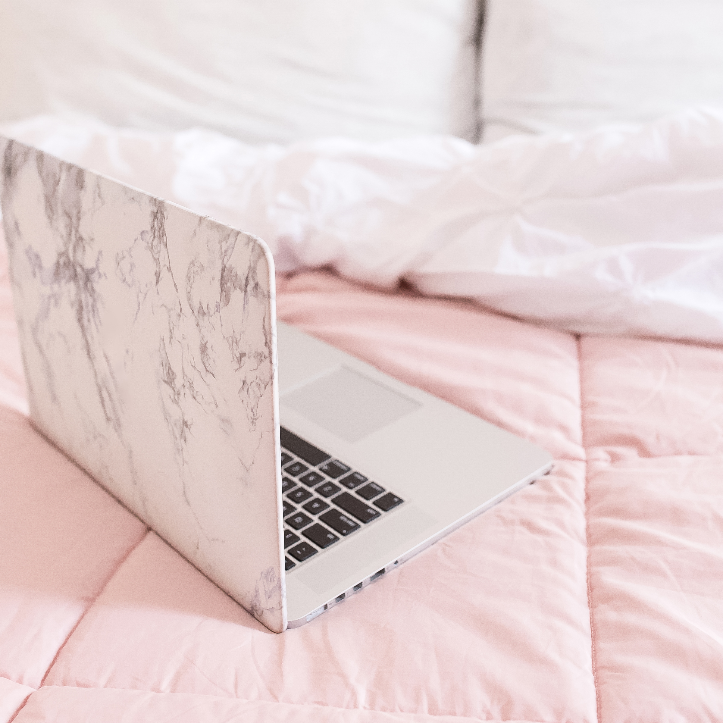
Need help using styled stock to create graphics that are unique and tailored to the specific vision of your brand?
In today’s post, we’ll be sharing 14 different graphic ideas that were created using Haute Stock’s new collections: Five More Minutes, Please and Pink & Grey.
These two collections feature different themes (our dreamy millennial lifestyle collection & our fitness, desktop, and stationery flatlay collection) to illustrate how members can mix-and-match stock photos in ways that work together to create a cohesive design style.
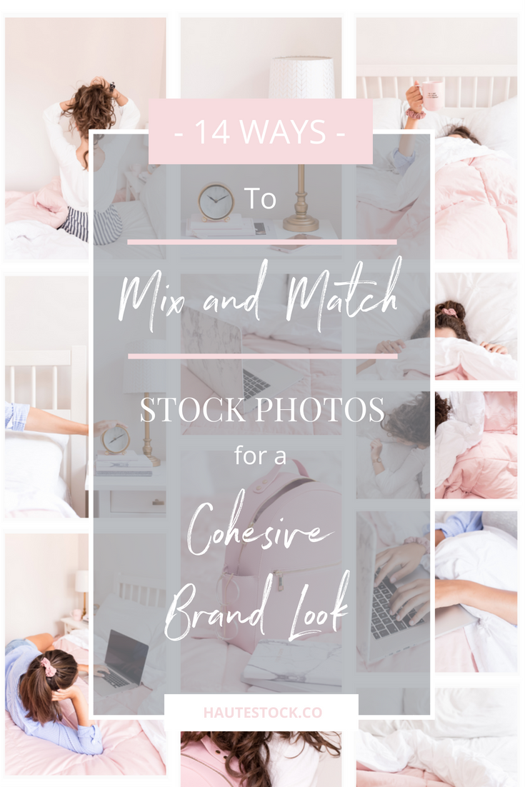
Let’s jump into the examples!
FACEBOOK ADS
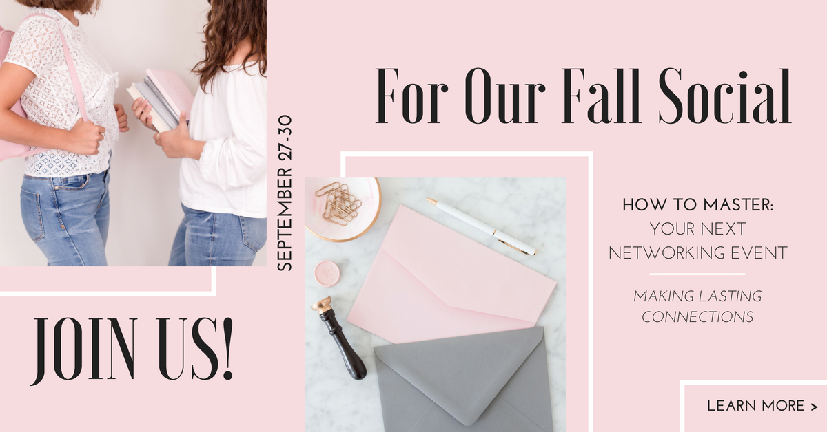
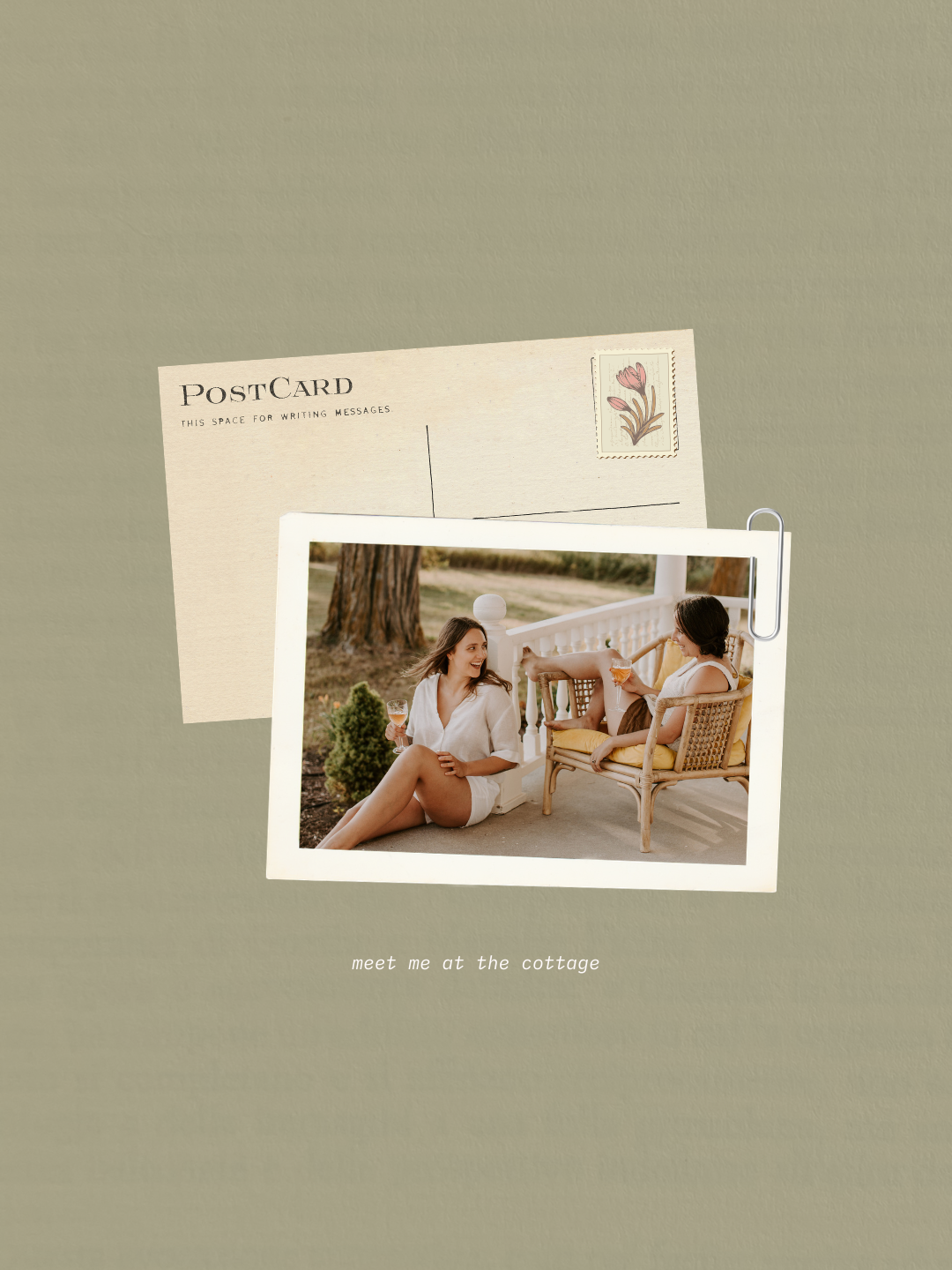
Design Tip: Two photos can be better than one! These photos are from different Haute Stock collections but they pair really well together because they have a similar color scheme.
Also don’t be afraid to get creative with your type — copy doesn’t always have to be straight-forward, left to right, and centered. Rotating your text can help create movement within your design and allow the viewers eye to naturally travel in the order you intended, emphasizing the most important elements.
Just make sure that the font, color and size is legible. Experiment with small words/phrases and avoid playing around with large paragraphs of copy (this can be overwhelming for the viewer).
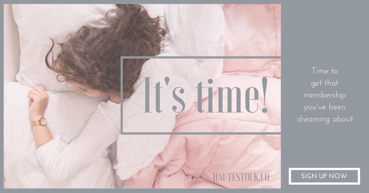
Design Tip: When you’re using a photo that doesn’t feature a lot of white space, it can help to add a colored overlay on top of the photo in order to allow for space to lay out your text. Adding the same color or a complimentary color border to the graphic can help tie in all the elements.
FACEBOOK POSTS

Design Tip: Have fun with your designs! Think about how you can incorporate the theme of a photo into the slogan of a new sales promotion. This can take your promotion graphic a step further and show personality.

Design Tip: Photos with a lot of negative space are perfect for designing for posts that require more information. Using different colors can help break up the text and adding a large design element such as the arrow will make your call to action hard to miss!
HEADERS OR HERO IMAGES
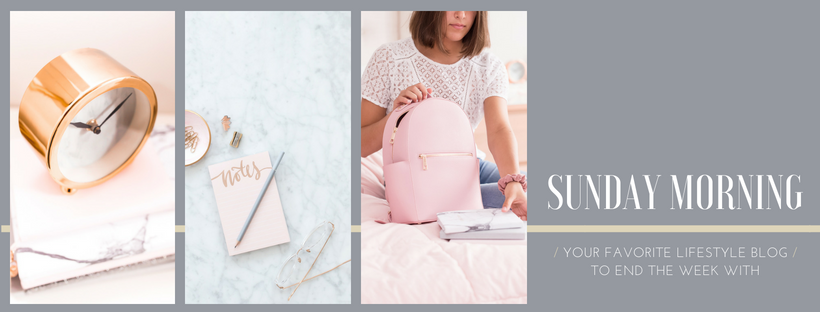
Design Tip: Adding more than one photo to your graphic allows you to show the versatility of your brand and visually communicate what you’re all about. For example, a lifestyle blog can cover a wide breadth of topics and using different photos from different collections can help you display this.
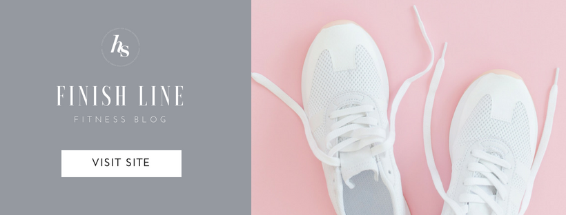
Design Tip: If a photograph has a dominant background color, it can be a good idea to add design elements of a contrasting color. It adds versatility and can help draw attention to the elements you want to stand out such as the title of your blog.
Design Tip: Facebook covers are a perfect place to not only market your business but also any promotions/new items/posts that you may have. Just remember to add a call to action sending people to where they can access it.
SOCIAL MEDIA GRAPHICS

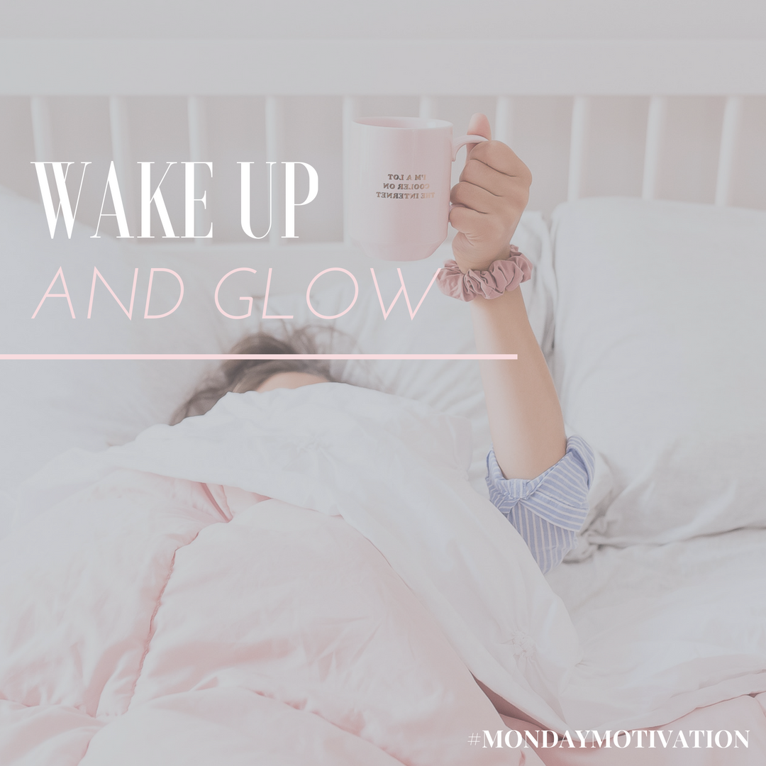
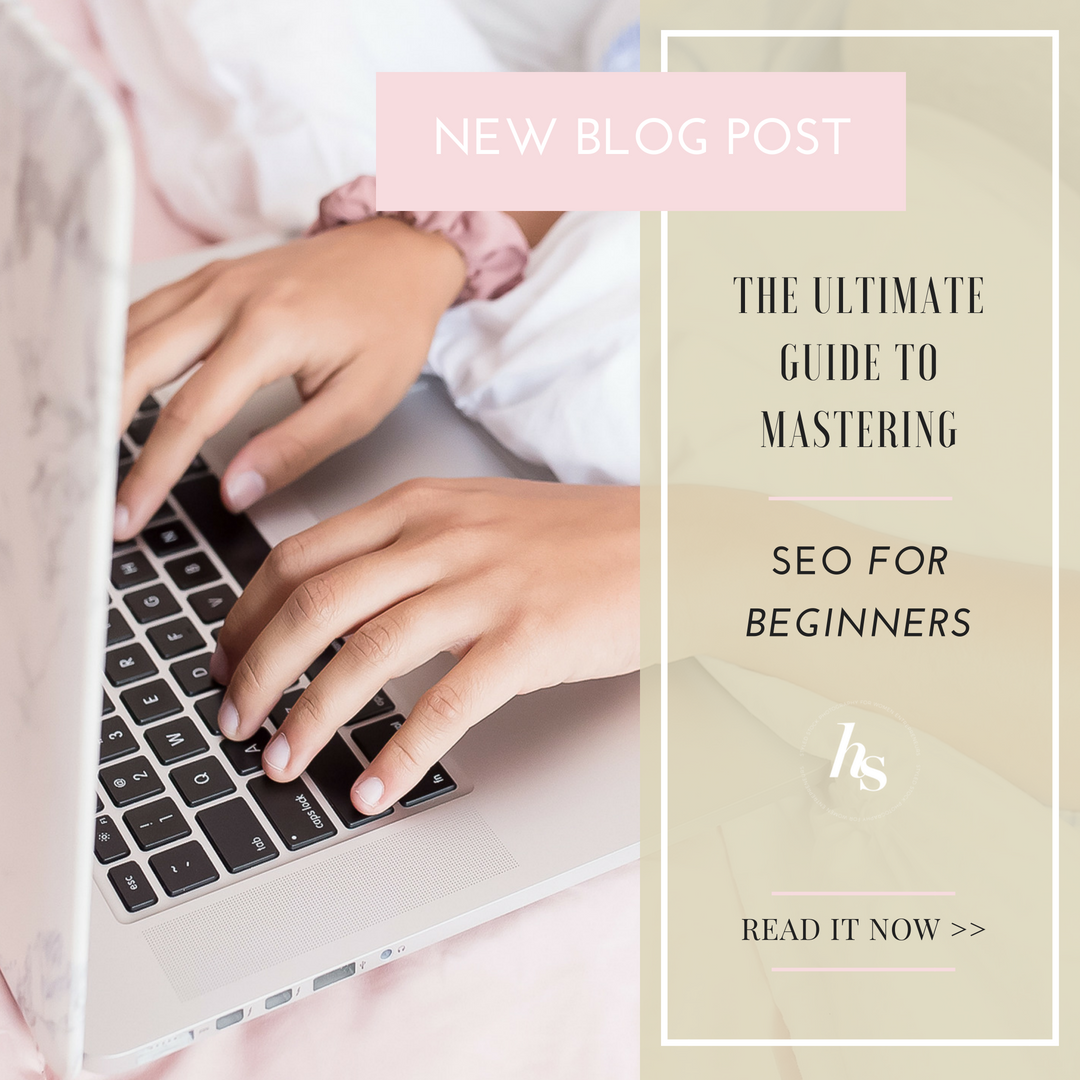
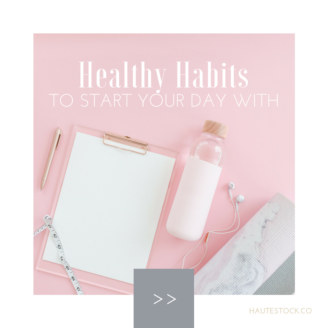
Design Tip: If you’re looking for a simple way to add a little more oomph to your design or a way to tie it all in, borders, lines and negative space should be your go-to. Don’t feel the need to fill up all the negative space with information, simple designs can be the most effective. Sometimes you’ll need to crop or play with the placement of photos to create interesting negative space.
sidebar buttons
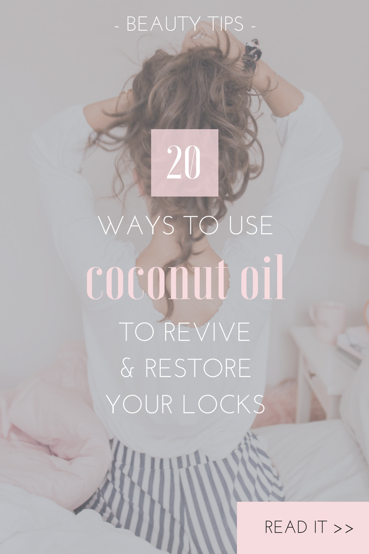
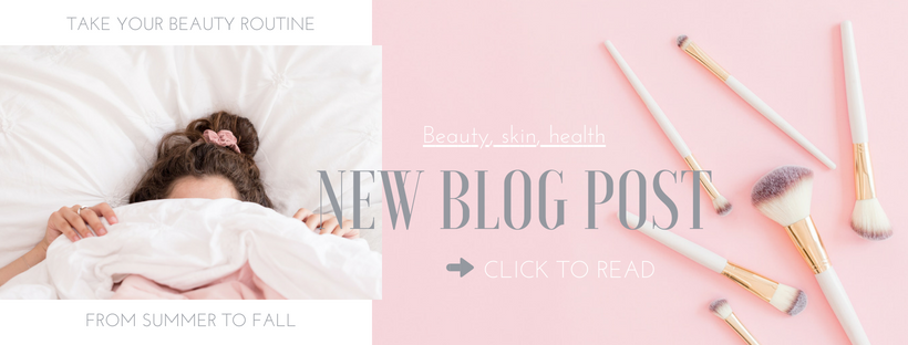
Design Tip: The way that you crop a photo can change the focus of the image. For example, this graphic is for a beauty blog post specifically about hair — this image was cropped ensure that focus was on the person in the photo rather than the background location of the photo.
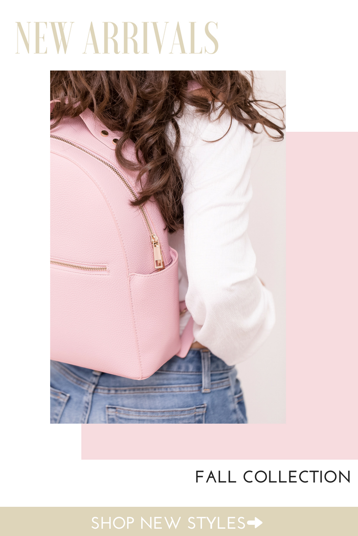
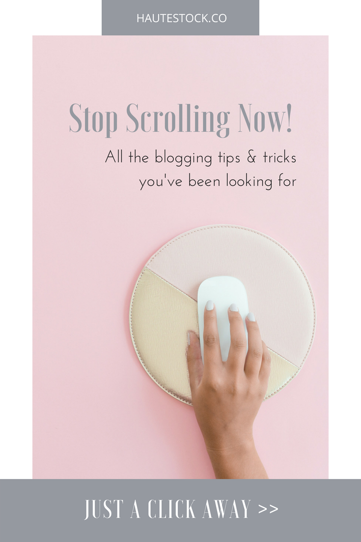
Design Tip: Playing around with different geometric shapes can add depth to a design and it also offers available space to add your text.
Feeling like Haute stock is the right fit for you?
Whether you’re a lifestyle blogger, fitness instructor, beauty consultant, or business coach — Haute Stock has the photos to fit your brand.
*Please note the graphics and images in this post are for example purposes only, and may not be used without prior approval. Questions? Contact us.
