Guest post by Paige @studiobicyclette
Paige is the owner and creative director of Studio Bicyclette, a boutique creative agency for design-driven dreamers and magic-makers. Offering brand strategy, creative direction and design, styling and photography, Paige helps other women-run businesses chase their dreams and elevate their brand thoughtful strategies and intentional imagery.
When the Haute Stock team reached out to Studio Bicyclette about undergoing a refresh for the brand, we immediately jumped at the chance.
With a similar audience, aesthetic and set of values, it felt like the perfect fit and an ideal time for a rebrand. We generally work with women-run, creative businesses who are ready to uplevel their brand and need an elevated visual identity that aligns with their vision and goals, and that’s exactly where Haute Stock was positioned.
As a company that is transforming the idea of what stock photography can be and positioning itself as an all-in-one visual content resource for modern brands, Haute Stock needed a brand that would help take them to the next level through a strategic design approach. Which is exactly where we started.
As Haute Stock begins to roll out their new branding, we thought we’d take this opportunity to walk you through the brand strategy and design process and give you a little peek behind the scenes.
Our signature, all-in package takes a holistic and full service approach to the design process, starting with a deep dive into the brand story and core values and using that as the platform from which to build a beautiful, intentional and elevated brand. It goes far beyond just the visual assets and is a collaborative, immersive process that helps us build the foundation.
Phase One: Discovery
Brand Strategy and Creative Direction
We start the process by deep diving into our discovery and research phases. There’s a lengthy questionnaire we ask you to fill out, and we also ask you to build out two Pinterest boards of inspiration, one that represents the lifestyle of your ideal client, and one that’s more focused on design elements. Using that as our starting point, we start to piece together your brand strategy, pulling lots of details from the questions you answered and then building out from there.
This first part is where we identify integral pieces to your brand, like your brand story, unique voice, ideal client, brand tone words, values and so much more. And the second part, the creative direction, is where we start to explore the visual side and how we envision the design coming to life.
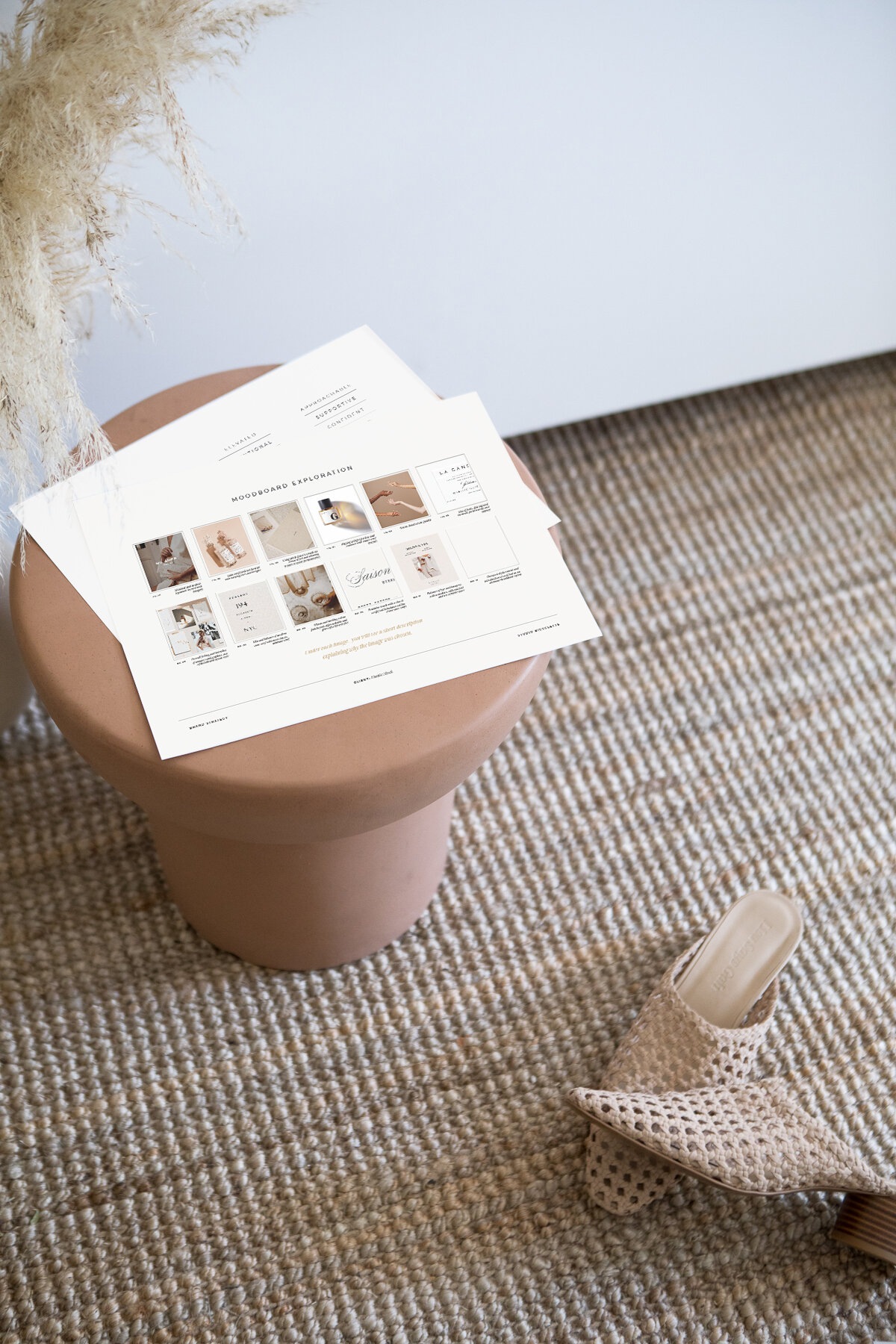
There’s a series of moodboards breaking everything down with visual references and insight into what I’m thinking, why, and ultimately — how it’ll all come together under your own signature style through wordmarks, typography, colour palette and layout design.
This design direction is meant to ensure that we’re properly communicating our vision for the brand identity and how the design phase will start to take shape.
During this initial phase, it became clear that our main intention with the Haute Stock rebrand was to elevate the brand and help take it to the next level in alignment with the vision and goals.
Drawing inspiration from timeless fashion brands and giving it a modern twist, we decided we’d focus on clean typography that will serve as an accent to the curated photography that Haute Stock is already known for.
Though it’s usually the visual portion of this strategy and creative direction deck that we (both the Studio Bicyclette team and the client) get super excited about, we wouldn’t be able to get there without that strategy piece — it’s all part of the process, and beyond guiding us to where we want to be, visually, there’s also a lot of value that can be carried forward.
We often have clients using portions of this to write their copy, build out content strategies, and communicate with their team about what the brand stands for.
Phase Two: Design
Brand Design and Presentation
Once the discovery phase is approved and any revisions are made, we use the brand strategy and creative direction as a roadmap to start working on the brand design development.
This is where it starts to get messy — in a good way! More often than not, during the strategy phase and as I’m pulling together inspiration for the moodboard and design direction, I’m also starting to play with really rough concepts. Pulling in fonts that I can see working, customizing characters and layering various elements together. Though I often start with a focus on the wordmark, it’s really only a small part of the final brand design, so I’m constantly testing to make sure everything works together and plays into the greater vision we have for the brand.
In this case, since Haute Stock is known for their carefully curated collection of beautiful stock photos, it was important to me that the rest of the brand would work well with each and every collection that’s released and stand on its own.
Type plays a huge part in my designs, so that’s where I spent the majority of time, pulling from that original design direction, testing and revising.
After exploring various ideas and concepts, we pick the strongest direction and present it via an in-depth design presentation that includes a logo, secondary logo, brand mark, colour palette, type treatment and other unique branding elements as needed.
For Haute Stock, the primary wordmark we landed on was a clean sans-serif with added curves and a feminine touch through subtle customizations. It feels modern but still classic, with gentle, barely-there flourishes and a balance in line weights and characters that gives it an editorial feel.
The type treatment includes a mix of varying weights of sans-serif fonts as the basis of the brand, accented with a classically feminine script used minimally as an accent, and a timeless serif font that brings in a fluidity through curved forms, adding interest and contrast.
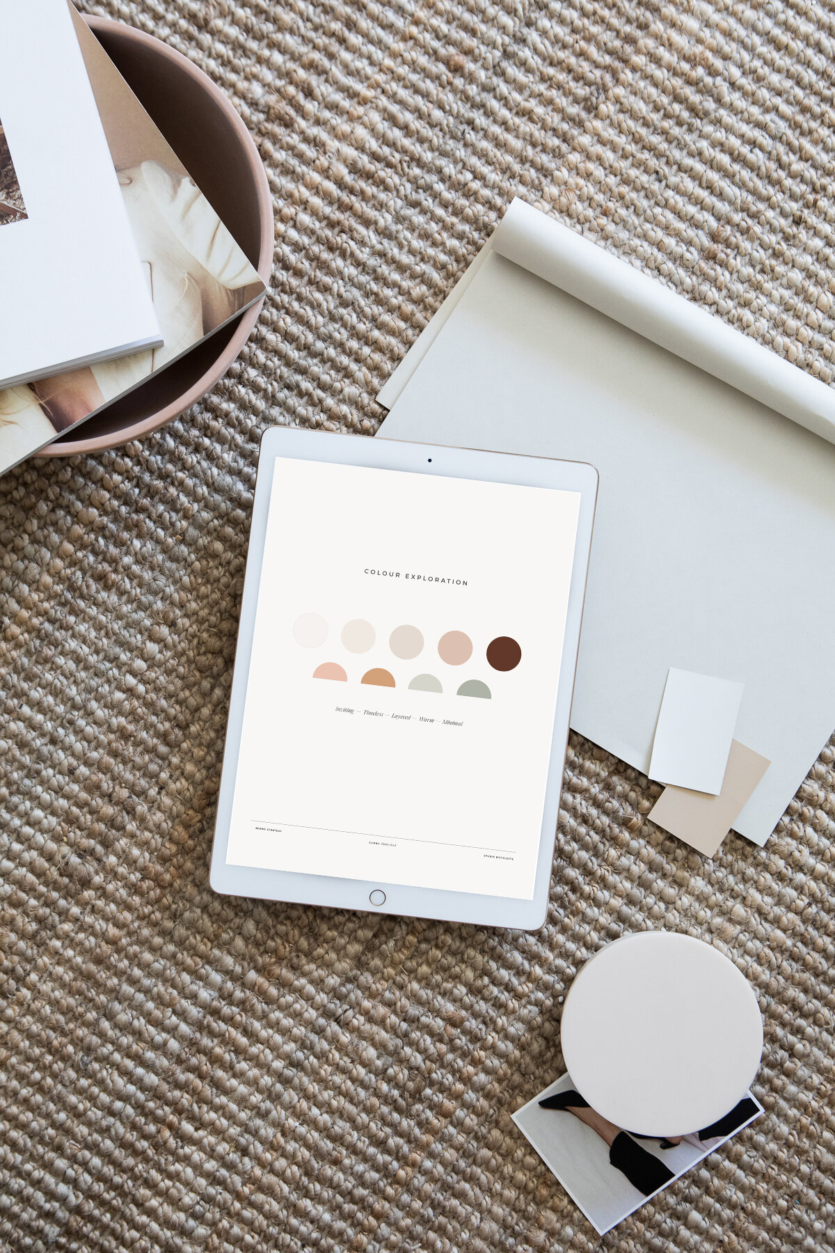
We decided we’d play up the use of white space in the layouts and overall design to let the branding and photography shine, which also gives us that elevated feel we were aiming for. It was really important that we were able to support and enhance the various Haute Stock collections, not take away from them or overshadow. The colour palette is based on creamy neutrals in varying shades with a warmth that feels inviting and inclusive, and will work when paired with a variety of colour palette for various collections.
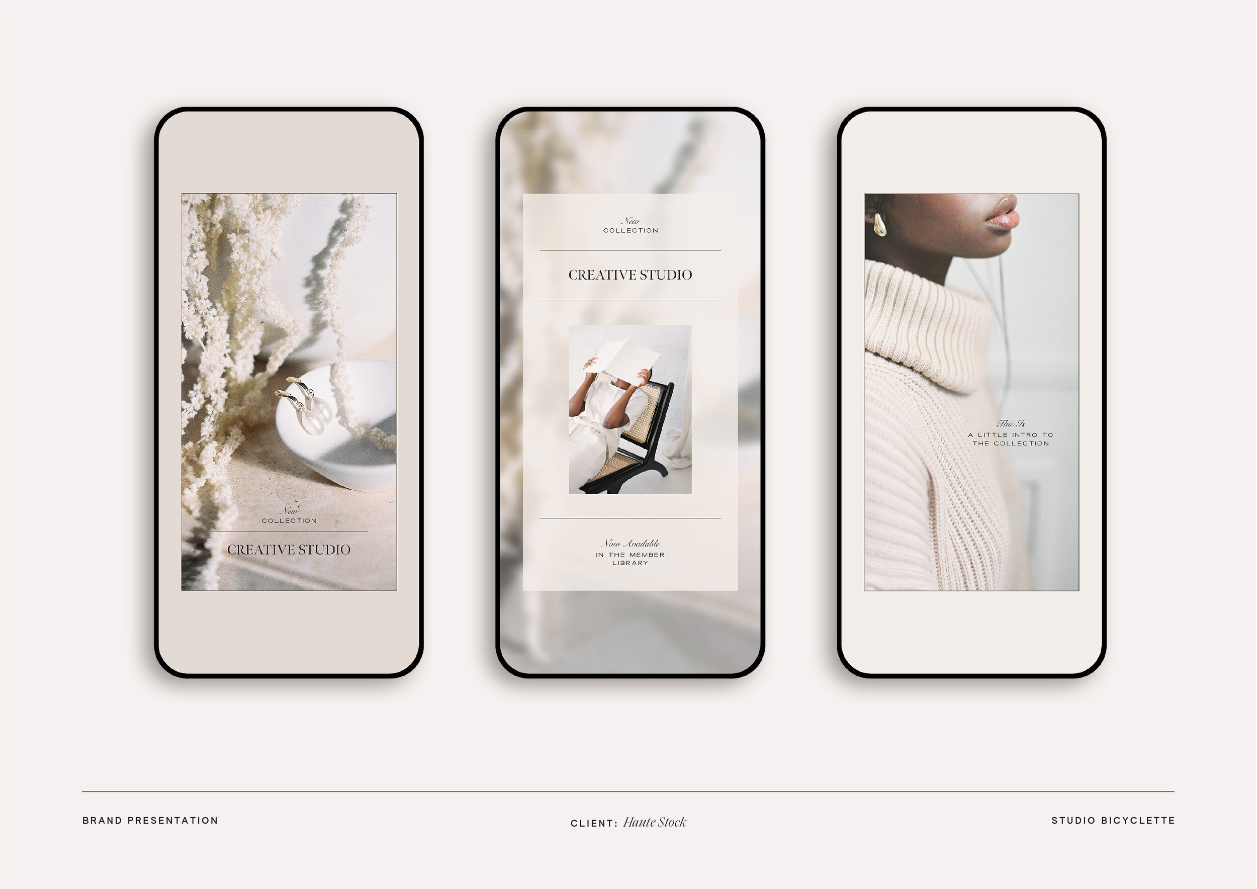
In order to help our clients visualize how all the elements of the brand will come together, we mock up some examples of the brand in use, which is where the vision starts to come together and the magic happens. In this case, we focused on digital assets, knowing that the Haute Stock brand would primarily be applied on the website and social platforms, especially to start.
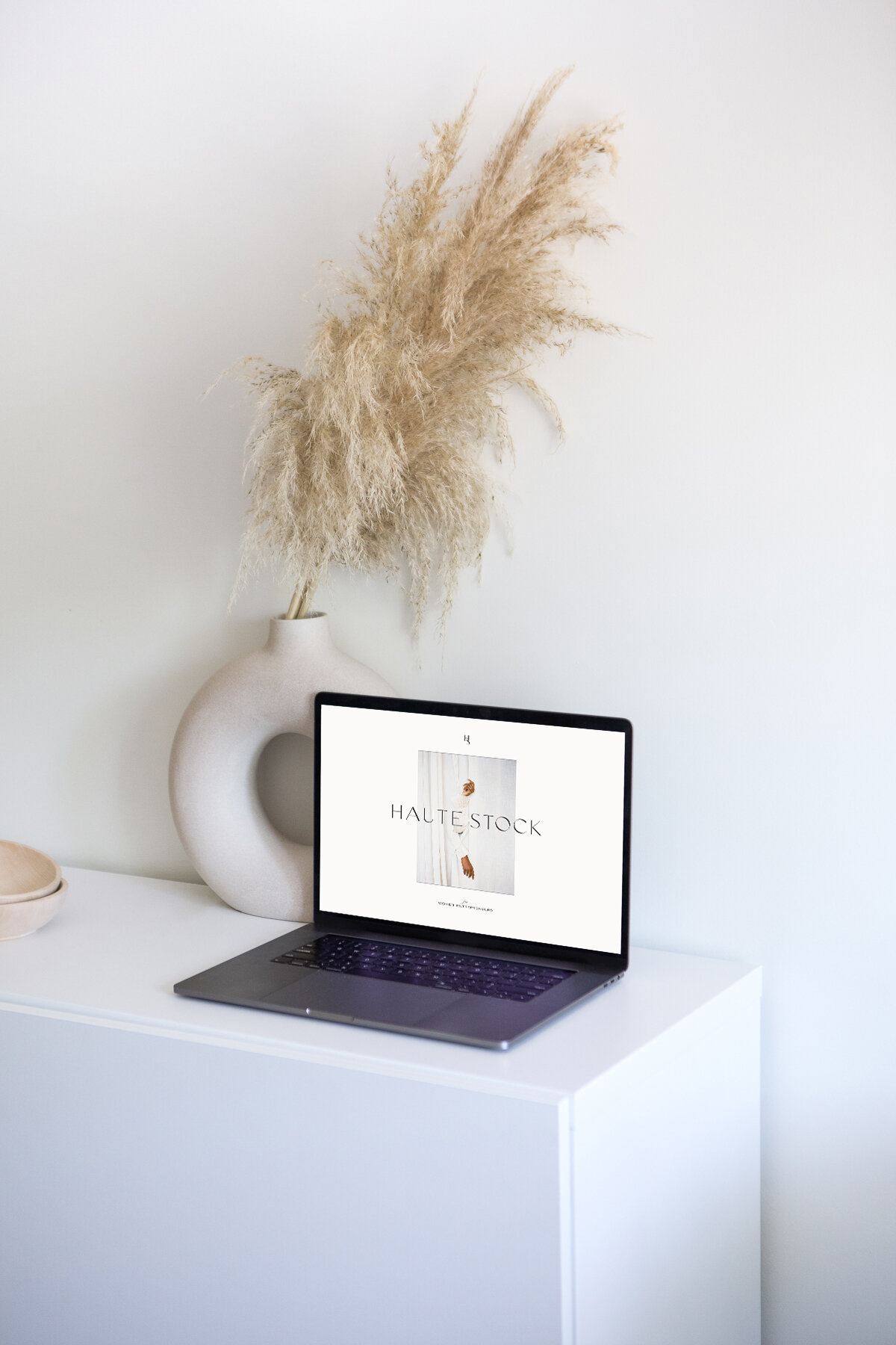
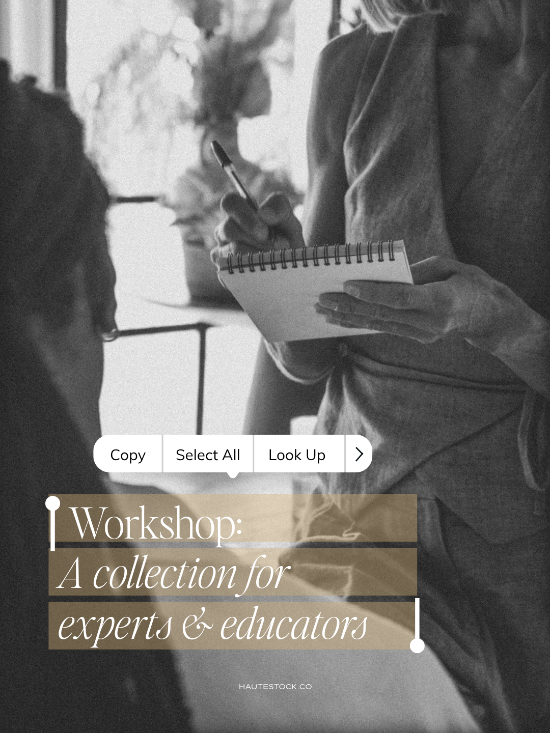
So I chose to showcase the new branding overlaid on to the current site design and through a series of instagram story templates. These mockups really help to communicate how the brand will come together, balancing the logo with the type treatment, colour palette, layout design and imagery.
Phase Three: Develop
Brand Launch and Project Wrap
Once the full brand is presented, we continue revising until perfect, and then we build out the rest of the brand collateral pieces. For Haute Stock, this included an extensive collection of branded Canva templates that the team could use to create additional marketing collateral: moodboard templates, blog post covers, marketing guide designs, and instagram story and feed templates.
Following the final sign off on the brand design and all collateral items, we begin packaging and organizing all the final files for print and web, and building out the brand standards manual, which will serve as a reference deck moving forward. This includes each and every brand element in a selection of the final brand colours and a variety of file types. Ultimately, we want to set our clients up with everything they might need for success.
And then — we celebrate!

It’s always so fun watching various elements of the new brand roll out and the vision come to life after we’ve spent so much time building it up from the foundation.

