

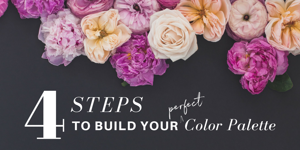
This guest post was written by LeAnna Weller Smith: Executive Creative Director, Weller Smith Design (and our resident Design Expert!)
In our last design tutorial, we took you on an adventure to Crack the Image Code. We looked at how to select and use styled stock photos in unique ways to enhance your brand with creative cropping, strategic white space, and more.
If you missed it, be sure to check it out here: How to Choose Styled Stock Photos for Your Brand.
Now in this post, we are talking all about COLOR. I absolutely LOOooOOve working with color. I used to color on my grandmother’s walls when I was a little girl, my book shelves are organized by color, and most of my design work involves tons of different color studies.
While I live and breathe in living color, for so many solopreneurs or small business owners, color seems to be one of the trickiest aspects when it comes to designing for your brand. And just to be clear, creating color palettes can be difficult for both DIYers as well as designers, so don’t think it’s only you that struggles to find just the right color palette for you or your client.
What makes working with color so tricky is that there are so many nuances…there is the psychology of color and why different colors work better for different topics, evoke specific feelings, or bring out different responses from those who interact with them.
We could talk about the color wheel and what colors should go together according to the basics of understanding primary, secondary, and tertiary colors, along with tints, tones and shades… See?! SO. MANY. NUANCES!
I’ve worked with many small businesses and entrepreneurs on their branding and firmly believe that even if you select colors using methods and meanings, you will never fully connect with your brand or attract the tribe of your dreams, if you don’t also take into consideration your own personal style, preferences, and aesthetic.
I think all of the above are an important part in understanding how color impacts every brand and each topic merits its own post for sure! However, what I want to do in this post is give you the tools and direction to get started — to inspire you to finally get your brand out there or help you update your current color palette with confidence in knowing that you are selecting a great set of colors that can be refined and tweaked as you continue to define your brand.
Sound good? LET’S DO THIS!
OK, there are a few things that I will call “prep work” when getting ready to work on your brand colors or color palette:
1 / Do A Deep Dive: What do you REALLY want your brand to say about you?
Before you start looking at colors, take some time to think about your brand and what you want to convey with the overall look and feel. Put together a list of words and phrases that resonate with you, your target market, and the products or services that you are selling.
Think about things like: What do you really want to be known for? How do you want others to see you and your brand? What should come to mind when someone comes across your brand organically? Describe your brand in 5-6 words.
We start with words because they can help provide insight into what to actually search for when it comes to feelings and colors.
Need help finding words or phrases? At the end of the post there’s a link to grab our super helpful (and free!) Color Inspiration Kit.
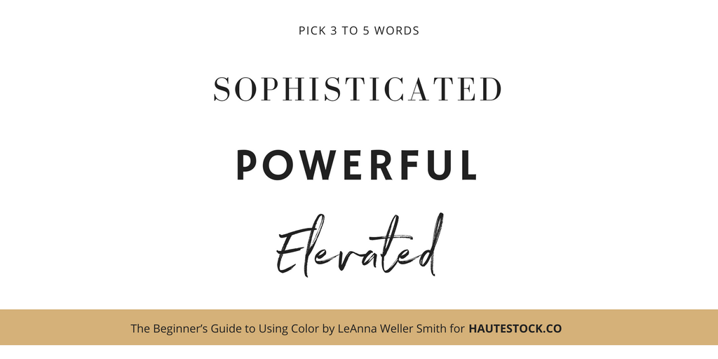
If you find that you are coming up with simple words or terms, take a look at a thesaurus to give you more options or to find something more powerful that resonates with you. Pick 3-5 words or phrases that you absolutely LOVE and start there.
I am choosing these words for my example below:
2 / Research, research, research!
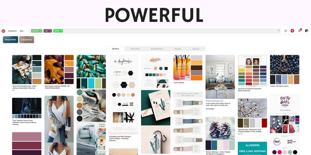
This is one step that you CANNOT skip — do your research! Take the words that you found and start your image search on sites like Pinterest, Desinspiration, or Behance.
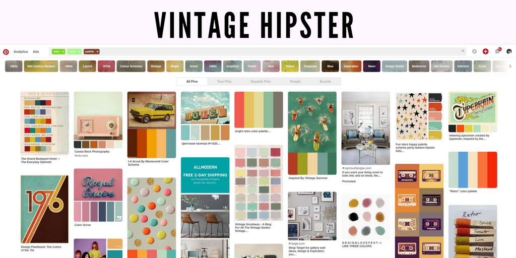
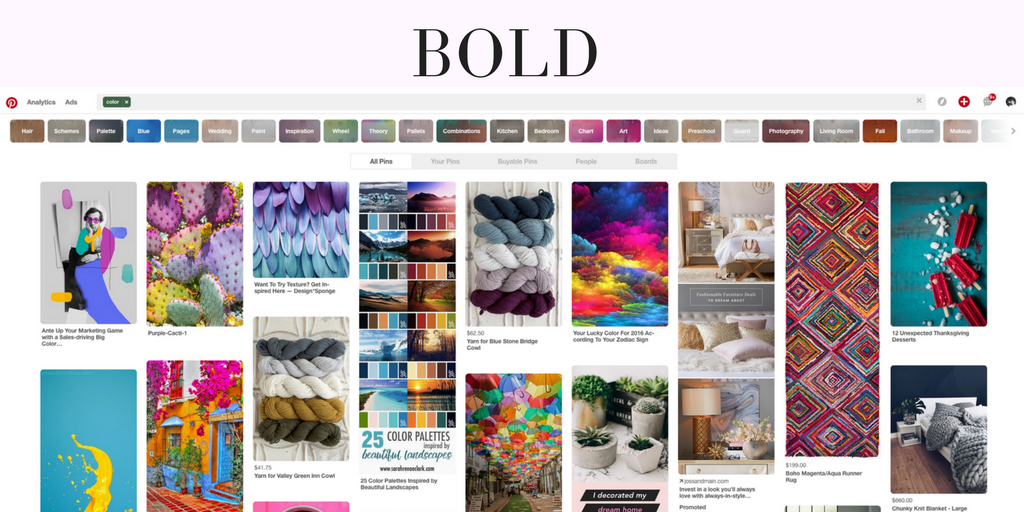
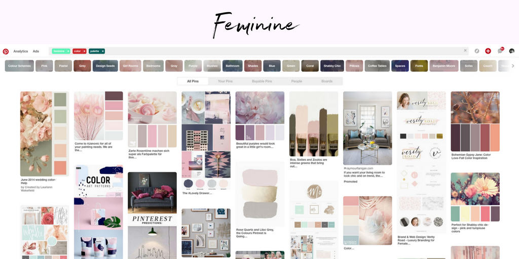
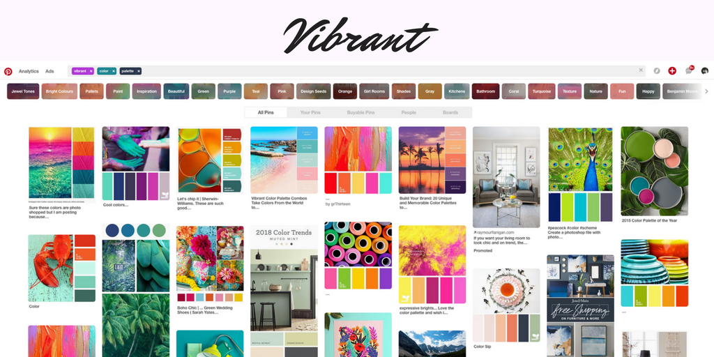
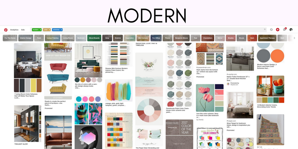
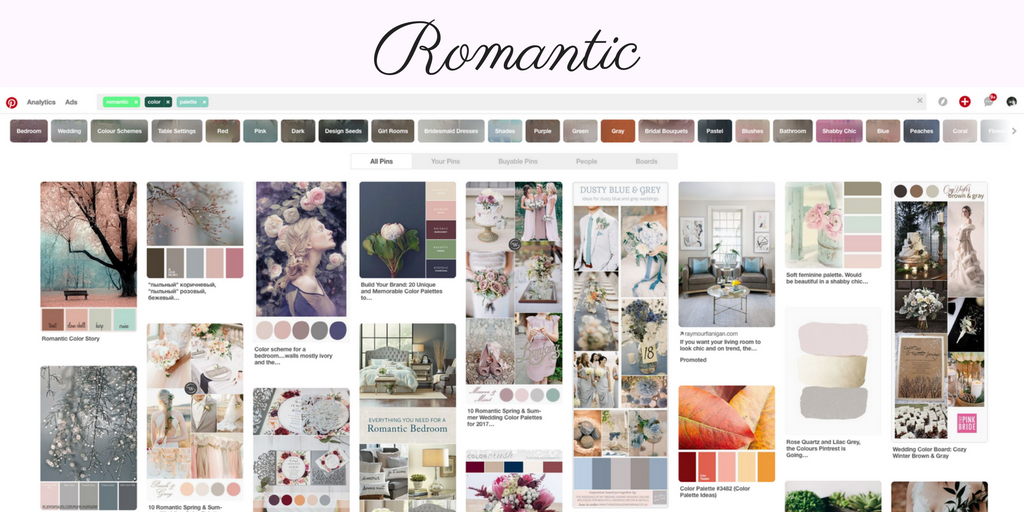
Some (brand specific) words you might use to start your search are: romantic, feminine, empowering, retro, vibrant, etc. You may also want to search with a specific color in mind to see what other colors are paired with it.
No matter where you begin, you should create a private Pinterest board or some sort of collection of your favorite images that you come across. Once you have images saved that you like, you will begin to see a pattern develop among those that you have been collecting; making it easier to pull colors for your branding.
Here’s a few examples that highlight how multiple word searches reveal completely different graphics and colors:
Now that you’ve completed your color “prep work”, it’s time to dive in to find out how to create your brand color palette!
Here comes the fun part — mixing and matching colors! For some, this might seem like the most daunting part, however, if you follow these 4 easy steps, you will be well on your way to your perfect brand color palette!
1 / Narrow down the images that were collected in your research.
Pick 5 or 6 favorites and take them into your preferred design program, ie. Photoshop, InDesign, Illustrator, Canva or any other online tool. If you select colors from a program that doesn’t come with a color picker, be sure to install one for your browser so you can pinpoint colors and pull their color value or hex code.
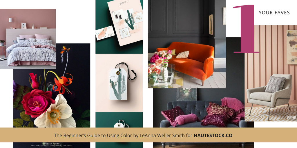
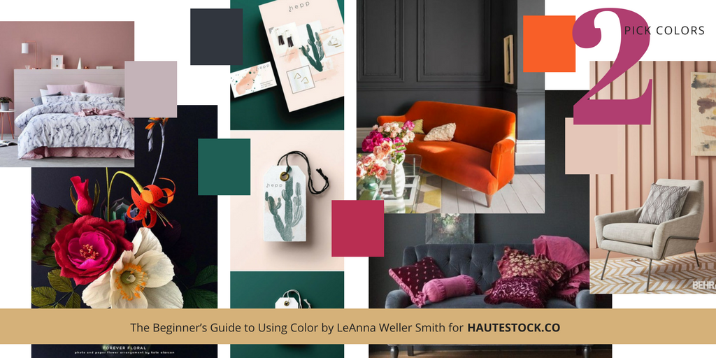
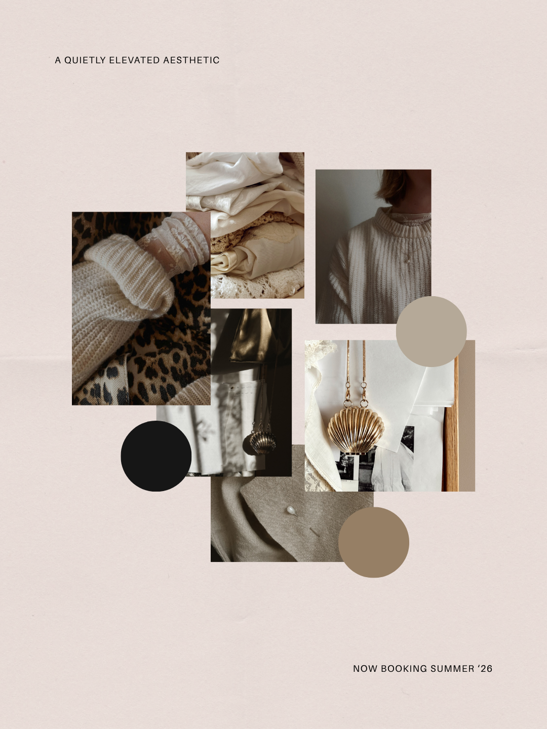
These are images that I selected from my graphic word search that I did earlier for Sophisticated, Powerful and Elevated:
Now that you have narrowed down your selection:
2 / Pull colors from the different images gathered and begin to build your color palette.
This won’t happen instantaneously! Trust me — even seasoned professionals rely on trial and error when picking the best colors. Usually we get to use color swatch books that allow us to move the chops around, making sure the colors go well, but when you are picking colors on a screen, you’ll test quite a few swatches before finding the perfect match!
These are colors that I selected from my image search. This took time and I had to sample several different colors before I was happy with the results. Assume that you will have to experiment a little as well, but it’s fun to see it start to come together! You may end up with more colors than I have, but that is ok — Step 3 will help narrow down your selections.
Once you have selected colors to work with:
3 / Narrow down the number of colors selected, ending up with 5-6 colors for your brand palette.
Check out the template I created — it can be downloaded and then uploaded into your favorite editing tool (scroll down to download it!). It has spaces for the colors you’ve selected, giving you a place to see how they come together. Some advanced color users might choose to use more colors but to keep it simple lets stick with 5 to 6.
Below is a break down of the type of colors you will need for a well-rounded brand color palette:
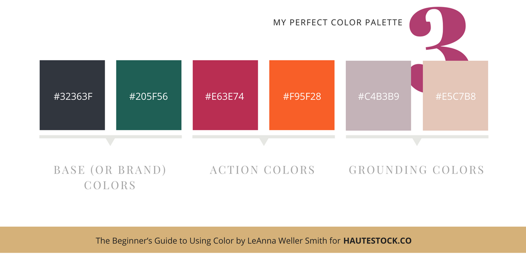
Within these colors, you will need:
-
2 base (or brand) colors,
-
2 action colors,
-
2 grounding colors.
1 – The ‘base colors‘ can be your brand colors, the darker colors in your palette, or the colors from your logo, photos, etc.
2 – The ‘action colors‘ will provide that little “pop” to highlight important items and can be used for buttons, callouts etc. These colors can be brighter or bolder so that they command a little more attention across all the colors when grouped together.
3 – And finally, the ‘grounding colors’ which are more subdued and could be variations of the two base or brand colors that you selected. These colors will provide room for your design to breathe, yet still provide some color to balance your design.
Once you have decided on your starter set of colors, you can tweak them until they feel like they flow well together. Again, you can refine these as you become more comfortable using color.
A little trick I learned in design school was to squint your eyes and look at your colors together. If they sort of blend together when you look at them, you are on the right track. If one of the colors pops out too much because it is either too bright or too light, you might want to consider tweaking that color.
BUT, sometimes that is exactly what you are going for…so always go with what feels right to you. (BTW, that tip from school is probably why I wear glasses now 😉 – but the trick really does work, especially when you are looking for colors that are in the same tonal range!)
4 / Now that your colors are in place, it’s time to get the party started!
Grab your colors and start putting them together with your brand photos, brand fonts, messaging, etc. Don’t feel like you need to use ALL of the colors in each layout or design that you create. Feel free to play with the way you use the colors — try using color blocks, color type, boxes, washes, illustrations, rules, etc. that use your brand colors.
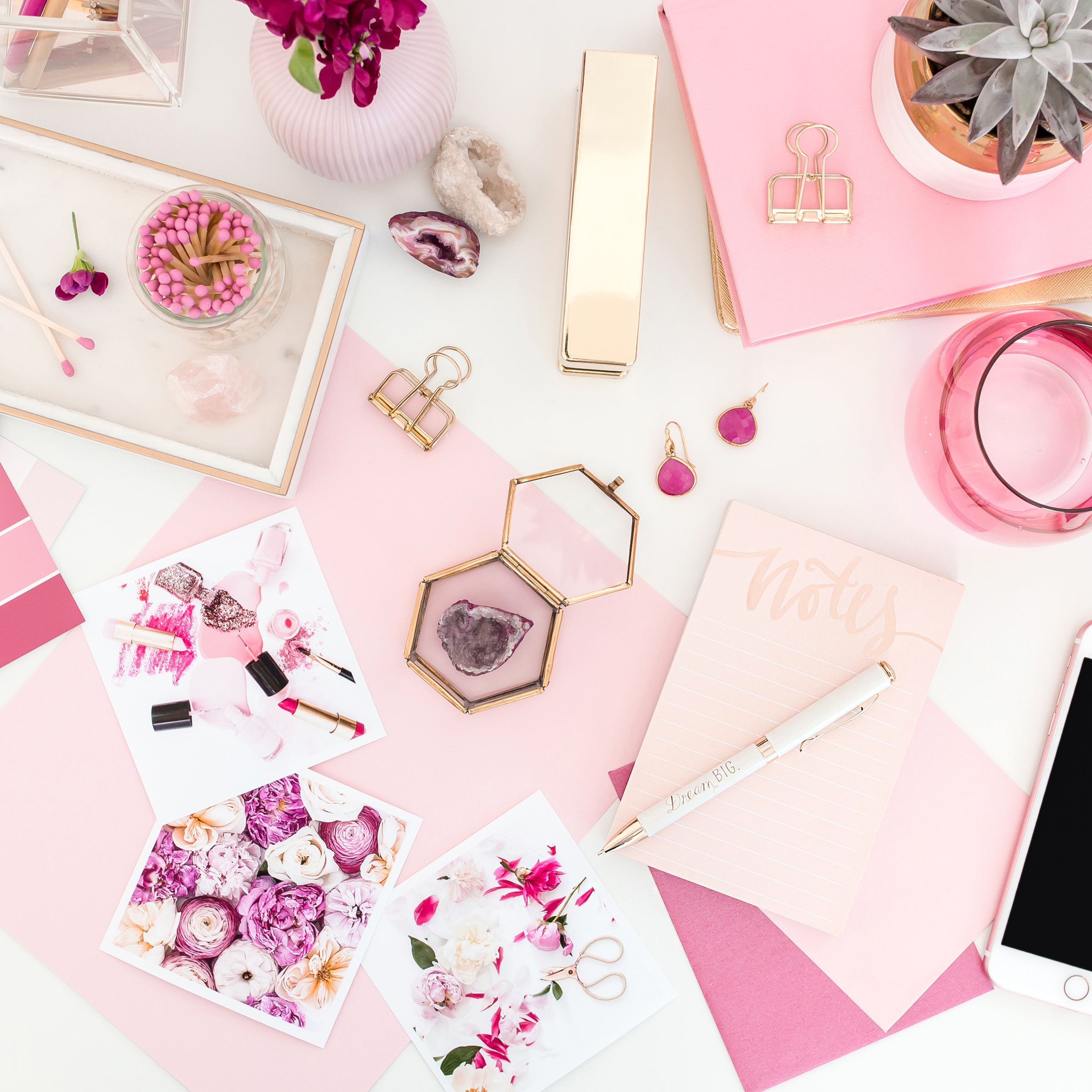
Also, pay attention to your photos! If you’re searching the Haute Stock styled stock library, pick images that either include your brand colors or have a neutral palette so they fit in with your colors.
Or, get creative by using overlays and gradients to get more traction out of styled images with your brand (see our post How to Customize Stock Photos using Filters, Gradients, & Overlays). By using photos with your brand colors incorporated, you don’t need to feel obligated to overuse the flat colors from your palette.
Below is what I came up with for my Sophisticated, Powerful and Elevated BEAUTY BRAND!
This shows that you don’t have to fall within the tried and true color palettes for your brand. Most beauty brands might follow the Feminine palette but using my bold colors and subdued grounding colors, it really brings my beauty brand to a whole new level!

So there you have it, you’ve created your first color palette — congratulations!
To keep you inspired, grab the Color Inspiration Kit below. I created this to help you on your way to defining your own “perfect” color palette!
I hope this exercise helped take the guesswork out of choosing colors for your brand.
As I mentioned before, there are definitely more technical ways to go about choosing colors, but I think this will help you get started quickly and with confidence!
If you take this tutorial for a test run, be sure to share your final color palettes with us. Like I said, I absolutely LOVE working with color and if you get stuck, I can take a look and let you know what I see from your research to help guide you further.
Be sure to check out the video tutorial for even more HELPFUL TIPS!
“I prefer living in color” —David Hockney
sign up for hautemail and get 21 free stock photos!


This was SO HELPFUL!! Thank you so much for creating such an in-depth, but easy to follow, blog post. Choosing brand colours has always been such a difficult thing for me and I’m tired of always changing them. I really think this will help (as well as the download!).
So glad you found this post helpful, Belinda! Choosing colors is always difficult, but I hope you got some useful tips on how to make it easier from this post. Good luck!
This information will help me pick the colors that will be right for my new VA business. I was a bit stuck, but now I can finish this task. Thanks for sharing this information.
Happy to guide you with picking out colors for your biz, Pippin! Would love to see what colors you chose 🙂