I often get emails from bloggers and bossladies who are interested in signing up for a Styled Stock Library membership but are unsure of how many images they will actually be able to use.
Their email usually goes something like this – “I’d love to become a member but my brand colors are x,y,z and I’m not sure how to use your photos with my branding?”
Here’s the thing, even if not all the images match your brand colors, there are ways to add your branding to just about any image so that it looks customized and flows with your brand aesthetic.
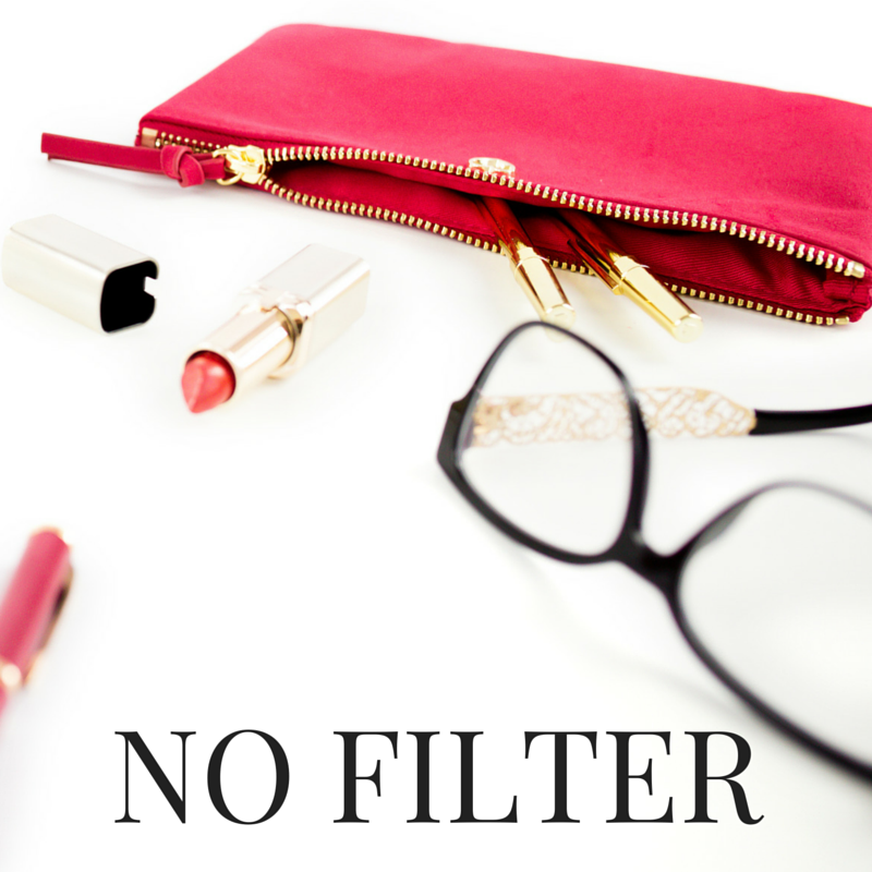
My brand colors are gold and black, but today I’m going to show you how I can incorporate some images with gold, red, black and green into my branding using our latest Styled Stock LIbrary desktop collection in red.
Here are my tips for adding your own branding to Stock Photos:
1. Use your brand fonts
One of the easiest ways to create brand recognition and consistency is to use a set of fonts on all your graphics. This not only makes it easier for your followers to identify your branding as they scroll through insta, pinterest or whathaveyou, it makes your life a heck of a lot easier too!
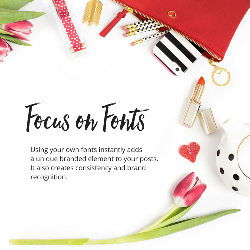
You should have 2-3 main fonts that you use regularly for your graphics and throughout your website. To keep things simple, I like to choose one script font, one serif font and one sans serif font. Choose one of each and combining them to create pretty quotes and text overlays for your blog post images will make it seem like you have this branding thing down pat, even if you’re not a designer.
My favourite resources for fonts are:
-
Font Squirrel (for free commercial use fonts)
-
Creative Market (for paid, but totally affordable fonts)
-
MyFonts (for paid and splurge-worthy fonts)
2. Use filters and overlays to match your branding
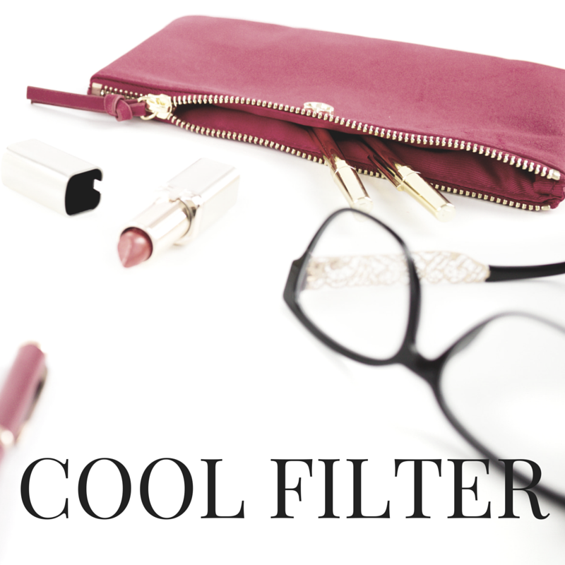
I like my photos white and bright, so that’s what you’ll find in the Styled Stock Library. A white background gives you the most versatility when adding text and overlaying your own product designs. But sometimes you want to get a certain affect that can’t be achieved with just a white background.
In those cases, I recommend using a filter or creating an overlay (if you’re using Canva, just go to shapes, choose a square, place it over the photo, adjust the color and then adjust the transparency).
You can totally change the look and feel of a photo by doing this. If you want to do it consistently, you can also create a set of branded images that are totally unique, even though you’re using stock photos. Plus, you can pretty much overlay text on any part of the image if you play with the transparency enough to make it pop.
Here are examples using different filters and overlays with the same photo.
3. Add your logo
You can absolutely add your logo or website URL to any of the images in the Styled Stock Library. In fact, I encourage you to at least add your web address to any images that you post online, especially on your blog and Facebook. This ensures that when people share your images they’ll always know where they came from.
This also creates brand recognition, consistency and keeps your website top of mind. I’ve been lazy in doing this in the past, but the easiest thing to do is create templates in Canva so there’s no excuse!


4. Insert your brand colors
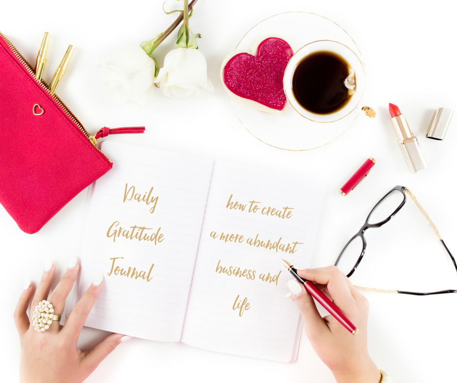
Just because a photo doesn’t have your brand colors in it, doesn’t mean it can’t. The easiest way to add your brand colors to a photo is to do so in your text or graphic overlays.
Now this isn’t going to work with all colors, you’ll have to use your judgement as to what looks good, but if you have some neutral brand colors, you can do this with almost any photo. And even if your brand colors are bold and bright, don’t be afraid to play around with some unique color combinations to see what you like!

5. Choose neutral colored images
There are plenty of more ‘neutral’ colored photos in the Styled Stock Library. You’ll find lots of whites, blacks, golds, and more recently silvers. These colors can compliment most brand color palettes. It’s really easy to add your own pop of color in the form of text or graphic overlays to these images.
You can get a Sneak Peek inside the Styled Stock Library here.






Beautiful post – visually + info-wise 🙂 Thank you for these insights – it’s easy to become overwhelmed with branding and stock photos, but they can be easy to customize + very popular with your audience.
So happy you found it helpful VK!
Great post. Glad I found it thanks to one of your Instagram posts. 🙂 These are very useful tips, and much appreciated!
Hi Connie, thanks so much for letting me know how you found this post! Glad to hear you found the tips useful!
Fantastic article! I recently signed up for your subscription after looking at tons of other stock photo avenues, but your site is so well put together and arranged by color that I had no choice! You drew me right in with such incredibly stunning stock photos!. I am totally redoing my blog as we speak, and I loved it so much that I told my daughter about and gave her a sneak peak. I told her she wouldn’t find a better place.
Alas, she had to do her own looking but it took only a few days for her to come back and sign up for her own subscription (Alma @ mysavvybudget.com). She decided to redo her blog as well. WE are super happy and pleased. I have been planning on writing a post of my favorites and you are definitely in first place!!!
Thank you so much for this article. It helps to show just how versatile your photos can be. Looking forward to all the new ones to come and the holidays too! (squealing like a girl).
Peace & Grace,
Maria Gagnon
theglassmom.com
Hi Maria, THANK YOU so much for your sweet message. You truly made my day with your feedback 🙂 I’m so happy to hear that both you and your daughter are enjoying the images, thank you for letting her know about the Styled Stock Library!
Please let me know when you’ve published your post, I’d love to read it. Thank you for including the Styled Stock Library, I really appreciate it!
These are great tips for someone like me who has not been blogging for long and still trying to create what I hope will one day become a brand. Still trying and testing things out but this is by far the most straightforward and clear post I have read on creating your own pictures using stock photos. So impressed!
So great to hear that A Busy Bees Life! Thank you!
Thank you for sharing these ideas. I have been struggling with images on my blog and am inspired to take another look at how I can brand them more.
So happy you found it helpful Emma!
Excellent info as always Rachel! I’ve not created a logo yet, I think I’ll work on that today
Some great tips hun! Appeals to my "branders heart" for sure!
I love how you have shown them that the other branding elements can shift your image from someone elses!
Thanks for sharing these tips. I never thought about using Canva to add a filter to an existing photo. I always have trouble creating the gold color. what RGB formula/HEX# did you use to create the gold used in this post?
Hey Jennifer, I used HEX #d5b178 for the gold in the last image. Hope that helps!
This was great! Thank you.
Totally random but do you have experience with squarespace? I am trying to add an image and it will not fill the entire page. Even with the "stretch" option selected, it will not cover the entire width so it looks odd. TIA! Amy
Totally random but do you have experience with squarespace? I am trying to add an image and it will not fill the entire page. Even with the "stretch" option selected, it will not cover the entire width so it looks odd. TIA! Amy
Great info and I follow most of it. One question. My main script for my blog is Clicker script which I love for the blog. When I use it over an overlay, it seems a little weak. So I’ve been using Rochester, which is similar, but a little stronger. Do you think that’s O.K.?
Hey Carol, I think it’s fine to use a similar font if it stands out more. Consistency is definitely important, but making sure that your designs are easy to read is the most important factor in my opinion. So I think you’re OK!
Great tips! I love using this for my own brand and it’s so important for companies to think about this when choosing images.