

Pick your brand color palette in three easy steps
Stuck on creating a color palette for your brand?
If you’re wondering how to choose your brand colors, you’re not alone! It’s one of the first (and most overwhelming) steps when building a visual identity. Should you go soft and feminine? Bold and editorial? Neutral and minimal? Your color palette sets the tone for your entire brand, from your website and Instagram to your email graphics and offers.
In this post, we’ll walk you through a simple, strategic way to choose a brand color palette that actually feels aligned — no design degree or second-guessing required.

If you’re thinking about starting a business, or launching a new offer, you may be considering DIYing your branding.
And that’s usually a good idea – hiring a professional designer is something we recommend doing when the time is right. Typically, that’s after you’ve been in business for a while and have a proven concept!
Hiring a graphic designer or brand strategist when you first launch your business usually isn’t necessary and can sometimes end up being a waste of money.
This is especially true if you’re launching something new that is likely to change, or your business services are likely to be tweaked as you get feedback on your offer. Who knows, you may end up changing directions completely, and then you’ve not only wasted money, but also precious time.
So, when you’re just starting out, we definitely recommending designing your branding yourself.
Here’s the catch…don’t use design and branding as an excuse to procrastinate launching your business!
Choosing a color palette seems to be something that trips DIY designers up.
It can be difficult to decide on a color scheme becuase it feels overwhelming, after all there are SO MANY options of color combinations out there!
Get our insider tips about choosing your brand colors in this video!
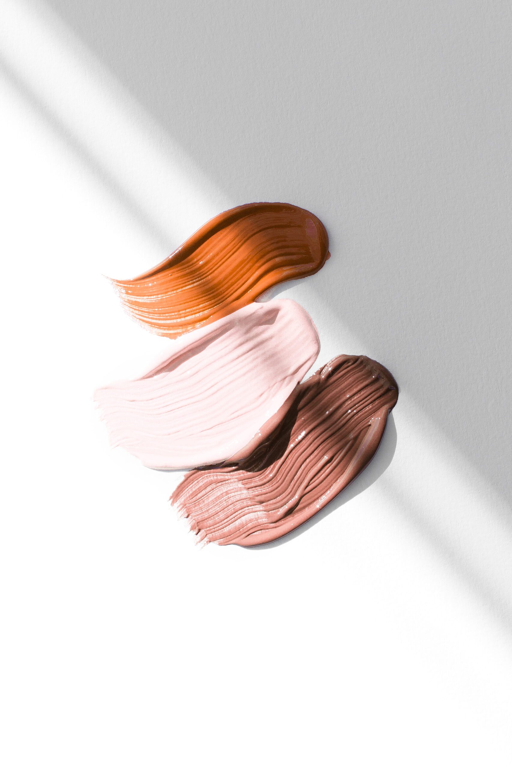
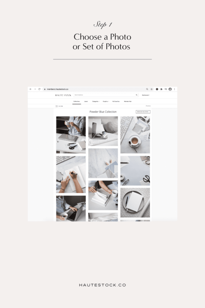
1/Find a Photo or a Collection of Photos you Like
Start by scrolling through the Haute Stock library and either download an image you like, or find a collection with a color palette that speaks to you and take a screen shot.
If you’re anything like us, you have a tendency is to over complicate things – and you’re probably thinking, what about color psychology? What about the color wheel? Shouldn’t you take that into consideration when you’re choosing your brand colors?
There’s definitely a place for all those things, but if you want to choose a color palette that’s appealing to your audience (and chances are, you’re also in your ideal audience) start with yourself. Go with your gut and see what you’re attracted to.
After all, the actual color palette is less important than using it consistently – and if you don’t like your color palette, you’ll be more likely to stray – using random colors and creating inconsistent graphics that will lose your audience.
Try this quick branding exercise:
If trusting your gut sounds a little too woo for your taste, then do this quick exercise:
Write down 3-5 descriptive words that you would want people to associate with your brand.
These words can be something like: friendly, fun, happy or luxurious, classic, refined.
Keep your words in mind as you search for an image or set of images to base your brand color palette on. Better yet, put the keywords one at a time in the search bar inside the Haute Stock library! The images that come up will be tagged with those keywords, so you’ll know you’re on the right track in choosing inspiration for your brand palette!
Not a Haute Stock member yet? Give our Free Stock Photos a try for inspiration! Or, you can search for photo inspo on Pinterest!
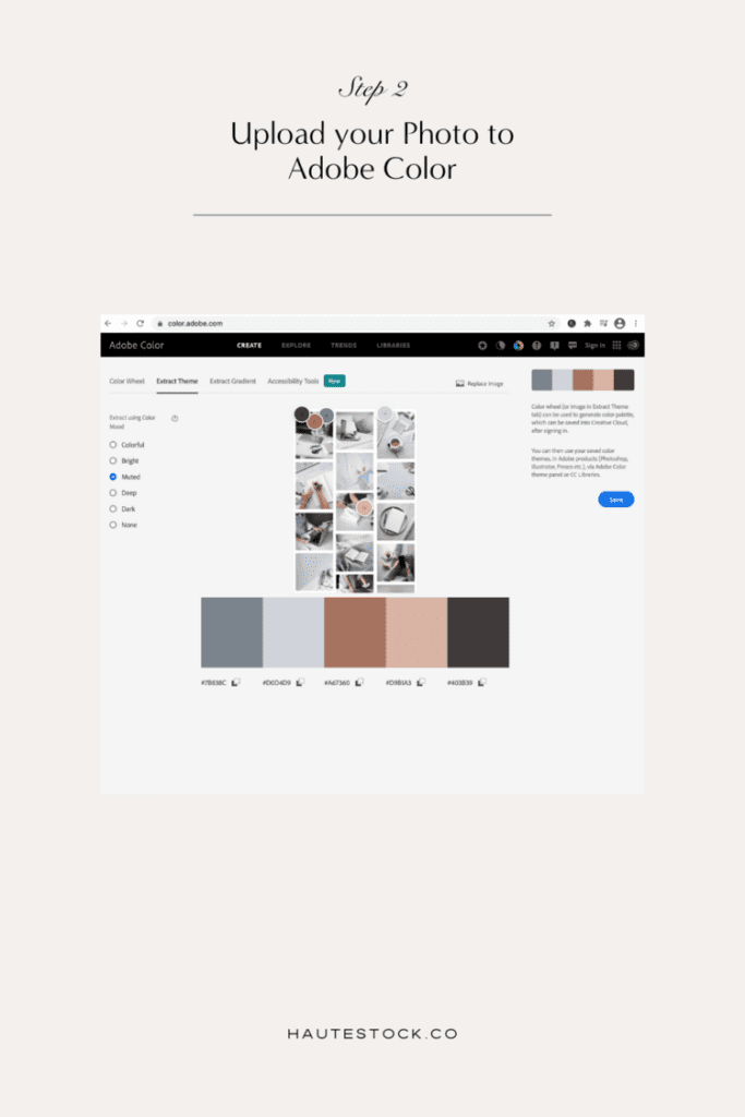
2/Upload your Image to Adobe Color
Alright so you’ve selected your image or taken a screenshot of your collection! Way to go! You’re almost there!
In this next step we’re going to upload the image to Adobe Color – hands down our favourite tool for creating color palettes. We love Adobe Color because it allows you to upload your own images and it will pull a beautiful and cohesive color scheme from the image.
You can also explore other palettes, see what’s trending and so on. But for our purposes, we’re going to upload and let Adobe pull a color palette from the image.
To add your image on Adobe Color, click on Extract Theme on the top menu and find the photo you want to upload.
Use Adobe Color to pull a palette from a photo you love
Once Adobe has pulled the color palette, you can go to the menu on the left hand side and play around with the different combinations, such as Bright, Dark, Muted and so on.
See if this gives you a palette that you love!
If not, you can also move the sliders in the image to manually select a color palette.
You may want to do this with one or two of the color options that Adobe automatically pulls to create a more customized palette.
Keep in mind you’ll want 1-2 main brand colors, a couple of neutral color options, and a dark color option for fonts!
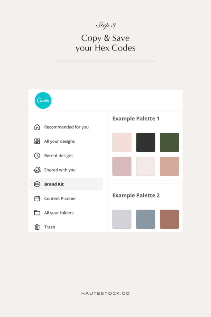
3/Save your Hex Codes
You did it! You created a color palette for your brand in an easy and fun way and now you’re ready to use those color whenever you’re creating graphics for your brand!
Save the hex codes (the little numbers with the # in front of them) by clicking on each one, and open up notes on your computer or a Google Doc. Save each of the color hex codes, because you’ll want them all to create your cohesive brand color palette.
You can upload your new brand color palette hex codes into your Canva Brand Kit to make your graphic design process so much easier!
Tips for using your brand colors
Now that you have a beautiful, cohesive color palette, it’s time to use these colors in your marketing and branding collateral.
Here’s where you should incorporate your brand colors:
✓ On your website such as on header images, buttons, calls to action, footers and blog post graphics.
✓ On social media, both in your images (mixed in with images that also have a neutral color palette) and especially in the graphics you create.
✓ In your lead magnets, presentations, PDFs, and other marketing materials to create a cohesive, professional presence.
As tempting as it can be to play around with different colors, sticking to a consistent color palette will help you build a recognizable brand, and will cut down on the around of time it takes for you to create graphics!
TL;DR: How to Choose Your Brand Colors
- Start with 3–5 emotional keywords that describe your brand vibe
- Find 3–5 visuals that reflect that feeling
- Use a tool like Adobe Color to pull hex codes from your images
- Build a palette with 1–2 primary colors, 1 CTA color, 1–2 neutrals
- Apply it consistently across all platforms