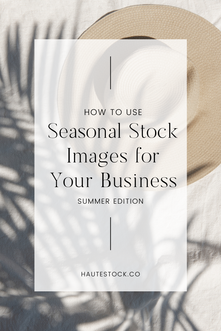
With summer in full swing, it’s the perfect time to do a little refresh and sub some of your standard brand and marketing graphics with imagery that embraces the season!
In today’s design How-To, we’re sharing five ways you can easily incorporate summer and travel stock photography into your branding materials, regardless of what you sell. Let’s dive right in!
1 / Summer Blog Post Topics
Chances are, you’ll probably create some seasonal content as it relates to your business and specific industry. Incorporating summer stock photos will help you add corresponding visual elements to your blog posts.
At Haute Stock we focus on creating versatile photos that feature architecture, landscapes, and lifestyle elements with a summer “feel” so you can easily add them into your branding materials without it being too much of a shift away from your usual style.
Here are a few summer blog post topics to get you started:
-
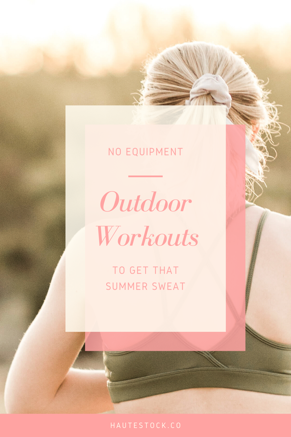
Healthy Living: The sun is shining and the weather is HOT! This is the perfect time if you’re a health or wellness coach to share your tips & tricks on how to stay healthy and happy during the summer months. Some blog post topic ideas include: No Equipment Outdoor Workouts, Quick and Healthy Summer Recipes, Essential Oils to Use this Summer. People’s lifestyles tend to shift with the change in seasons and your blog posts can embrace this!
-
Beauty & Fashion: A seasonal switch means an entire change-up of clothing and beauty routines. If you’re a lifestyle, fashion, or beauty blogger then it’s your time to shine. You can share 10 Different Ways to Style a Basic White Tee, Ultimate List of Our Favorite Summer Beauty Products, or Tips for Organizing Your Summer Closet for the Best Use of Space.
-
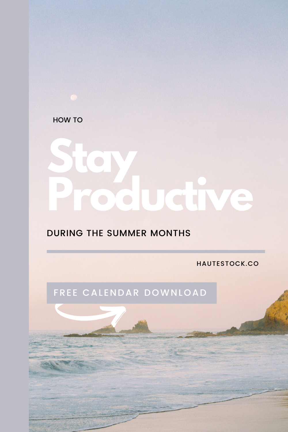
Educational: Share your summer business tips & tricks. What things do you tend to focus on in your business in the summer months, or what do you struggle with that your clients need help with as well? This could be anything from How to Stay Productive During the Summer Months, Business Courses to Launch this Summer, or Reasons Why You Should Rebrand This Summer.
-
Interior Design: Everyone has home renos and redecorating on their minds, after spending so much time indoors. You could create blog posts on How to Redecorate Your Patio for the Summer, 20 Ways to Give Your Home a Summer Facelift, or Summer Thrifting: Tips for Finding Home Decor for a Steal.
-
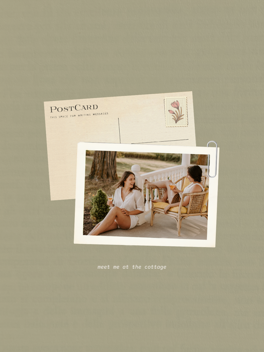
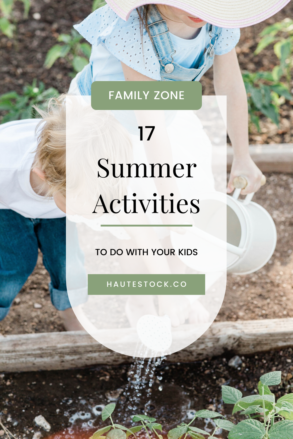
Motherhood & Family: Summer time means even more family time! Whether your main business is directly related to motherhood/family or if your ideal audience consists of mamas, then you can use this time to target that audience specifically. You could share your own tips for Summer Activities to Do With Your Kids, How to Manage Your Business While Staying Present With Your Kids This Summer, or Self-care Tips for Families to Do Together.
-
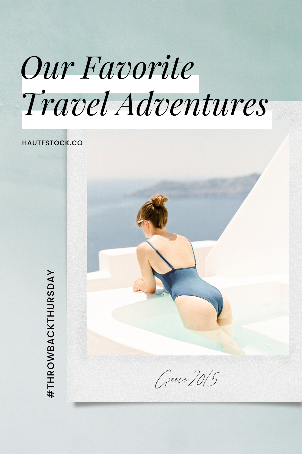
Travel: This topic would usually be at the top of our list for summer but as this year is very different, we’ve put it at the bottom. Travel topics are still useful for business but may take on a different, more creative direction than before. Blog topics could be Activities to Do in your Backyard, Top Tourist Attractions to Visit in Your Own City, Throwback of Our Favorite Travel Adventures or maybe it’s time to start mapping out your Ultimate Bucket List of Dream Travel Destinations, for the future.
bonus tip: already have popular (but older) summertime post on your blog? give it a refresh with new summer imagery that’s more in line with your current branding. then, relaunch/repost that baby to get more eyeballs on it and more traffic to your site overall.
➡ See these topics in action in the mockups below, featuring imagery from our latest seasonal collections: Dreamy Desert, Luxe Summer, Summer Breeze, Gardening, and Santorini Blue.


2 / Update Your Website Headers
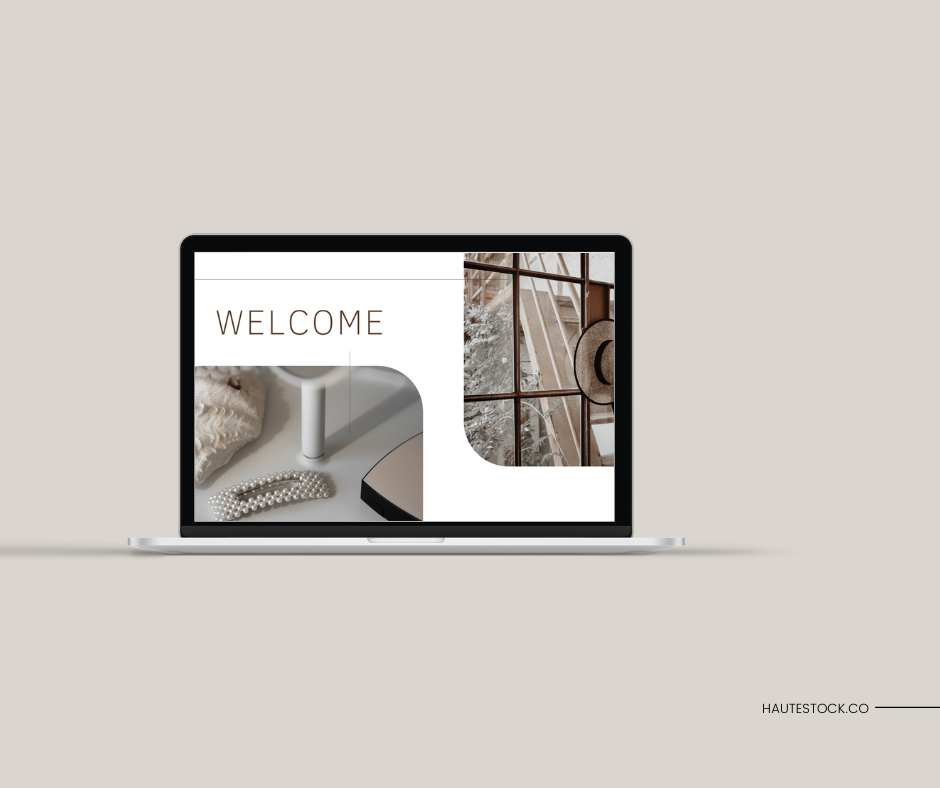
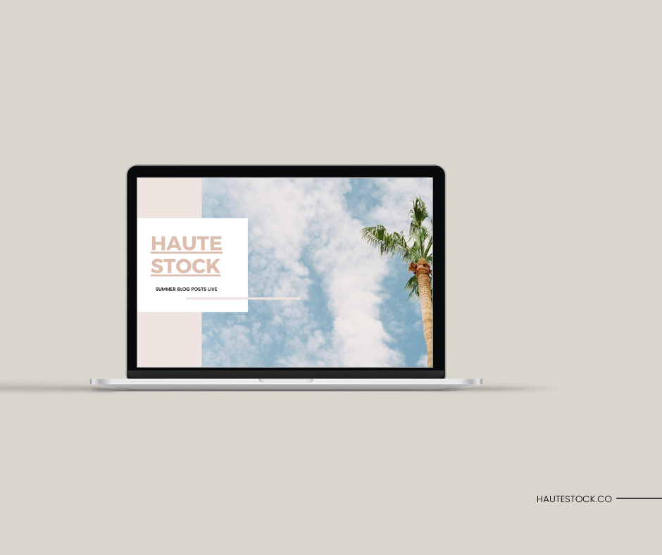
Basically any major seasonal holiday or seasonal shift is the perfect time to update your website header, at least for a couple of weeks.
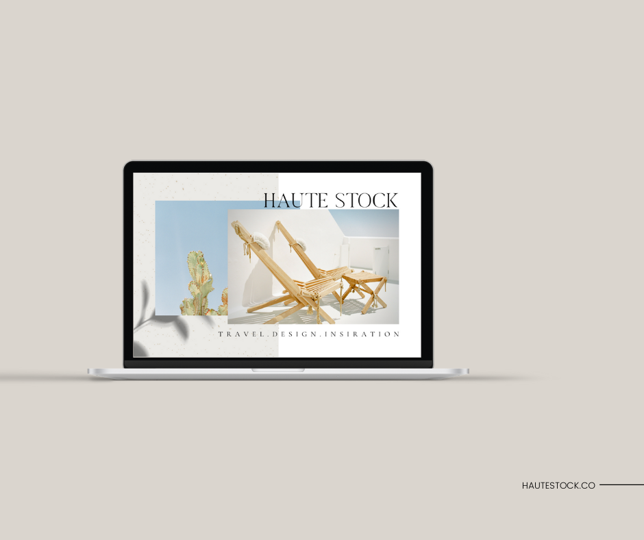
While it does make sense to keep some your website visuals static (i.e. not changing them out all the time, as consistency is key for brand recognition), updating your website headers every so often is a quick and easy way to embrace change and add in some imagery that you love, without changing out all your visuals completely.
➡ Check out the example website headers below, using summertime imagery from our Luxe Summer, Santorini Blue, and Summer Breeze collections.
3 / Summer Promotional Graphics
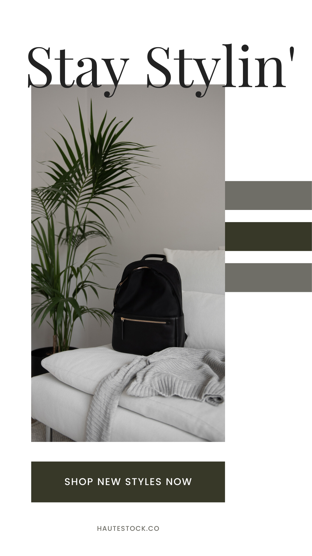
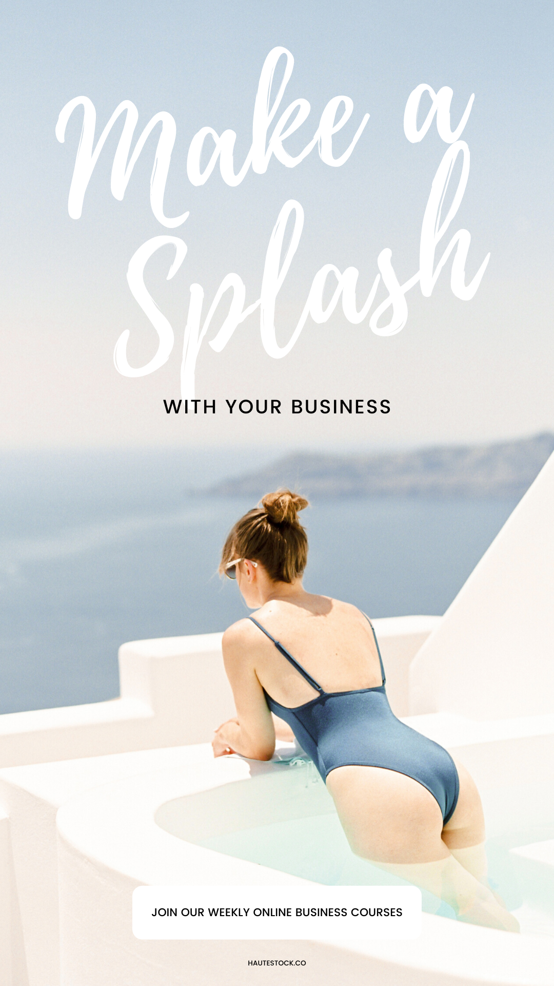
Your promotional graphics should attract your audience and encourage people to click on your offer, so choose wisely! You need something eye-catching, on-brand, and professional, but also something that sparks interest and makes an impact visually.
Sounds like a tall order, but don’t stress — seasonal imagery, like summer stock photos, can be used for almost any and every business because they don’t relate specifically to a service or industry, but rather they emote a feeling of laid-back, lazy summer days and memories made under the hot sun.
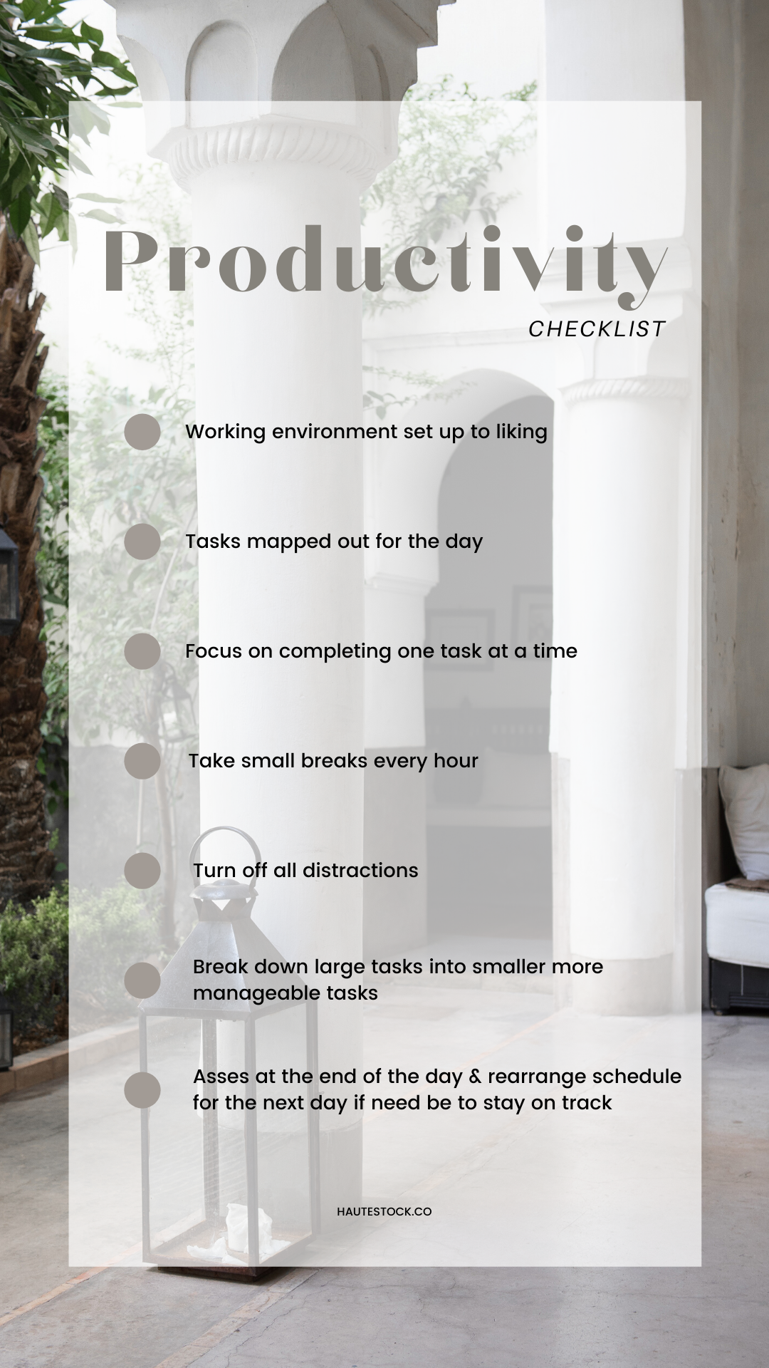
Summer imagery also makes the perfect background for opt-ins like checklists and workbooks, which can also be updated for the season.
➡ We put summer stock photos to work in these promotional graphics by incorporating images from our Luxe Summer and Santorini Blue collections.
4 / Newsletter Graphics
Another useful platform to update with summer imagery is your newsletter — it’s where you’re sending out your business’ latest news and important information, so it would only make sense that your graphics are also up to date!
bonus tip: if you send out a standard, automatic Welcome / Thank You email to customers after they opt-in to or purchase something from you, simply update the current graphic with a summer stock photo. Keep the font/copy the same to maintain brand consistency. Or, get creative with sizzling copy to make it interesting!
➡ Don’t miss the chance to make your mark with visuals by making use of your platforms! These newsletter graphic examples were created using our Dreamy Desert, Summer Breeze, and Santorini Blue collections.

5 / Mix Summer Into Your Feed & Branding
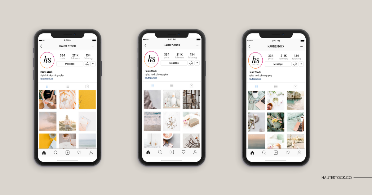
Play around with incorporating summer and travel stock photography into your Instagram feed by following this formula: For every three squares in your feed, include one summer related photo. Don’t necessarily worry so much about having the image relate perfectly to your caption — as long as both are engaging, the image is relevant simply because ‘tis the season. Continue to create a cohesive feed through color, style, and feel.
bonus tip: This is when a social media planning app like Later or Planoly really helps! They’ll allow you to plan your feed in advance, and to see how the images coordinate with each other so you’re confident in maintaining a cohesive, on-brand feed.
➡ There are so many ways summer, travel, and other seasonal imagery can be added to your Instagram feed, to keep your visuals looking fresh, interesting, and on-brand. These three Instagram feed mockups feature different color palettes (from peach and sunshine tones, to neutral greys, and calming blues) and incorporate at least 3-4 of our summer stock photos from different collections. Maintaining a cohesive brand look by focusing on color, feel, and style is key, especially when using seasonal imagery.
There you have it! Some of our top tips for incorporating summer stock photos and travel stock images into your branding this season! Which tips will you be trying for your brand?
The Haute Stock Library includes hundreds of summer inspired stock photos and travel images that you can use for your summer sales graphics, blog post graphics, Instagram stories and so much more!

Summer Visuals for your Brand Made Easy
Sign up for a subscription to the exclusive Haute Stock library and get access to thousands of styled stock images, stock videos, social media graphics, customizable Canva templates and designer branding elements!

