


Using the right fonts is key ingredient for creating effective designs.
Fonts can help emphasize key information, set the tone and add different levels of interest to your graphic. Just read the following words and tell me your brain didn’t just read each one differently….
SALE, sale, sale!
All the same font, yet making the word bold or italicizing it can change our interpretation.
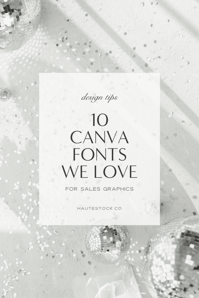
This post will help build a solid foundation so you can create high-quality sales graphics for your business that look polished and professional.
The fonts featured are available on Canva, or if you don’t have Canva then you can easily download free fonts (take a look at one of our go-to’s for commercial use, Font Squirrel).
Important things to consider when you’re looking for fonts:
Legibility – Are the fonts easy to read? You don’t want your customers to be struggling to read your graphics because you run the risk they’ll lose interest or miss important bits of information!
Especially for sales graphics – keep your fonts simple and avoid using script fonts for lots of text.
Type Characteristics – What fonts do you feel represent the tone your graphics are trying to portray?
Sans-serif, serifs, handwritten, cursive or display – each font category can give off a different vibe. Pairing fonts with different characteristics together can help depict a story but also add layers of interest that make your design more dynamic than using a single typeface for your entire graphic.
For example: sans-serif fonts are more modern, serif fonts tend to side more on the traditional side and cursive fonts can add a feminine touch.
Font Families – Does the font you’re using include different weights (regular, thin, bold, heavy, italic)?
This isn’t necessary but it can be a handy and simple way to emphasize different phrases within your text while ensuring the fonts do not clash because they are part of the same family!
Putting It All Together:
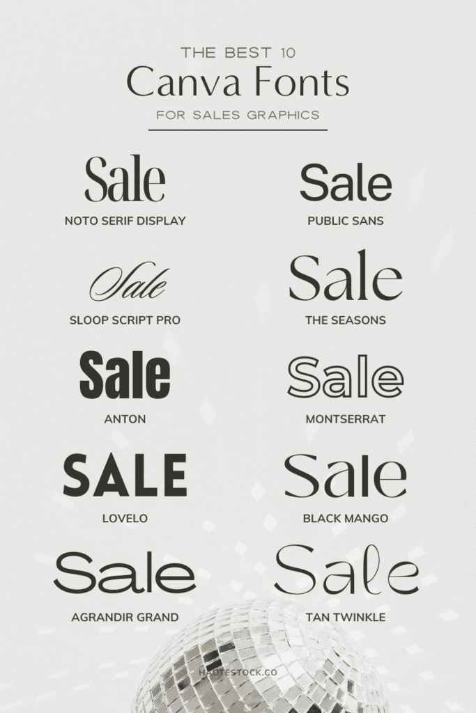
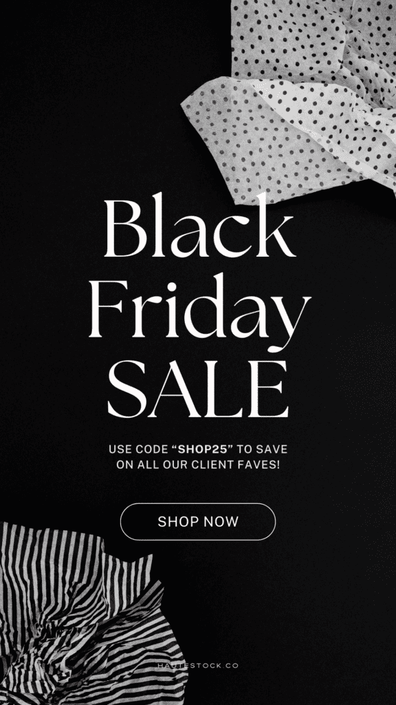
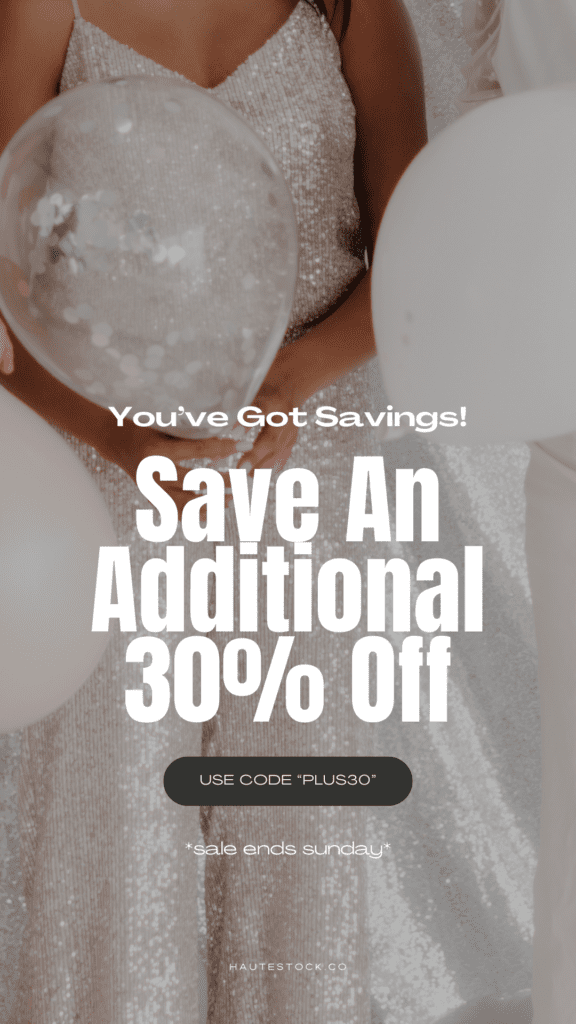
Fonts Used:
- Public Sans
- Sloop Script Pro
Sloop Script Pro is a cursive font that highlights important parts of the text and draws your eye to it.
Public Sans pairs well and it’s a great font for copy because it’s easy to read. It also has different weights which is handy when you want to bold or italicize important bits of information.
You will see Public Sans paired with a lot of designs below because it’s simple yet balanced enough to match a ton of different fonts.
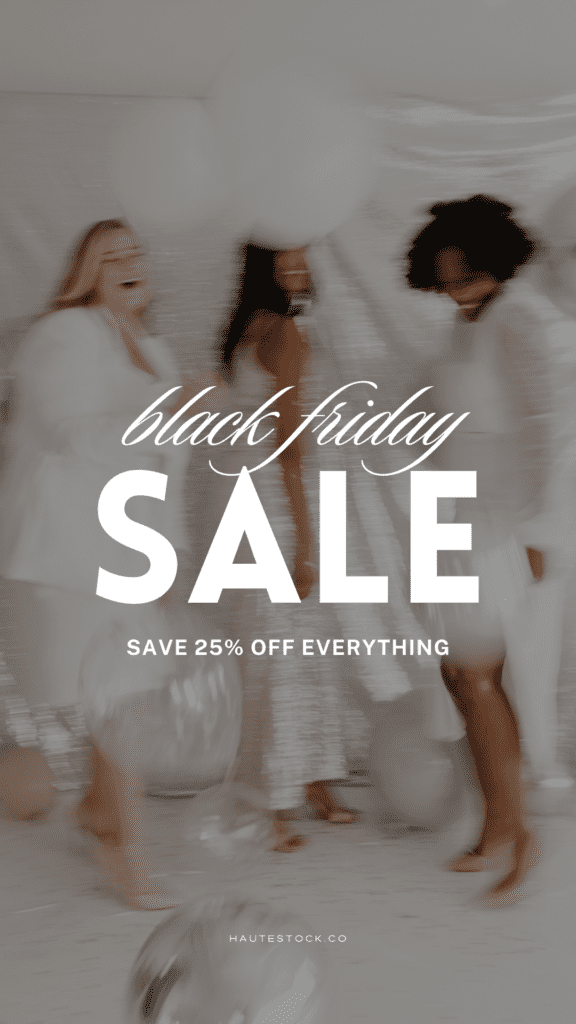
Fonts Used:
- Public Sans
- Noto Serif Display ExtraC
Noto Serif Display looks elegant and editorial even at large sizes. It’s great for headings and has different styles available to italicize or bold important copy. This will also help add dimension to your design.
Fonts Used:
- The Seasons
- Public Sans
The Seasons is another serif font that looks high-end at large sizes. The font has extra flourished serifs at the end of the letters’ strokes which adds a little bit of fun to your plain text!
Great for catching your viewer’s attention!
Fonts Used:
- Sloop Script Pro
- Lovelo
- Public Sans
Pairing a bold font (Lovelo) with a script font (Sloop) makes a really fun pairing. It’s bold but elegant. The two together create a modern design.
Fonts Used:
- Le Jour Serif
- Public Sans
Le Jour Serif is only available in all capitals so it’s best used for large eye-catching headings.
Then pair it with an easy-to-read san-serif font like Public Sans for all of the longer copy.
Fonts Used:
- Noto Serif Display ExtraC
- Public Sans
Noto Serif Display is a serif font that adds an element of class and sophistication to this graphic.
Public Sans is bold enough to get noticed while displaying important information in a clear way.
Fonts Used:
- Agrandir Grand
- Anton
Agrandir Grand and Anton are both san-serif fonts that are bold and modern.
Agrandir Grand is a bit slimmer making it the better option for longer copy and Anton with it’s thicker type is better for headings.
Fonts Used:
- Noto Serif Display ExtraC
- Lovelo
Noto Serif Display is used in caps and italicized to add different levels of interest to the design.
Lovelo is a bold font that still looks clean at smaller sizes.


Fonts Used:
- Emitha
- Anton
- Public Sans
Emitha is another script font that is on the thinner side. It offsets the thickness of Anton and creates a well-balanced design.
Remember to use the appropriate font when it comes to highlighting certain copy in your design. Bolder fonts for your most important hooks or info. Flourished fonts can be used for your subheading information and then the simplest fonts for longer copy.
Fonts Used:
- TAN Twinkle
- Agrandir Grand
TAN Twinkle has unique flourishes which look best at large sizes. It’s a font that makes a great header but won’t be legible at smaller sizes or for lots of copy.
Paired with Agrandir Grand for longer bits of copy, it looks modern and well put together.
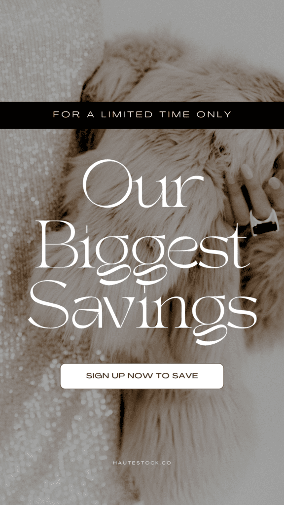
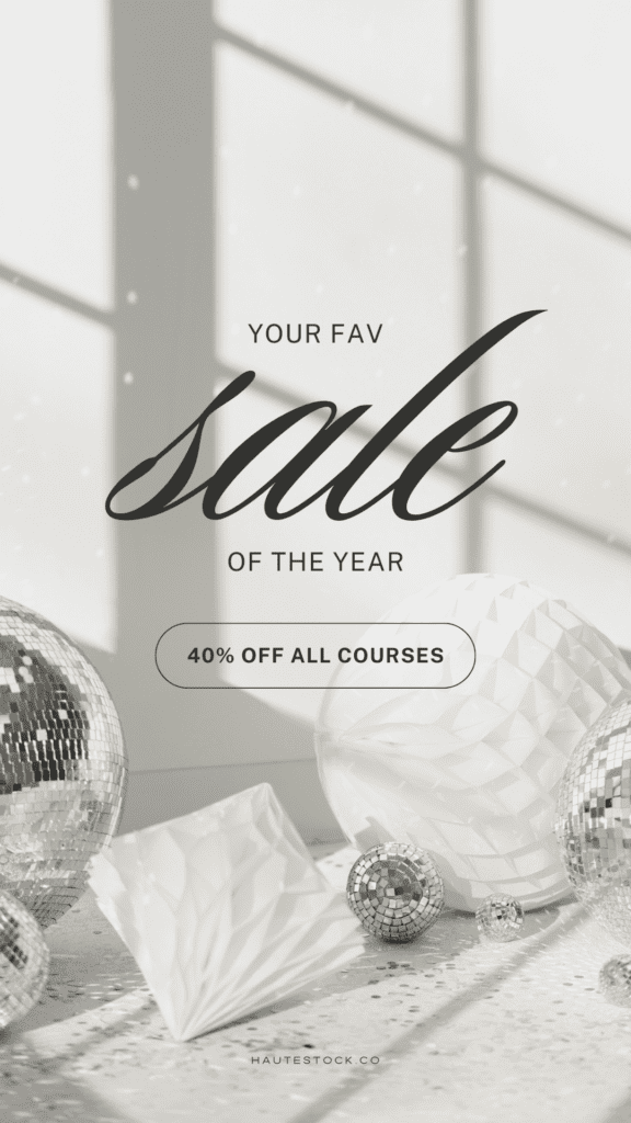
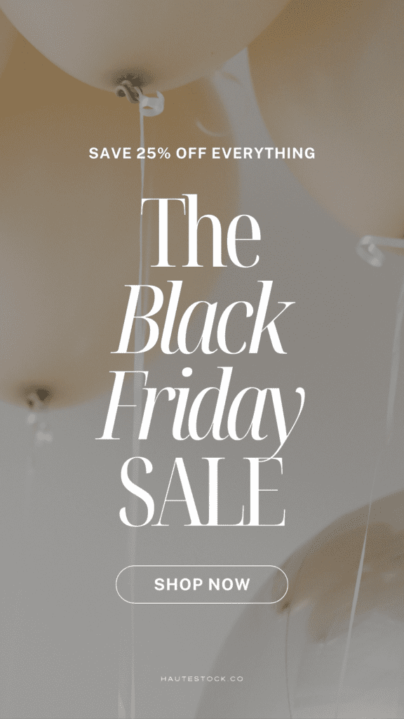
Get the Images to Create these Black Friday Email Marketing Graphics Inside the Haute Stock Membership

Font selection deserves just as much attention as your background images for your sales graphics! Before you get started designing, choose at least two different fonts that pair well together and try to pick fonts that feature different characteristics such as serif, sans-serif, or display.
Decide which information you want to highlight within your copy and in which order. Then choose your fonts accordingly based on the hierarchy you want to create within your graphic.
Using the tips we’ve given you in this post + images from our Black Friday Collection and Champagne Disco, you’ll be able to create professional looking sales graphics in a snap!

Want Black Friday Marketing Templates, Images and Videos for your Promotions?
Get instant access to over 9000 stock photos, stock videos and marketing templates inside the Haute Stock Membership!


I always have a hard time picking the right fonts to use. I love this post, thanks!
It can definitely feel overwhelming with so many to choose from! We’re so happy you found the post helpful!