Your brand is the face of your business — so if it doesn’t look professional, you risk losing potential customers before they even give you a chance. Let’s explore five common branding mistakes that can make your brand look unprofessional, and more importantly, how to fix them.
Let’s dive in and make sure that your brand is making the right impact!
1. Lack of Cohesive Branding
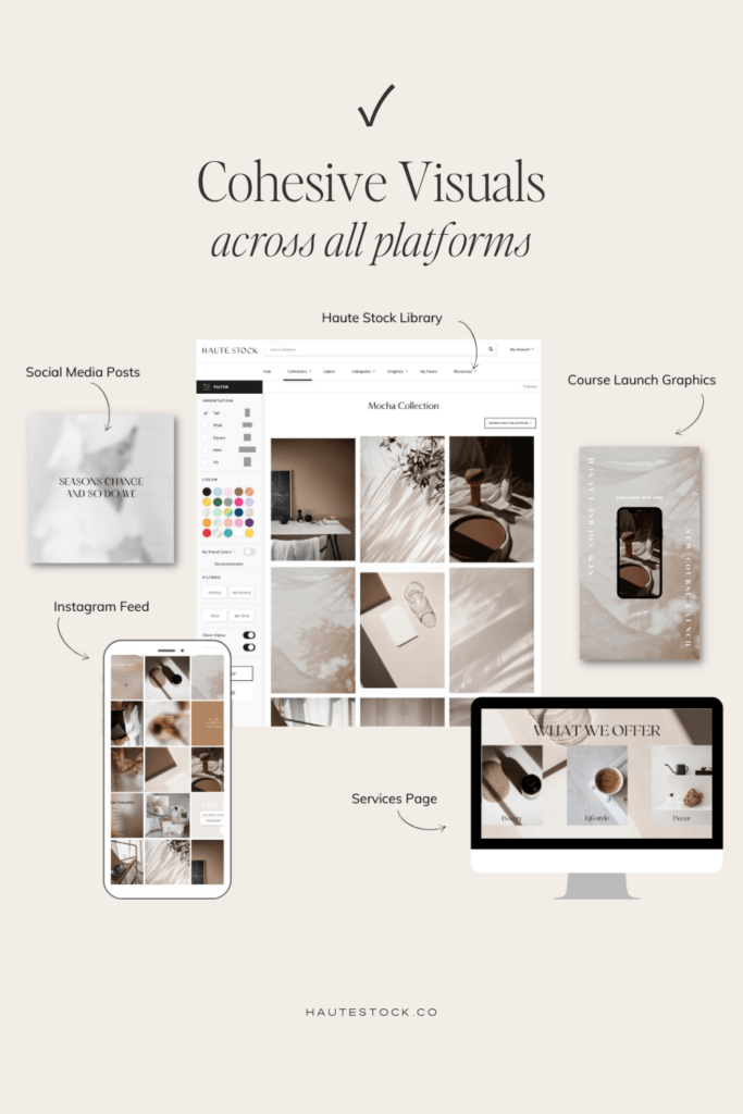
Consistency is key when it comes to branding. Lack of consistency is one of the most common branding mistakes, and it can hurt your brand in many ways!
If your brand looks different on every marketing platform, it can confuse your audience and dilute your message.
These days, consumers require multiple touchpoints before they buy from you, so it’s super important to make sure that ALL those touchpoints have the essence of your brand.
That means using the same visual elements, similar photo style, consistent brand voice, and messaging throughout your website, social media, email marketing, and anywhere else your target audience is interacting with you online (or offline!).
To create a professional and cohesive brand, start by establishing a clear brand strategy. Define your brand’s mission, values, and most importantly: target audience.
Once you have a solid foundation, ensure that your brand’s visual elements such as colors, fonts, logos and images are consistent across all platforms, including your website, social media profiles, and marketing materials.
Consistency not only helps you build brand recognition but also conveys professionalism and reliability to your audience. With that comes trust, which is essential before anyone will feel confident in buying from you.
If you need a little help making sure that your brand visuals are cohesive across platforms, you can download our free visual branding checklist to stay on track!

2. Inconsistent Typography
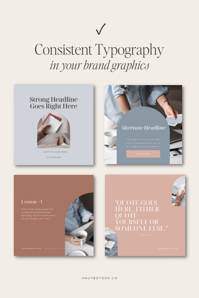
Typography plays a crucial role in conveying your brand’s personality and creating brand recognition.
Using too many different fonts can make your brand look messy and make your work unrecognizable.
It’s easy to get sucked into playing around with new fonts every time you use a different template, but this is hurting your overall brand consistency and making your design take longer than necessary!
Using too many fonts is one of the easiest branding mistakes to fix.
Choose two to three fonts that align with your brand identity and stick to them consistently.
Select a font for your headlines, another for body text, and possibly a third for accents or emphasis.
This will create a cohesive visual identity that reflects your brand’s professionalism and attention to detail.
For your headline font, make sure you choose something that looks good in large format, usually a serif font works well here.
For your body font, you want to choose a font that looks good and is easy to read in long paragraphs and smaller sizes. Typically we recommend a sans serif font here.
And for your accent font you can choose a script font, or a display font, but note that this font is going to be used sparingly in your designs, and only to add a bit of style or flair — not for important text!
One place we love to search for fonts is Creative Market. There are so many different fonts styles to choose from and you can search by brand keywords to find related fonts. Our two favorite font creators on Creative Market are Jen Wagner and Nicky Laatz.
3. Low-Quality Images & Graphics
In online marketing, visuals are everything.
With just a split second to capture attention and encourage someone to stop scrolling, the images you use for your marketing content can make or break whether or not your content is even seen.
Beyond getting discovered on social media, using the right imagery will help you attract your ideal audience.
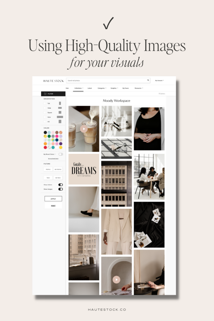
One of the most common branding mistakes we see new entrepreneurs make is having blurry or pixelated photography on their website, relying only on free photo sites, and using generic templates for marketing.
Using low-quality images and graphics can create a sense of doubt in your prospective buyer’s mind.
Making them question whether or not your offer is as good as you say it is, or if you can deliver on your promises.
When you invest in high-quality imagery and create marketing content that aligns with your brand’s messaging, you create a sense of trust with your audience.
By using curated imagery from the same or similar sources, it also helps you create a cohesive visual brand that builds recognition with your audience.
If you’ve never used stock photos before, you can try out 21 Free Stock Photos from the Haute Stock Membership to get started!
We’ll not only give you a set of our favorite Haute Stock images, we’ll show you exactly how you can use them across your marketing platforms to create a cohesive brand.
4. Cluttered Design
When you’re creating graphics, always aim for the minimal amount of content to get your message across.
Cluttered designs can overwhelm your audience and make your brand feel amateur.
Instead, give your design some breathing room by utilizing negative space strategically.
Negative space refers to the empty space between elements in your design. It helps create a sense of balance and allows your copy or content to stand out.
Avoid cramming too much information or too many elements onto a single design. Instead, prioritize what’s most important and give each element enough space to shine. A clean and organized layout will make your brand look polished and professional.
It will also make it easier for your audience to consume your content and retain the information you’re sharing.
One of the ways you can avoid this branding mistake is to use professionally designed marketing templates for your graphics.
With a few tweaks to customize for your brand, like swapping out the colors, fonts and images, you can get a professional design in minutes.
With high-quality marketing templates, you don’t have to worry about the layout, having enough negative space, or how the graphic will be read, because they are created with good graphic design principles in mind.


5. Lack of Audience Focus
The goal of your brand should be to attract and resonate with your target audience.
So many people miss this! Instead they think about what colors, fonts, photos they like, rather than digging into what their audience would like.
If you don’t want to make this branding mistake, then you need to spend time defining your ideal audience. You need to understand what your audience likes, what they don’t like, what your audience fears, what they desire, and what they are attracted to.
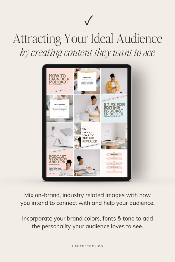
You need to tailor your branding to your audience’s preferences by using colors, fonts, and imagery that speak to them while supporting your key brand messaging and vibe.
It sounds like a lot of work, but going deep to understand this is going to help you set a strong foundation for your brand and help you attract the right people.
Use language, visuals, and messaging that resonate with your audience. By doing so, you’ll build a strong emotional connection with your audience and position your brand as the go-to in your industry.
If you want professional help finding the perfect images for your audience, we offer our Couture Curation® service FREE for Haute Stock members! It includes filling out a short branding questionnaire and then our professional designers hand-pick images for you.
Conclusion: The Top Five Branding Mistakes
There you have it! The top five branding mistakes, include: lack of consistency with your visual branding elements, using inconsistent typography, low-quality images and graphics, using cluttered designs, and lack of an audience-first approach.
Now you know exactly what you need to do to fix these branding mistakes. And while it does take a bit of effort, that effort does pay off in having a more memorable, recognizable, and trustworthy brand. Which should lead to more sales!
If you want even more help with your branding (and help finding high-quality, carefully curated on-brand images) you’ll definitely want to check out the Haute Stock membership!
Not only do Haute Stock members get access to our exclusive library of over 8500 stock assets, that include stock photos, stock videos and Canva templates for marketing, you’ll also get our training guides, caption prompts and more!


