

Burgundy color palettes for luxury brands are the definition of rich, refined elegance. Deep, emotional, and timeless, burgundy brings instant sophistication to a brand’s visual identity.
Unlike brighter reds, burgundy feels mature, grounded, and powerful — making it a perfect choice for high-end brands, premium service providers, and modern luxury businesses.
Whether you’re branding a high-end wellness studio, luxury lifestyle brand, or premium service brand, burgundy brings warmth, authority, and sensual elegance to your visual identity.
Below, we’re sharing curated burgundy-inspired color palettes designed to help luxury brands feel polished and desirable.
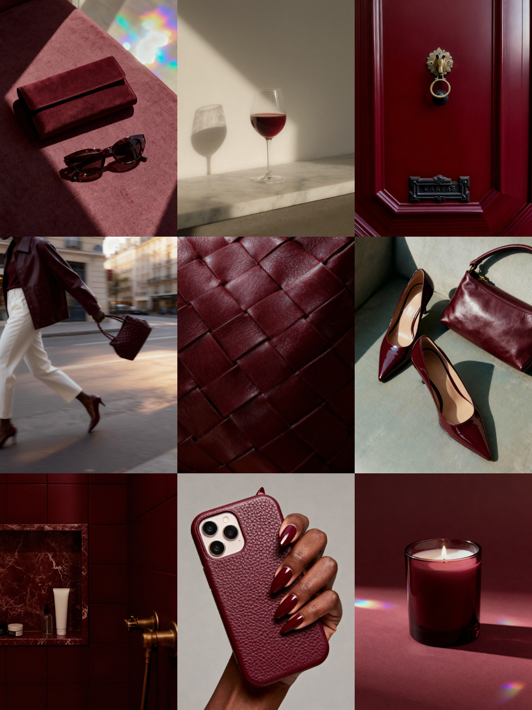
Romantic Depth
A palette for brands that feel intimate, refined, and emotionally rich
Dusty Rosewood — #985B5D
Soft, muted rose with a mature undertone. Adds warmth without feeling overly feminine.
Cabernet Velvet — #52171C
A plush, wine-toned burgundy that feels romantic and indulgent.
Black Cherry — #240C0E
Deep and dramatic, this shade anchors the palette with luxurious intensity.
Perfect for: luxury wellness brands, intimate retreats, romantic product lines, boudoir-inspired beauty brands.
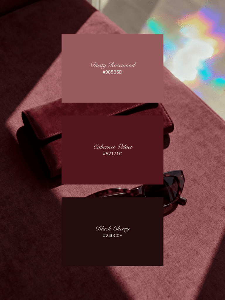
Earthy Elegance
Where heritage tones meet modern luxury
Soft Sage — #A9A99B
A muted green-gray that softens the intensity of burgundy and adds calm.
Espresso Olive — #2C2F26
Dark, earthy, and grounding. Brings a natural luxury feel.
Rich Merlot — #431617
A classic wine tone that feels timeless.
Perfect for: holistic wellness brands, botanical skincare, interior studios, sustainable luxury brands.
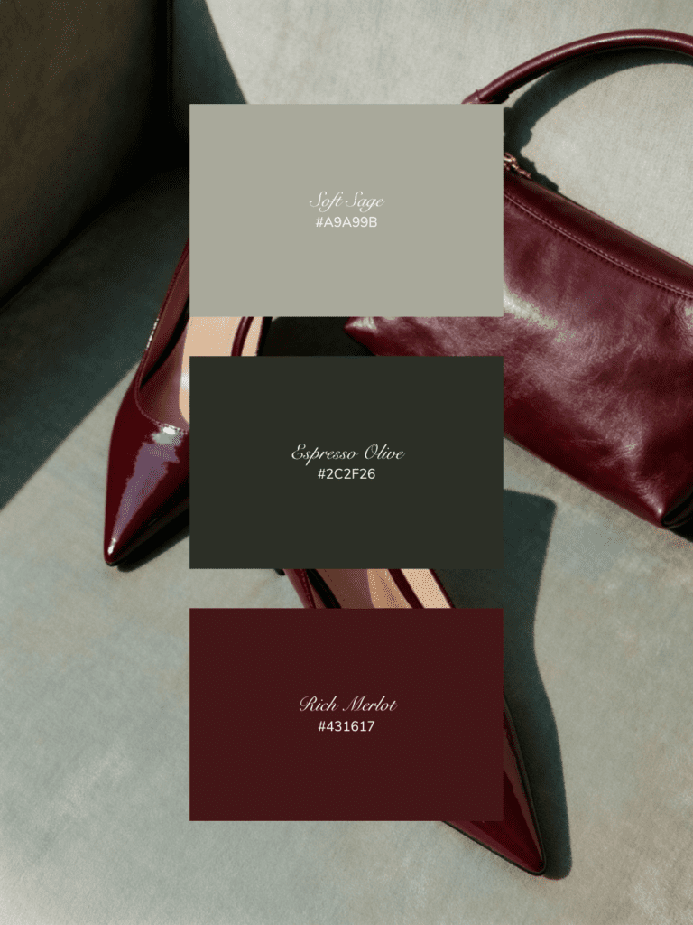
Understated Opulence
Quiet luxury in color form
Cream Cashmere — #DDC8B3
Soft and creamy with warmth, the perfect elevated neutral.
Vintage Greige — #9F8E87
A sophisticated blend of gray and beige that feels architectural and timeless.
Midnight Bordeaux — #2A070C
An ultra-deep burgundy that adds drama without overpowering.
Perfect for: luxury consultants, high-end service providers, interior designers, personal brands in the premium space.
Golden Heritage
Old-world richness meets modern polish
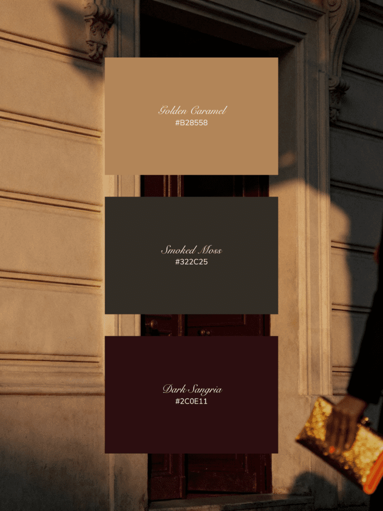
Golden Caramel — #B28558
Warm, inviting, and heritage-inspired. Adds a glow to deeper tones.
Smoked Moss — #322C25
Moody green-brown that feels historic and grounding.
Dark Sangria — #2C0E11
A bold, wine-soaked burgundy that radiates depth and prestige.
Perfect for: boutique hotels, heritage brands, artisanal products, luxury food & wine brands.
Modern Romance
Soft, nostalgic, and beautifully moody
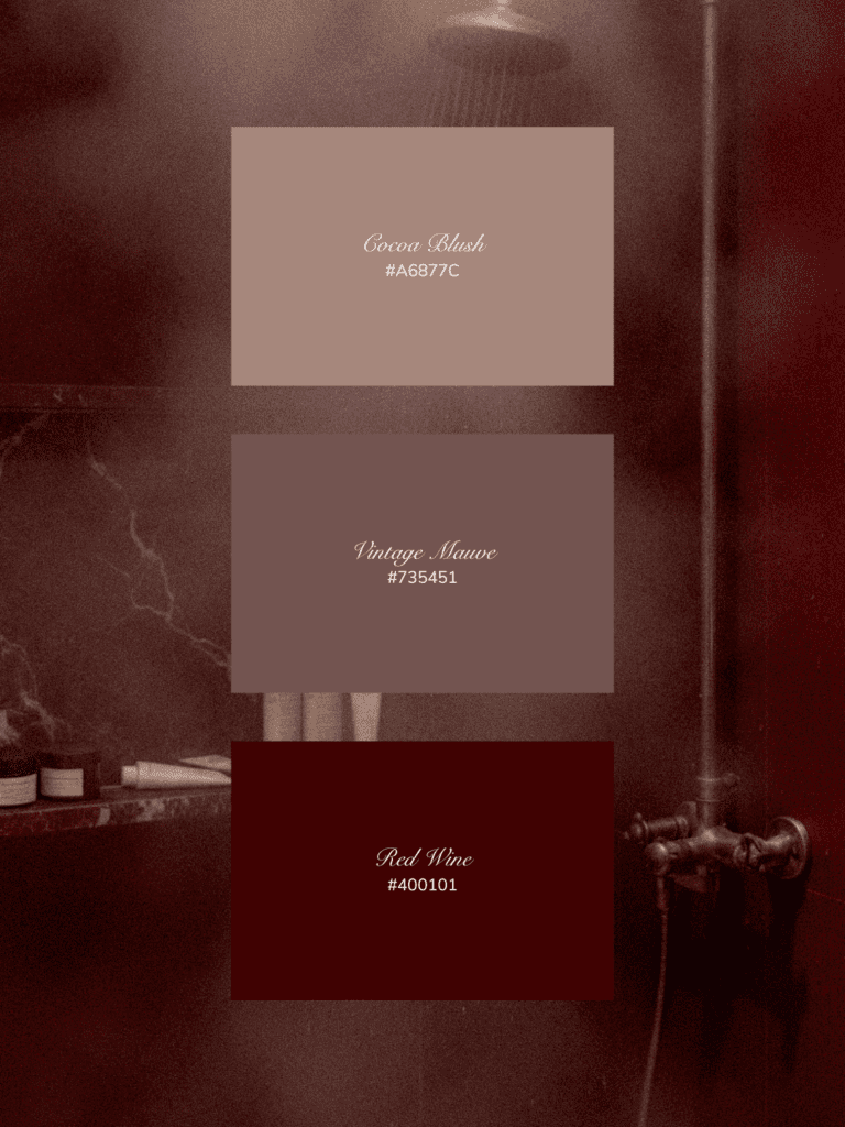
Cocoa Blush — #A6877C
A warm taupe with rosy undertones that softens the palette.
Vintage Mauve — #735451
Muted and romantic, this shade bridges soft and bold beautifully.
Red Wine — #400101
Classic, rich, and sensual. A statement luxury shade.
Perfect for: elevated feminine brands, luxury spas, personal care, high-end lifestyle brands.
Why Burgundy Color Palettes Work for Luxury Branding
Burgundy as a brand color isn’t trendy, it’s timeless. It evokes:
- Emotional richness
- Sensual sophistication
- Grounded confidence
Unlike bright reds, burgundy feels mature, composed, and deeply intentional, which is exactly what premium brands want to communicate.
When paired with warm neutrals, muted greens, or golden tones, burgundy becomes even more luxurious, creating a brand presence that feels expensive, elegant, and emotionally resonant.
What Colors Go Well With Burgundy in Luxury Branding?
Burgundy pairs beautifully with:
- Warm neutrals like cream, greige, and taupe
- Earthy greens like sage and olive
- Rich browns like caramel and espresso
- Soft muted pinks and mauves
- Deep near-black tones for contrast
These combinations create a luxury brand color palette that feels layered, emotional, and timeless.
If you’re ready to build a brand that looks as premium as the experience you deliver, this is your sign.
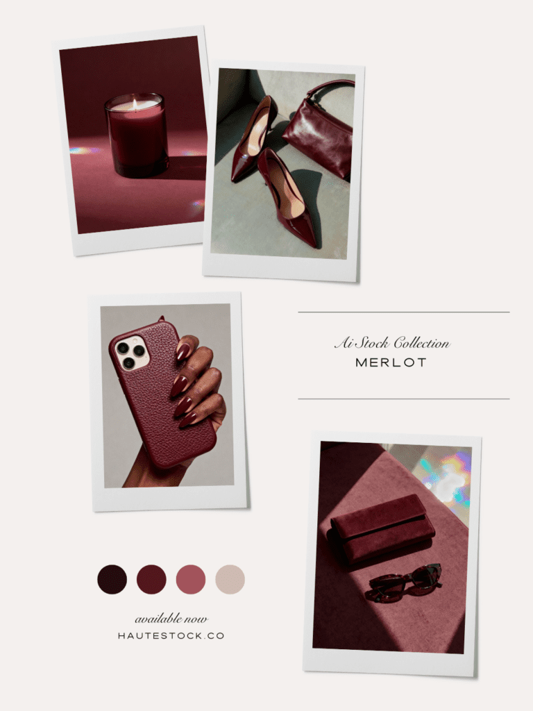
Inside the Haute Stock Membership, you’ll find elevated, design-forward imagery and color-driven collections like Merlot that make your brand feel instantly refined, cohesive, and high-end without the custom photoshoot price tag. Join thousands of entrepreneurs creating luxury-level visuals with ease, and give your brand the depth, polish, and presence it deserves.
FAQ: Burgundy in Luxury Branding
Is burgundy a good color for luxury brands?
Yes. Burgundy is strongly associated with heritage, depth, and sophistication, making it a powerful choice for luxury branding. It feels richer and more refined than bright red.
What does burgundy symbolize in branding?
Burgundy symbolizes elegance, confidence, emotional depth, and timelessness. It often conveys a sense of legacy and premium quality.
What colors pair best with burgundy for a high-end look?
Cream, greige, sage, olive, caramel, and deep charcoal all pair beautifully with burgundy for an elegant, luxury brand color palette.
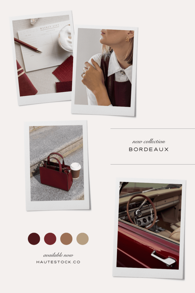
Where can I get luxury burgundy branding stock photos?
Inside the Haute Stock Membership you’ll find our Merlot, Bordeaux and other premium stock image collections with burgundy palettes. Unlock them all and start using them for your brand when you become a member.