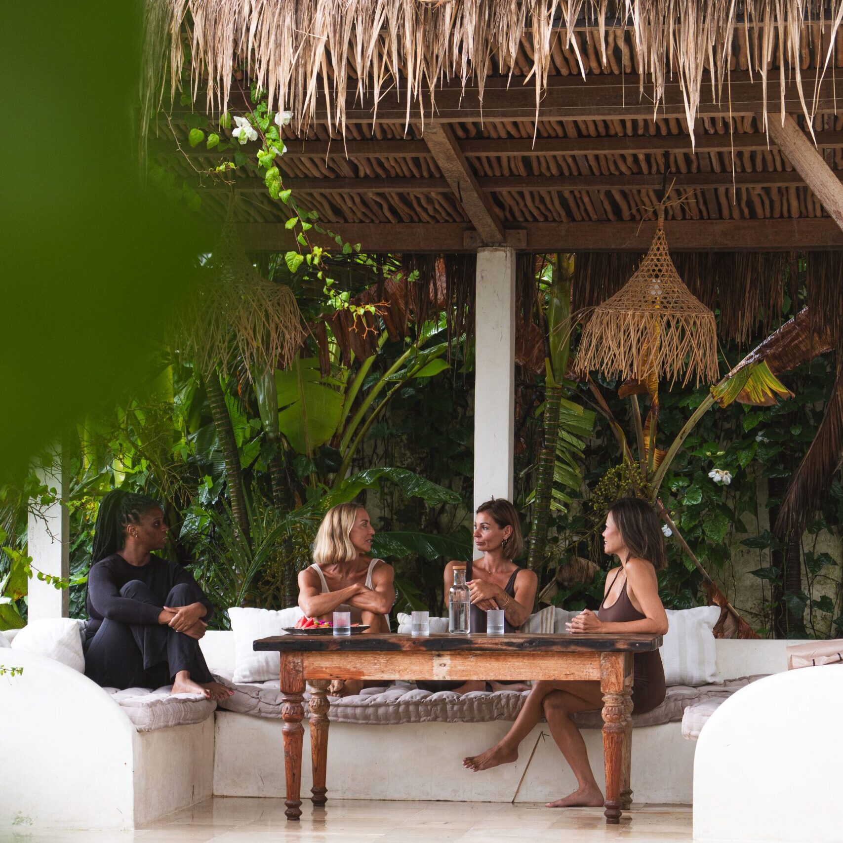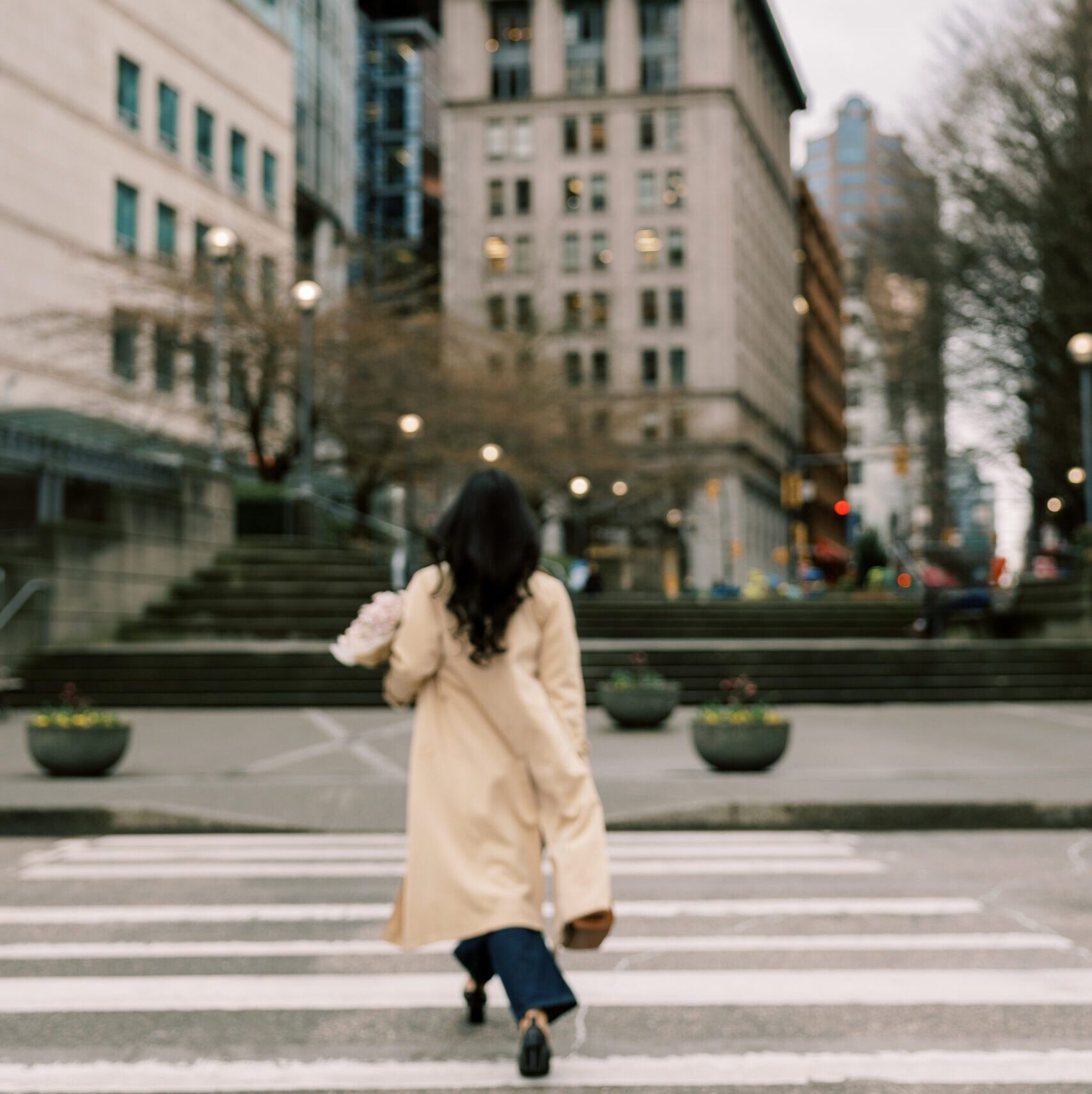


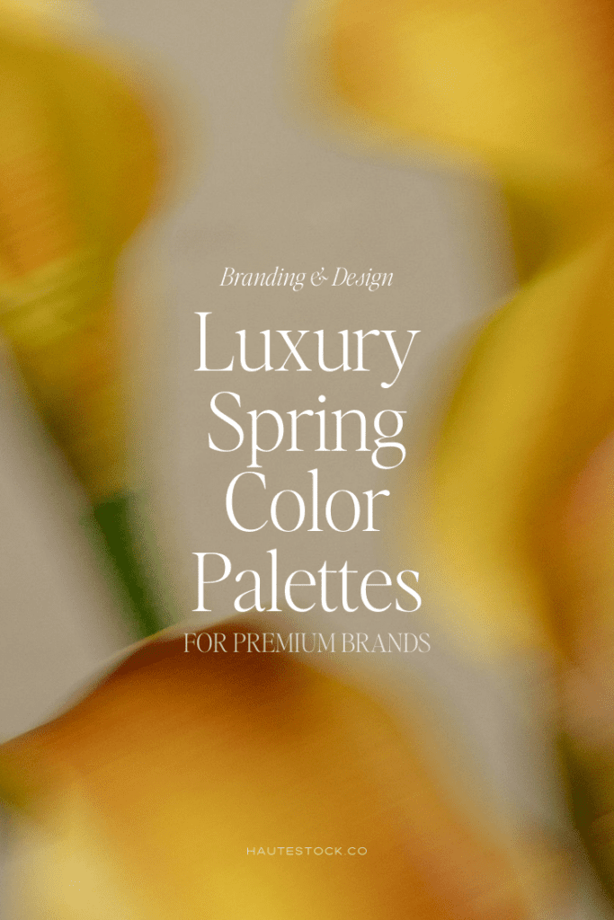
Spring is the perfect season to refresh your brand aesthetic. As nature shifts toward lighter textures, soft florals, and warm sunlight, your visual identity can evolve too. Luxury spring color palettes blend earthy neutrals, botanical greens, and soft florals to create a brand look that feels elevated, natural, and timeless. For creative entrepreneurs, coaches, and wellness brands, these palettes can instantly make your content feel editorial, calm, and high-end.
In this guide, you’ll discover 6 luxury spring color palettes, how to use them in your branding, and where to find the visuals to bring them to life.
If your brand is ready for a seasonal refresh, this post will give you the exact inspiration to start.
How to Choose a Luxury Spring Color Palette for Your Brand
Before diving into the palettes, it helps to understand what makes a color palette feel luxury rather than trendy.
Luxury palettes typically include:
- Muted, earthy tones rather than neon or overly saturated colors
- Layered neutrals (ivory, linen, stone) as a foundation
- Nature-inspired accents like moss green, terracotta, or floral tones
- Warm undertones that feel organic and calming
For spring branding specifically, look for palettes that feel:
- Fresh but not pastel-heavy
- Soft yet grounded with earthy hues
- Balanced between light neutrals and deeper accents
This creates a palette that feels seasonal but timeless, which is ideal for brands that want longevity in their visuals.
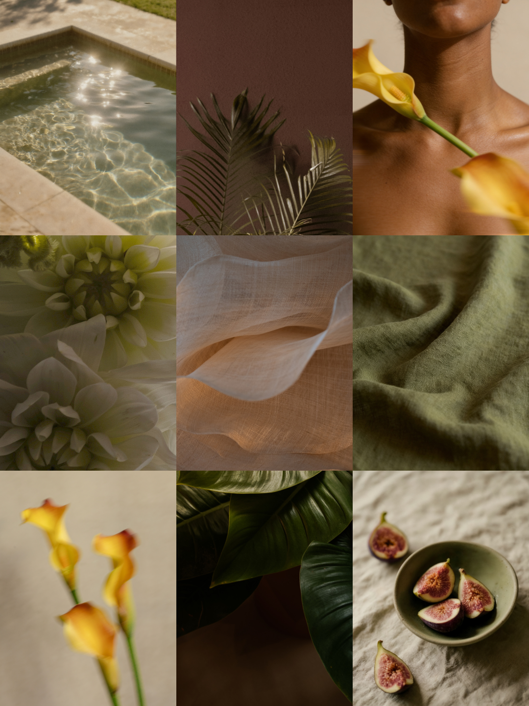
Botanical Warmth: Marigold, Moss & Amber
This palette brings together sun-warmed florals and grounding greenery, creating a vibrant but still refined spring aesthetic.
- Marigold Bloom — #D7AB38
- Moss Stem — #8E7F3C
- Amber Petal — #B57016
Best for:
- Lifestyle brands
- Creative entrepreneurs
- Editorial-style content creators
How to use it:
- Marigold for accent buttons or highlights
- Moss green for headings or brand backgrounds
- Amber for subtle contrast elements
The result feels earthy, creative, and sophisticated.
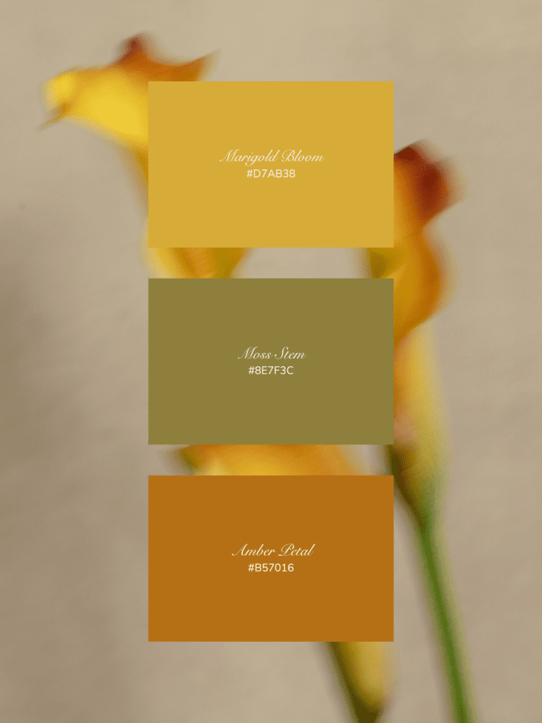
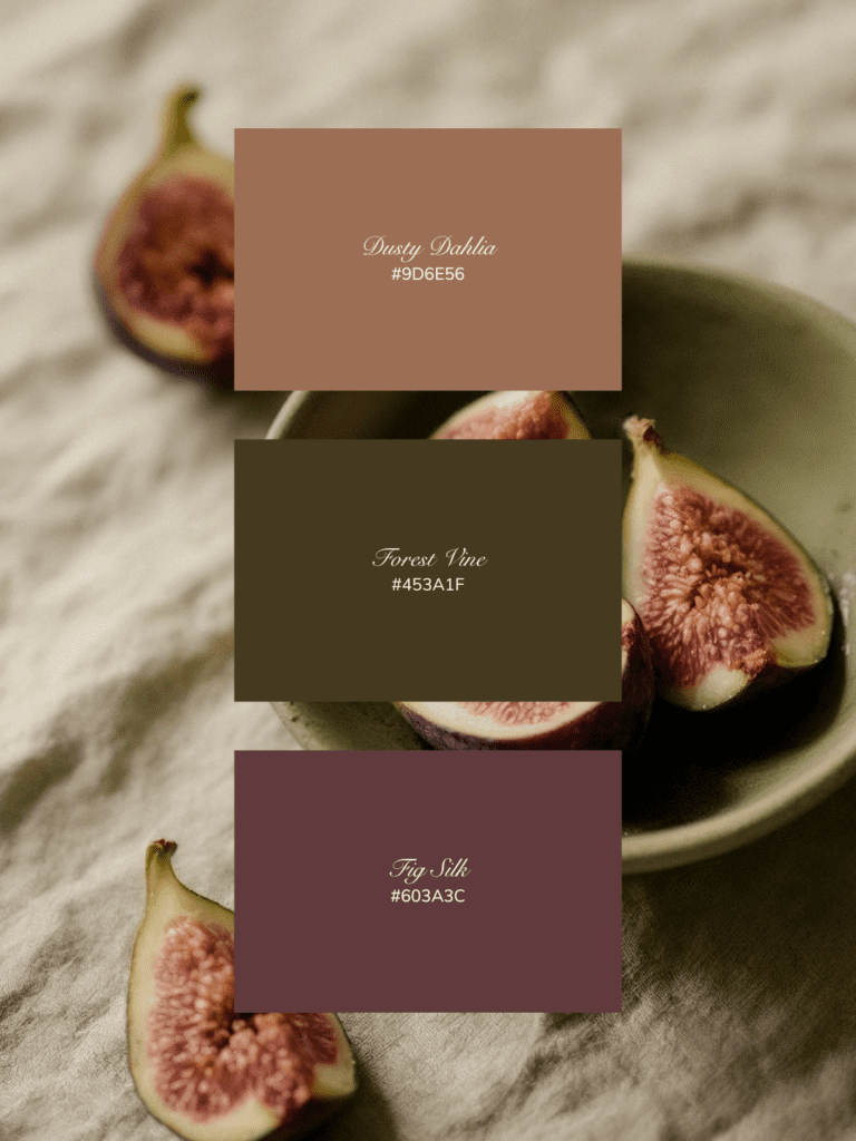
Fig Garden: Plum, Forest & Soft Rose
Inspired by ripe fruit tones and deep botanical greens, this palette feels luxurious and slightly moody while still perfectly spring-ready.
- Dusty Dahlia — #9D6E56
- Forest Vine — #453A1F
- Fig Silk — #603A3C
Best for:
- Wellness brands
- Nutritionists
- Beauty brands
- Personal brands with a grounded aesthetic
How to use it:
- Use Fig Silk for strong visual anchors
- Forest Vine for text and contrast
- Dusty Dahlia as a soft background tone
This palette feels organic, rich, and quietly luxurious.
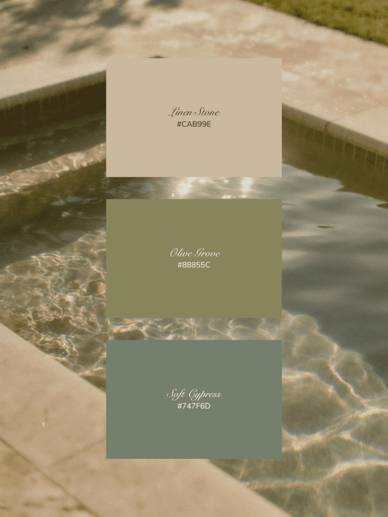
Garden Pool: Linen, Olive & Soft Cypress
This palette captures the calm of sunlit water, stone textures, and Mediterranean greenery.
- Linen Stone — #CAB99E
- Olive Grove — #88855C
- Soft Cypress — #747F6D
Best for:
- Interior designers
- Wellness brands
- Boutique product brands
- Retreats or travel brands
How to use it:
- Linen as your primary neutral
- Olive for brand accents
- Cypress for typography or icons
The overall look feels calming, minimal, and spa-like.
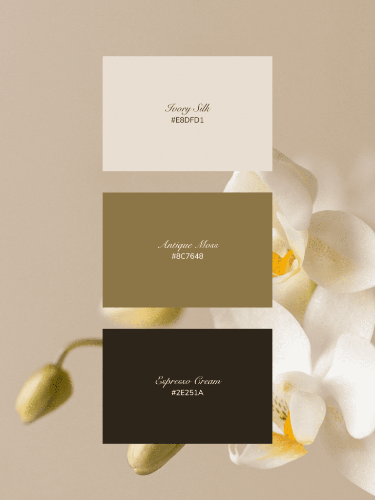
Orchid & Espresso: Elevated Neutral Spring
This palette proves spring palettes don’t need to be pastel. Instead, it combines creamy neutrals with rich grounding tones.
- Ivory Silk — #E8DFD1
- Antique Moss — #8C7648
- Espresso Cream — #2E251A
Best for:
- Luxury service providers
- Interior designers
- High-end coaches
- Fashion brands
How to use it:
- Ivory as your main background
- Espresso for typography
- Antique Moss for secondary accents
This palette delivers quiet luxury and timeless elegance.
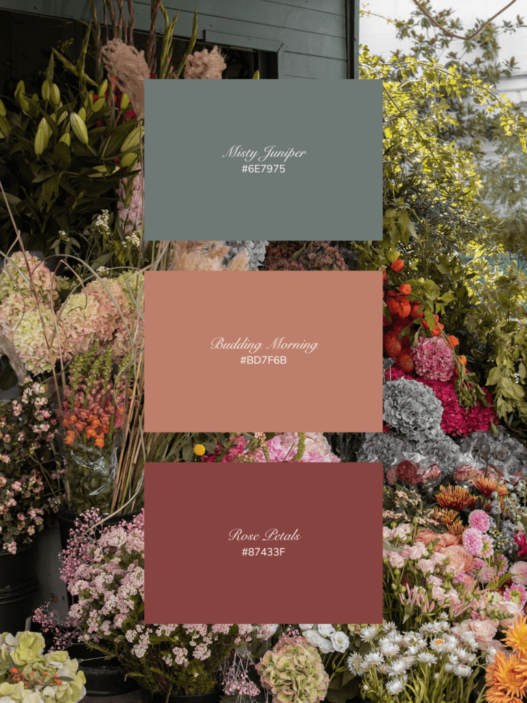
Spring Flower Market: Soft Rose, Juniper & Terracotta
Inspired by fresh bouquets and outdoor markets, this palette is warm, romantic, and inviting.
- Misty Juniper — #6E7975
- Budding Morning — #BD7F6B
- Rose Petals — #87433F
Best for:
- Florists
- Wedding professionals
- Creative studios
- Lifestyle brands
How to use it:
- Rose Petals for calls-to-action
- Budding Morning for backgrounds
- Juniper as a balancing neutral
This palette feels romantic, artistic, and natural.
FAQs About Spring Color Palettes for Branding
What colors feel most “spring luxury” for branding?
Some of the most popular luxury spring colors include:
- Moss green
- Linen beige
- Marigold yellow
- Terracotta
- Dusty rose
- Olive green
These shades feel natural, warm, and refined.
Should spring branding use pastels?
Not necessarily. While pastels are common, muted earthy tones often feel more luxurious and timeless. For example: Pastel pink → Dusty rose or Mint green → Moss or olive. This shift makes the palette feel more sophisticated and modern brand-ready.
How many colors should a brand palette include?
Most luxury brands use 3–5 core colors, typically including:
- 1 light neutral
- 1 medium neutral
- 1 accent color
- 1 deeper anchor tone
This creates visual balance across websites, social media, and marketing materials.
Tools to Create a Spring Brand Aesthetic
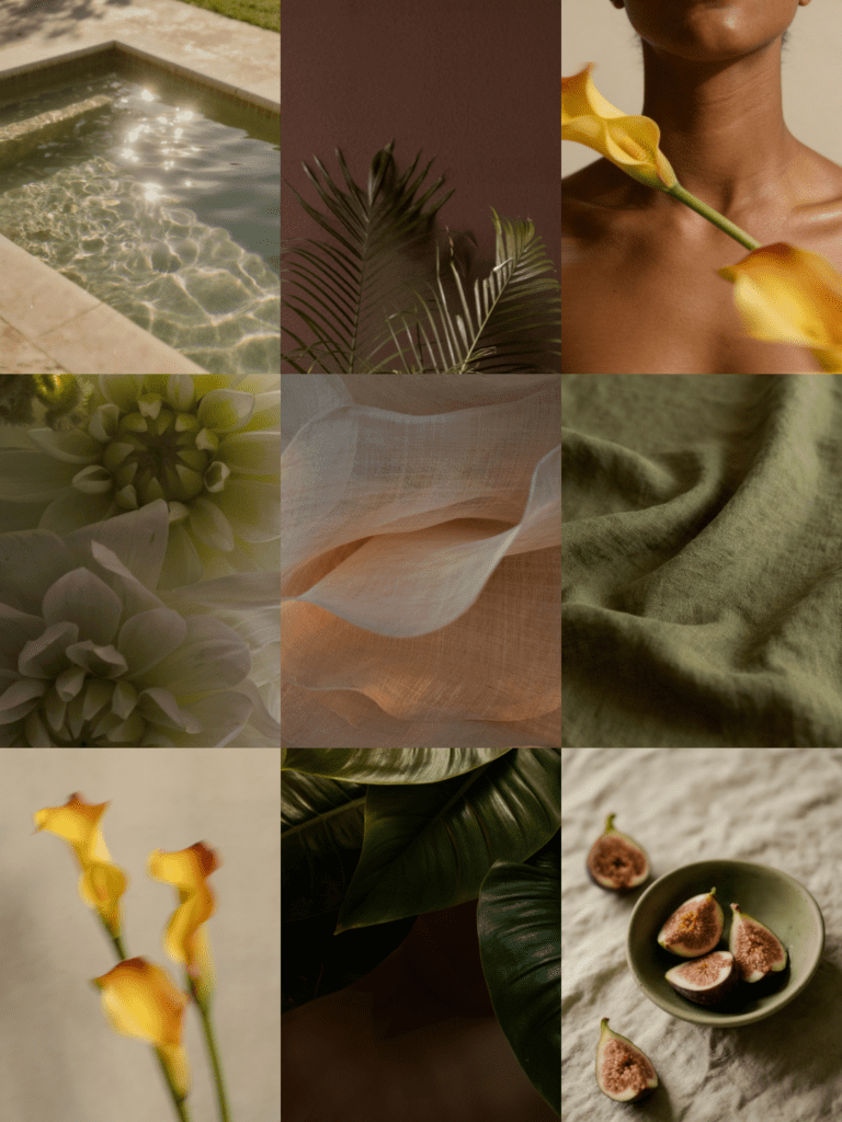
If you want your spring color palette to feel cohesive across your brand, visuals matter just as much as color.
Inside the Haute Stock Membership, you’ll find:
- Curated luxury spring stock photos
- Canva marketing templates
- Lifestyle visuals designed for coaches, creators, and creative entrepreneurs
Instead of piecing together random images, you can create a fully cohesive brand aesthetic in minutes.
Key Takeaways
- Luxury spring color palettes combine earthy tones, soft florals, and warm neutrals.
- Avoid overly bright pastels in favor of muted, nature-inspired shades.
- A balanced palette usually includes 3–5 complementary colors.
- Pairing your palette with cohesive imagery instantly elevates your brand.