Compelling Components of a Successful Landing Page
Question for you — how many landing pages have you created in your time as an online business owner?
If you’re just starting out, the answer is probably only between 1-2, but if you’re more seasoned in the world of entrepreneurship, it might be well over 10+.
If you’re selling a course, directing traffic to an email list, or drumming up excitement for a product launch, chances are you’re sending your followers off their social media apps and onto a good ol’ https:// landing page link hosted on your site.
In the jump your audience makes from your email marketing newsletter or social platform to your landing page, what’s going to keep them there, scrolling through to either make a purchase or enter their email for future updates?
Imagery, that’s what. And not just any photos off the Internet, but imagery that inspires and connects, that tells your followers that you see them, and better yet, that you totally get them.
Sure, your copy definitely plays a part in keeping your followers there. After all, they’re keeping up with you on social and through email, so they’re invested in what you have to say.
But there are those who find your landing page organically, and stick around because their first impression of your page is a good one – one that speaks to them quickly and draws them in.
So, what makes up a compelling landing page that makes readers want to stick around and share their coveted email or credit card number?
Let’s use the Instagram Ads Mastery landing page, from The Digital Buzz founded by Carole, to break it down for us.
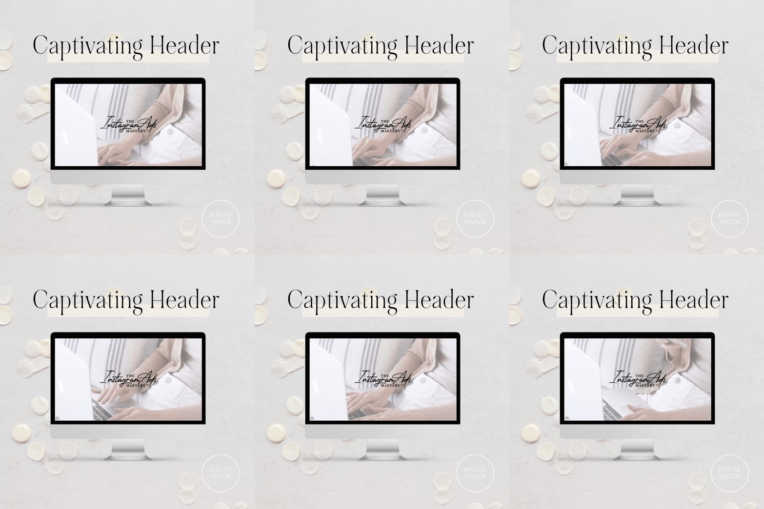
1 / Captivating Header
The Instagram Ads Mastery page commands your attention from first glance with a Haute Stock video as the welcoming header, rather than a static photo.
Video is a fantastic medium to use to really “stop the scroll” because the subtle movement pulls you in immediately, almost making you do a double-take to make sure you’re not imagining it.
As the use of video gains popularity on all platforms, consider incorporating stock video into your website landing page design as the first visual the potential customer sees, or at least incorporating video into the page to create space between #allthethings and regain interest.
Design tip: Don’t add text to a busy video or one that has lots of quick cuts. A simple, subtle stock video with negative space or minimal colors and movement is best when adding text to the header so it’s easy to read and consume.
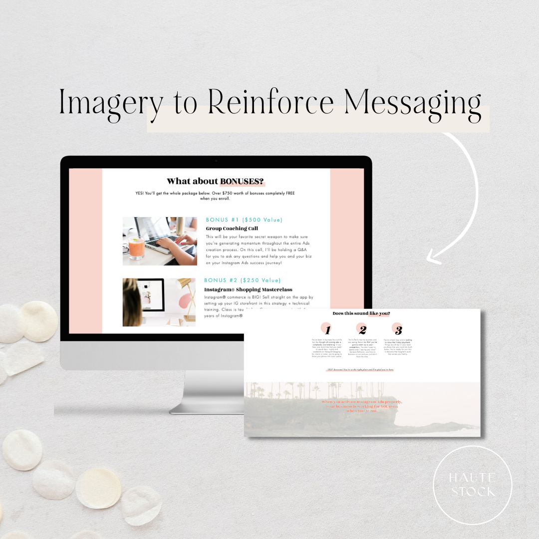
2 / Use Imagery to Reinforce Messaging
We all know that a picture speaks a thousand words, but it speaks many more when your website copy and imagery compliment each other to reinforce your messaging.
For example, Carole uses two Haute Stock images in the “Bonuses” section of her landing page that, when reading the copy next to it, show you exactly what to expect — “Group Coaching” as shown in Image 1, and “Instagram Shopping” as shown in Image 2.
Carole also uses a stock image from our Summer Breeze collection in a section of the landing page to reinforce her messaging above and in the quote overlaid on the photo — that the Instagram Ads Mastery course will help you free up your time to do more of what you love (read: relax in the tropics).
The website copy, juxtaposed with this relaxing, serene stock image of palm trees, further cements in the readers mind that that type of lifestyle is possible with the help of this course!
Design Tip: When choosing images for your landing page, scan your copy for “keywords” that are easily searchable in the Haute Stock image library, that would yield relevant imagery to compliment your messaging.
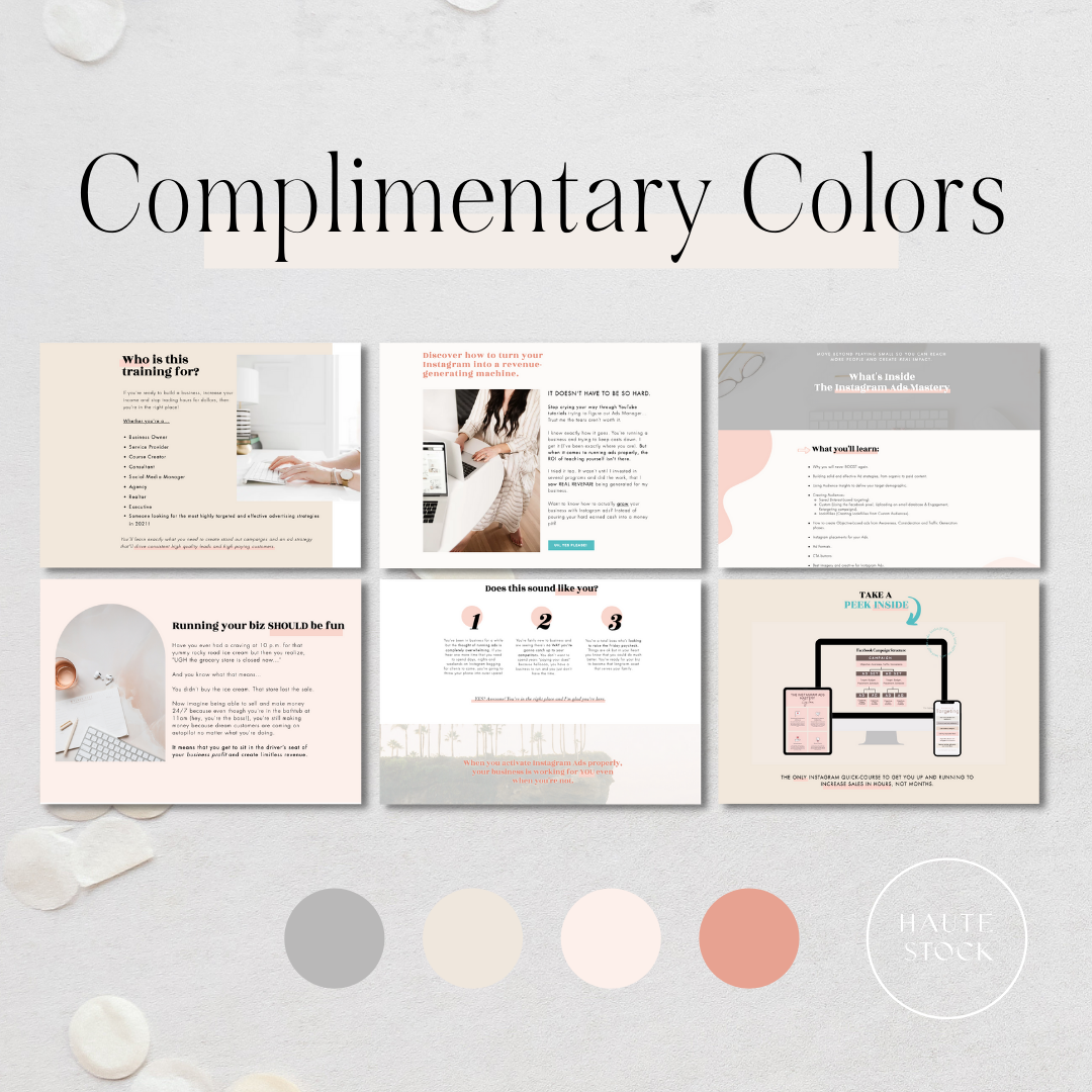
3 / Complimentary Colors
Right away, the Instagram Ads Mastery landing page looks polished and professional because the Haute Stock photos used compliment the brand colors.
The stock images enhance the page design without distracting or taking away from the content on the page.
The viewing experience is heightened because everything looks aesthetically pleasing, cohesive, and on-brand. Everything you want your brand to exude, so your work is taken seriously!
Design tip: Use a filter or colored overlay on photos that are not quite the right fit color-wise. That way you can use your favorite, cohesive images without compromising the overall aesthetic of the page. Or, use stock photos with a neutral color palette that can be mixed into pages featuring your brand colors to create a cohesive feel.
It’s clear to see from the examples above, that The Digital Buzz 100% nailed their Instagram Ads Mastery landing page.
They’ve got all the right things happening throughout, and we weren’t the only ones to notice!
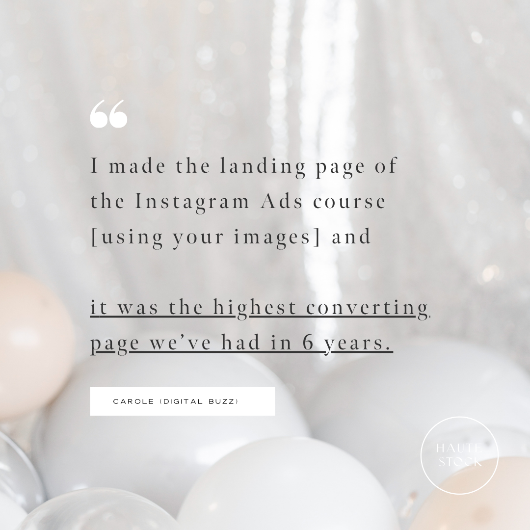
According to Carole,
Haute Stock’s stock photos and videos helped make the landing page for the Instagram Ads Mastery course a financial success!
If you’ve ever doubted the power of imagery — the power of the RIGHT imagery — here’s your proof that a visual strategy that is well thought-out and positioned to enhance your position as knowledgeable, trustworthy, and the answer to their problems, will help you be successful!
Now, what are you still doing here? Start browsing the Haute Stock Library for the perfect images and videos for YOUR successful landing page!
