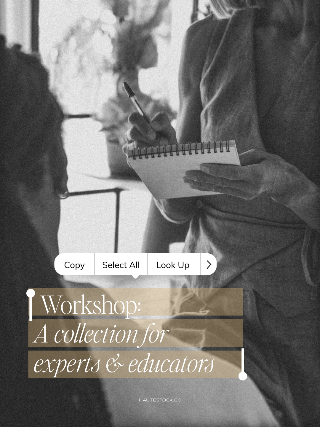


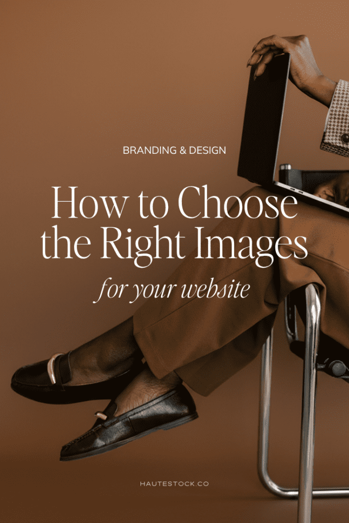
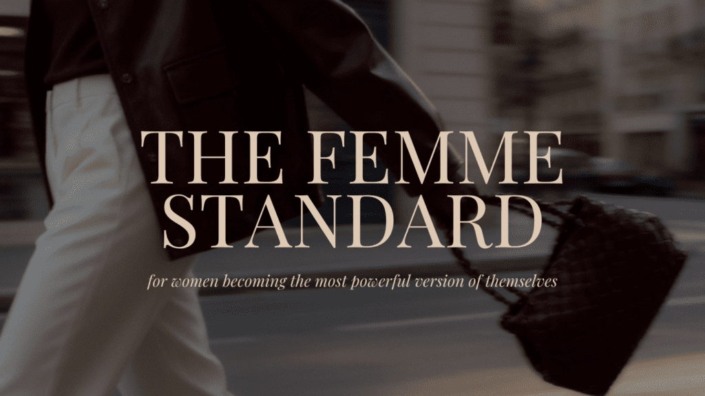
Your website images aren’t just decoration, they’re one of the most powerful trust signals your brand has. Here’s how to get them right.
The moment someone lands on your website, they start forming an opinion, before they even read a single word. Before they understand your services, your process, or your pricing, they’re already deciding whether your business feels like the right fit for them. And so much of that first impression comes down to your images.
The right photos make your website feel polished, credible, and aligned with your ideal client. The wrong ones (even if everything else is perfect) can make an incredible offer look amateur.
So how do you actually choose the right images for your website? That’s exactly what we’re breaking down today.
Prefer to watch? The video below walks you through everything with visual examples. Or keep reading for the full guide.
Start With the Feeling You Want to Create
To start, you need to know how you want people to feel when they land on your website.
Take a moment to write down a few words that describe your brand. Are you calm and organized? Editorial and moody? Energetic and creative? Airy and feminine? Playful and bold?
This matters because every image communicates emotion. If your photos don’t reinforce the same feeling as the rest of your brand, your website will feel disjointed — even if the individual images are beautiful on their own. When the mood is consistent across your whole site, your brand instantly reads as more intentional and trustworthy. It looks like you are exactly who you say you are.
If you’re not sure where to start, take this free Brand Style Quiz to find your aesthetic.
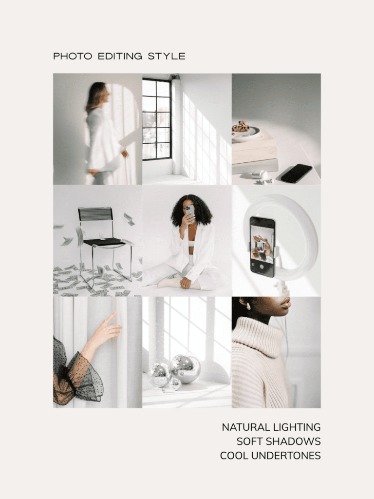
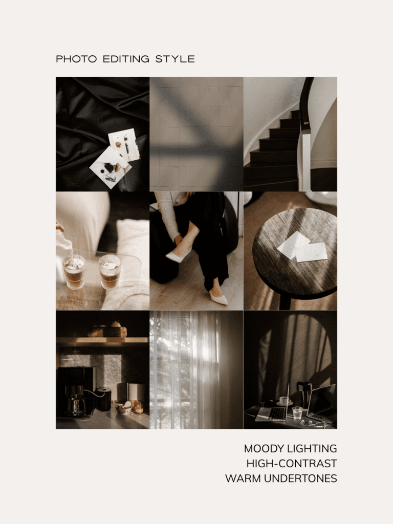
Keep Your Images Visually Consistent
Once you’ve defined your aesthetic, consistency is everything.
The images across your site should share similar lighting styles, editing tones, and color temperatures. Bright and airy photos shouldn’t be mixed with dark and moody ones. Cool-toned images don’t pair well with warm golden ones. If you put all your website images side by side, they should feel like they belong to the same photoshoot.
A few things to keep consistent:
- Lighting style — high-key and bright versus low-key and moody
- Color temperature — warm tones versus cool tones
- Editing style — high contrast versus soft and muted
When it comes to color, you have two solid options: choose images that feature your brand colors, or stick with mostly neutral images and let your brand colors show up as accents in text, buttons, and backgrounds. Both approaches work beautifully, what matters is choosing one direction and sticking to it.
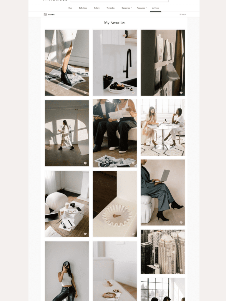
A great way to check for visual consistency is using the favorites feature in Haute Stock, where you can like images to save them, then view them all together in one place. Seeing your selections side by side makes it immediately clear whether they feel cohesive — or whether a few need to go.
When images clash visually, the website feels chaotic, even if you can’t put your finger on why. Consistency makes your brand feel designed rather than thrown together.

Your Hero Image Matters More Than You Think
Your hero image — the large photo at the top of your homepage — is the very first thing visitors see. It needs to work strategically, not just look pretty.
A strong hero image:
- Supports your headline and brand message in both subject and style
- Draws the eye toward the text rather than competing with it
- Isn’t overly busy or distracting — either through natural negative space or thoughtful cropping

If your hero image is too visually complex, your headline becomes hard to read and you’ve already created a disconnect with a potential customer before they’ve had a chance to engage. A few practical tips: reduce the image opacity to help text stand out, use a soft overlay if needed, and always crop vertical images into a horizontal format for web.
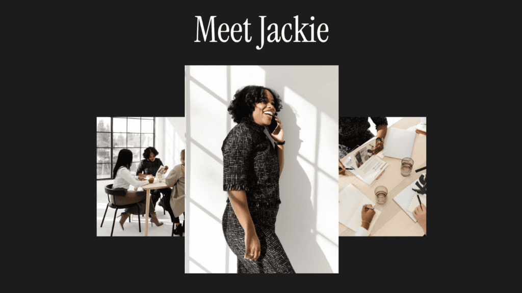
Your About Page Is About You
This is the one key place on your website where stock photos should not replace you.
Your About page needs at least one photo of your actual face. Choose one that feels aligned with your brand aesthetic and looks natural and approachable. It doesn’t have to be from a professional photoshoot (though if you’re ready for that investment, a personal brand shoot is absolutely worth it). Even a simple, well-lit photo will do the job.
Why? Because people want to know who they’re giving their money to. Seeing your face builds connection and trust faster than any amount of carefully written copy. It creates transparency and makes your business feel genuinely human.
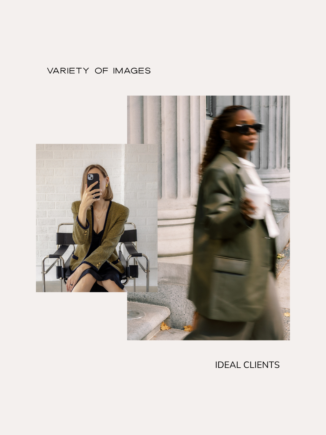
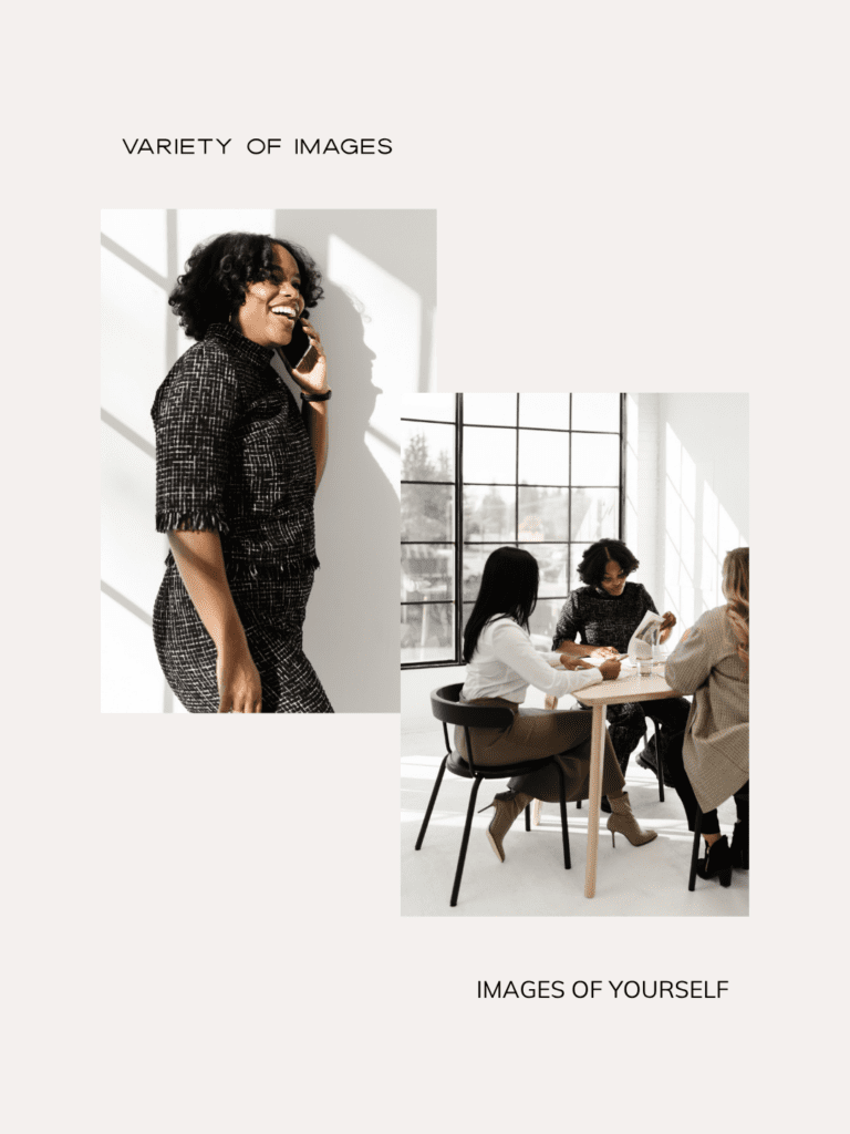
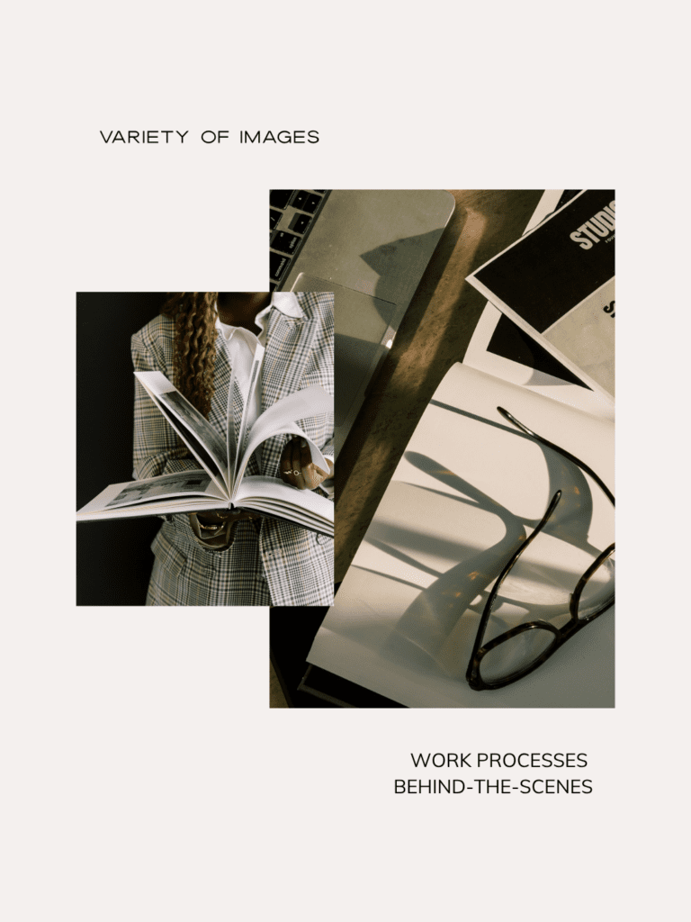
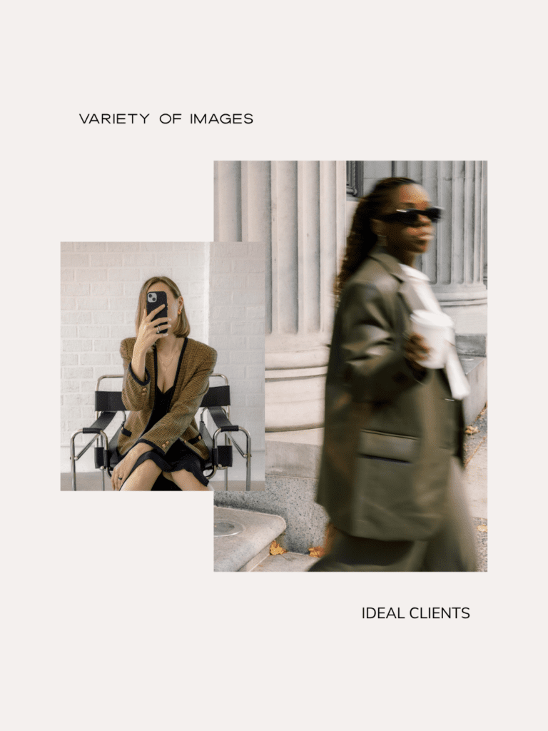
Use a Variety of Images, Not Just Photos of Yourself
Here’s something that surprises a lot of people: having too many photos of yourself can actually work against you.
When every image on your site is of you posing, it becomes harder for your potential clients to picture themselves inside your brand. This is one of the reasons incorporating stock imagery isn’t just a time-saver, it’s actually a smart strategic move.
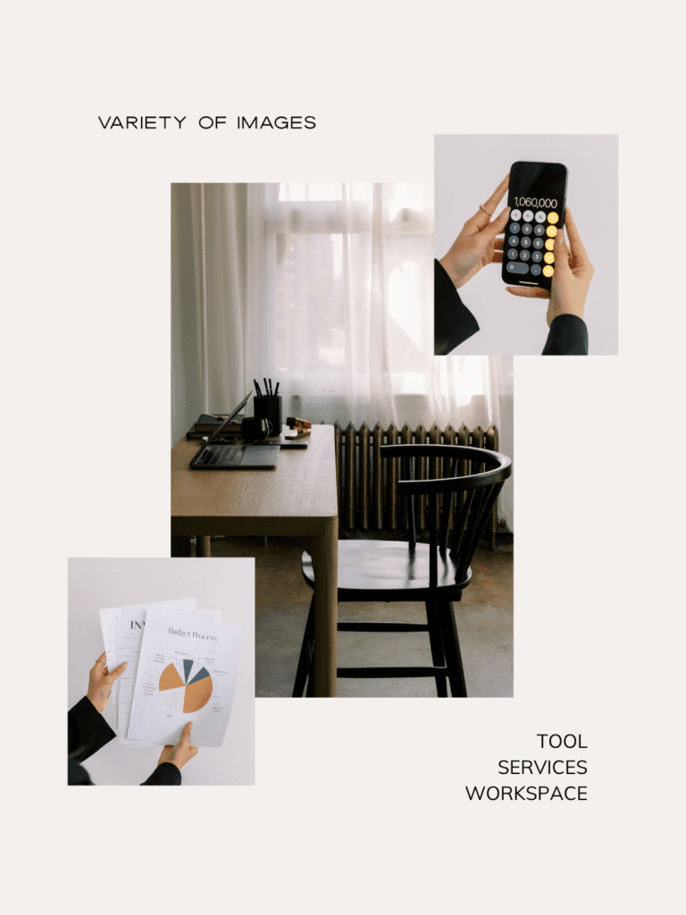
A well-balanced website uses a mix of:
- Photos of you: building connection and showing your personality
- Your services, tools, or workspace: giving context to what you do
- Process or behind-the-scenes moments: either stock images or your own brand photos
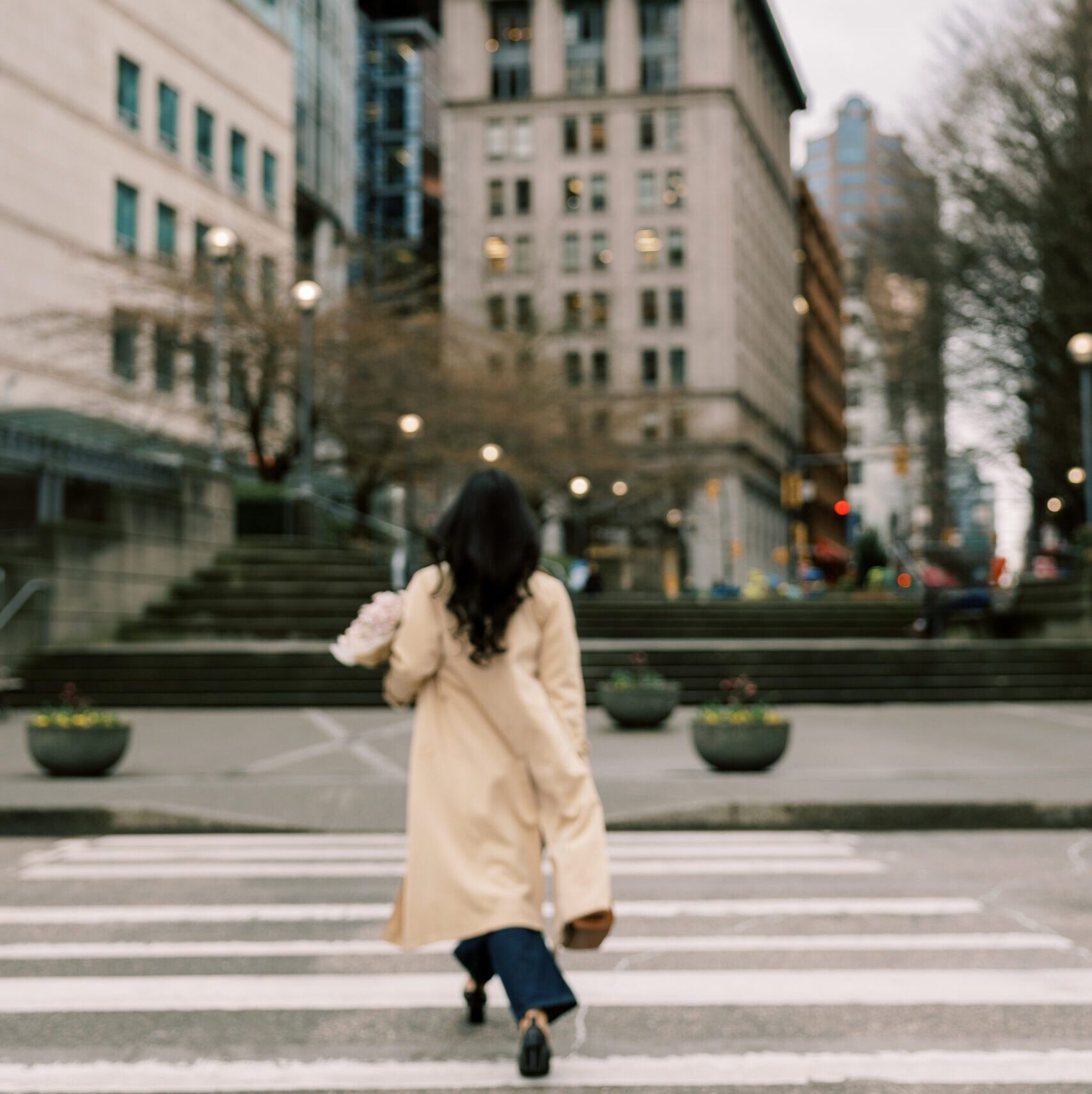
- People who resemble your ideal clients: helping your audience see themselves in your brand
- Lifestyle and atmosphere images: conveying the transformation or outcome your clients can expect
When your imagery covers all of these angles, visitors can imagine themselves working with you, using your services in their real life, and experiencing the results you offer.
Contrast Is Your Friend
Good contrast is what makes a website look professionally designed rather than thrown together. And there are two kinds of contrast to think about: contrast between your text and its background, and contrast between the different sections of your page.
For text, the rule is simple: make sure the text color strongly contrasts the background so it’s easy to read. Avoid placing text over busy areas of images, and don’t use text that’s too light in size, weight, or color. When in doubt, add an overlay or gradient behind the text.
For page sections, each section should feel visually distinct. One of the most effective ways to achieve this is by alternating between light and dark backgrounds as you scroll: a dark image section followed by a light text section, then a color-blocked section. This creates clear visual separation while keeping the overall feel cohesive, as long as all your colors stay within your brand palette.
If visitors have to work to read your website, they’ll leave. Contrast keeps things readable, accessible, and visually engaging.
Quick-Reference: Choosing Website Images
Start here:
- Define the feeling you want to create and write down 3–5 brand keywords
- Choose your aesthetic direction and stick to it (if you need help finding your brand aesthetic, take the free brand style quiz)
- Select images with consistent lighting, editing style, and color temperature
- View all your selections together before finalizing
- Make sure your hero image supports your headline and isn’t too busy
- Include at least one real photo of yourself on your About page
- Mix images of yourself, your work, your ideal client, and lifestyle/atmosphere shots
The Bottom Line
Choosing the right images for your website isn’t just about finding the most beautiful photos — it’s about finding the right photos for your brand. Ones that create a consistent feeling, support your message, and help your ideal client imagine themselves working with you.
When your imagery is intentional and cohesive, your website does a lot of the trust-building work for you.
Looking for a library of styled stock photos that actually make this easy?
Haute Stock has thousands of images organized by aesthetic, with tools designed specifically to help you find and curate photos that work together, so your website can look like it was designed by a pro, even if you built it yourself.
Frequently Asked Questions
What kind of images should I use on my website? Use a mix of photos that represent you, your services or workspace, your process, people who look like your ideal clients, and lifestyle imagery that conveys the results of working with you. Most of these can be stock photos. The most important thing is that all your images share a consistent aesthetic, including similar lighting, color temperature, and editing style.
Should I use stock photos on my website? Yes, stock photos are not only a time-saver, they’re a strategic tool. Using only photos of yourself can make it harder for potential clients to envision themselves in your brand. A good balance of personal photos and on-brand stock imagery tends to convert better.
What makes a good hero image for a website? A strong hero image supports your headline, doesn’t compete with your text, and creates a clear visual hierarchy. Look for images with natural negative space, avoid overly busy compositions, and reduce opacity or add an overlay if needed to make text stand out.
How do I make my website images look cohesive? Choose images with similar lighting styles, color temperatures (all warm or all cool), and editing tones. If you place all your selected images side by side, they should feel like they came from the same photoshoot. Tools like Haute Stock’s favorites feature make it easy to compare your selections before committing.
Why does my website look unprofessional? Inconsistent and poor quality images are one of the most common culprits. Mixing bright airy photos with dark moody ones, using images that clash in color temperature, or choosing a hero image that’s too busy can all make an otherwise well-designed website feel disjointed. Choosing visually consistent, high-quality images and ensuring strong contrast between text and backgrounds makes a significant difference.